You are using an out of date browser. It may not display this or other websites correctly.
You should upgrade or use an alternative browser.
You should upgrade or use an alternative browser.
Post your "Product Photography" Big or Small.
- Thread starter Kodiak
- Start date
Michael J.
Senior Member
•
Thanks for the good note, Michael! …but why do you think it is a difficult shot?
The right lightning to avoid flashpoints on the subject and the reflection ground- and the right angle to get the view to see inside and to see the the outside as well in details. And to compose the shot such the front-wheel in the right direction.
But you know photography is just a hobby to me I am only telling you what I think as a not pro. So if I make some foolish thoughts forgive me that I speak right from my heart.
mr2_serious
Senior Member
•
Do you want me to comment them? Or did you, rightfully, just want to share them?
Constructive criticism, no problem for me (I know they are not perfect
Sent from my SGH-T999 using Tapatalk 2
Last edited:
ooooh, finally something I can play in! Hehe. These were part of my portfolio for Illustrative class.
Alright "mr2_serious",
At fist glance, I recognize a high sense for plasticity when it come to light, colours
and materials. The fourth element of the equation, organization, you seem to have
neglected or ignored in some of the presented parts of your portfolio. At fist glance,
as well, I think I have detected two perfect and impeccable posts! Let's go deeper:
View attachment 46483
This chess board is a very good idea. The plasticities of light, colours and materials
are all working together to achieve a captivating, strong static composition. The fourth
element of the equation, organization, the one that makes good to perfect is missing:
• The figures are all sharper at the top then they are at the bottom
• The alignment of the figures to the chessboard could be improved
• The chessboard itself is improperly aligned
View attachment 46484
Yes, this one is technically correct. At the same time, the less appealing.
A good catalogue shot.
View attachment 46485
Associated, normally, to these products are ideas like warmth, pleasure, relaxation…
None of these is reflected here. Another great catalogue shot.
View attachment 46486
This is the first time you were working against yourself! The selection of a darker coloured
background would have made this take a hit! Else than the alignment of the top rotor and
the background, everything is perfect. I am not considering the landing gear misalignment
because this is a minor detail. The actual background does not bring up the shape and the
features of the rotor blades.
View attachment 46487
Absolutely! This one is PERFECT! Here, all four elements of the equation are working together!
Clean, detailed, correct specular expression and layout.
View attachment 46488
This last one is my favourite. Two details only took the word perfect from it, and this is, again,
the fourth element of the equation: organization. Here, this is translated in the fact that there
is not enough water in the second (red) glass, and the first (amber) is slightly too far apart!
Everything else is perfect: light, colours, and materials are all working together! Beautiful!
•••
This is the kind of report I would write to my students. They know me! I am hard but fair! I do
hope that this was constructive enough assuring you that I do not practice any other way.
Have a good day…
mr2_serious
Senior Member
Thanks Kodiak(c)... LOL  I enjoy the input. Illustrative was a tough class; learning all the different lighting techniques but it was a joy.
That's pretty much how my professor would have said it. But for our portfolio, he let the class grade it. The only thing they mentioned was the rotor of the helicopter.
The chess pieces, I wanted to try something different so I decided to hang the board and use it as a background. Now that I think of it, it probably would have been better to just tape the board to a wall instead of having it hang freely from a boom arm.
My suggestion to others: 1. take your time to check everything if you are working by yourself 2. it is a bit easier when you have an assistant or two 3. If you have it or can rent it, a tilt shift lens is wonderful
Can't wait til my gf takes this class so tag along and work on a few ideas I didn't get to last semester
Photowyzard
Senior Member
I will post up 3 for you to comment on, Kodiak. Looking forward to hearing what you have to say. These were all experiments for me. Great topic.
Right! … Art, you ran for it! Now, Let's see…
At first glance…
Black backgrounds… why not? Framing in over done and much too tight anyway!
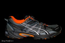
I will reject the third picture as flash test… does not qualify for a critique. The
two others are an other ball game. Completely!
View attachment 46553
The exposition is good. The expression is just fair because only the glass has a
special treatment. The bottle, that IS the product, is not so eye catching as the
glass… this takes the attention on the wrong spot. Black glass is cool but rather
insufficient control of the specular lights.
This was taken with an inadequate lens for the purpose; the compression is too
high and the perspective was not chosen wisely.
The set is not clean… most unforgivable!
As a long time whisky amateur, I can say that the glass is everything but a whisky
glass and is totally inappropriate… This faux-pas would infuriate any art director!
The picture appears sharp and the general tonal range very well picked for this
type of application.
___________________________________________________________________
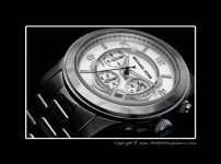
View attachment 46554
It would all be so perfect if…
I love those dramatic falloffs like the one on the bottom left of this picture!
When you set up the needles on the face of the watch, you had it square to your
face and eyes, right? Now that it is in place on the table top, the angle of two of
the needles is still right but not the "seconds" needle! It is either two seconds too
late or too early! … because the position of the watch to the camera is not the best.
The numbers 4 and 6 should be at least partially readable; #4 is invisible and #6
is hardly distinguishable. From the axis 1 through 8, the watch should have been
lowered to give visual access to at least part of the numbers 4 & 6.
This positioning small correction would possibly have affected positively the place
of the "seconds" needle between 6 and 7.
The dof is clearly insufficient: the 47th through the 52th seconds markers are way
too soft.
Otherwise, the light is great and the specular spots are very well under control.
___________________________________________________________________
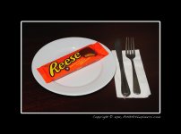
View attachment 46555
Rejected, does not qualify.
Must have been a flash test or you are pulling my leg!
___________________________________________________________________
Like everyone else, I may have strong opinions but that does not make me right!
These comments are based on my subjective experience.
Photowyzard
Senior Member
Excellent review, thank you!!
The Reese Pieces shot was for a monthly challenge. It was done mostly tongue in cheek! No problem at all with the rejection.
The Whiskey shot was just something I wanted to try, I agree with your assessment 100% and I learned something from it, thanks!
The watch shot was an actual serious attempt. The commentary is spot on. You know your stuff! The second hand was exactly 1-2 seconds short of perfect, it should have been in the middle of the gap, not touching any number or dial. Missed the timing and noticed it after I moved the watch so I did not re-setup or re-take the shot.
MK is on the knob of the watch. I was attempting to light that much better but missed the spot lighting on it (was using an LED Penlight to Light Paint, but did a poor job). It would have look a lot nicer if the MK was more visible against the dark shadow.
I don't typically do Product Photography, I wanted to take a stab at it. I love watches, I really like watch photography and in all these shots, composition and lighting is everything.
Thanks for taking the time, greatly enjoyed the read!! I did learn something on the Whiskey Shot and the Watch shots and I am appreciative of the time you spent on the commentary! A great read!
Art
The Reese Pieces shot was for a monthly challenge. It was done mostly tongue in cheek! No problem at all with the rejection.
The Whiskey shot was just something I wanted to try, I agree with your assessment 100% and I learned something from it, thanks!
The watch shot was an actual serious attempt. The commentary is spot on. You know your stuff! The second hand was exactly 1-2 seconds short of perfect, it should have been in the middle of the gap, not touching any number or dial. Missed the timing and noticed it after I moved the watch so I did not re-setup or re-take the shot.
MK is on the knob of the watch. I was attempting to light that much better but missed the spot lighting on it (was using an LED Penlight to Light Paint, but did a poor job). It would have look a lot nicer if the MK was more visible against the dark shadow.
I don't typically do Product Photography, I wanted to take a stab at it. I love watches, I really like watch photography and in all these shots, composition and lighting is everything.
Thanks for taking the time, greatly enjoyed the read!!
Art
•
Hi y'all!
This is my older son's (Bénédict, 19) first attempt to serious macro photography!
I did kick his ass because he did not clean his watch properly before setting it up!
The only light source here is "high-tech and very expensive" window daylight!
I know, I know, this is not available to everybody… but we have it! =)
…and one styropor reflector!
All together, i think he did pretty well… what do you think?
View attachment 46591
Have a good day…
RockyNH_RIP
Senior Member
•
Hi y'all!
This is my older son's (Bénédict, 19) first attempt to serious macro photography!
I did kick his ass because he did not clean his watch properly before setting it up!
The only light source here is "high-tech and very expensive" window daylight!
I know, I know, this is not available to everybody… but we have it! =)
…and one styropor reflector!
All together, i think he did pretty well… what do you think?
Have a good day…
Hello Kodiak,
I really like the watch and how he did that... like the composition, it works for me... and the watch face is nicely lit and exposed... Curious, what was used for the background?? I see some texture in there... (not complaining, just curious!
Pat in NH
Last edited:
•
Hey Pat,
This background was bought at our local art supplies shop. It's a 0,5 m² paper that is
glossy on on side and has some "wavy" structure on the other… pretty much like ondu-
lated cardboard but without the second surface. It comes in different colours and costs
around one Euro.
Have a good time!
Hello Kodiak, Curious, what was used for the background?? I see some texture in there...
Hey Pat,
This background was bought at our local art supplies shop. It's a 0,5 m² paper that is
glossy on on side and has some "wavy" structure on the other… pretty much like ondu-
lated cardboard but without the second surface. It comes in different colours and costs
around one Euro.
Have a good time!
The painful lessons are the ones best rememberedI did kick his ass because he did not clean his watch properly before setting it up!
All together, i think he did pretty well… what do you think?
View attachment 46591
Have a good day…
The sharpness of the watch is great. However, the lines of the backing are distracting for me. I like the shot overall.
RockyNH_RIP
Senior Member
•
Hey Pat,
This background was bought at our local art supplies shop. It's a 0,5 m² paper that is
glossy on on side and has some "wavy" structure on the other… pretty much like ondu-
lated cardboard but without the second surface. It comes in different colours and costs
around one Euro.
Have a good time!
Thank You! Interesting choice, I like it. I did not notice the 1st 2 looks, eyes drawn right to the watch... then I examined closely as I use black paper myself and notice... so it does not draw from the subject, he did good!
Pat in NH
Kodiak,
I have really liked the lessons you have been doing with your sons and the sharing of that lesson on here. I don't see myself ever needing to shoot product, but I never want to pass up a chance to learn a new skill because many skills in photography cross over.
With that said, here is my attempt at a product shot. My first, a Tokina lens, was horrible and I knew I could do better. Went back and figured out how I could improve my shot. This one I feel good about, but want your feedback. The second image was for fun - how in my mind I saw this product possible being used in an advertisement.
With no further delay... please JUDGE ME!
Attachments
Don Kuykendall_RIP
RIP :(
Kodiak,
I have really liked the lessons you have been doing with your sons and the sharing of that lesson on here. I don't see myself ever needing to shoot product, but I never want to pass up a chance to learn a new skill because many skills in photography cross over.
With that said, here is my attempt at a product shot. My first, a Tokina lens, was horrible and I knew I could do better. Went back and figured out how I could improve my shot. This one I feel good about, but want your feedback. The second image was for fun - how in my mind I saw this product possible being used in an advertisement.
With no further delay... please JUDGE ME!
Great shot. I like the second version as a finished ad. Good text placement and color. Would not be a lot to do to get it ready for print.
•
Hi Moab Man,
I am very reluctant to satisfy your curiosity. I did it twice before on serious attempts
or portfolio but this is not what is expected in a forum I was told.
"This forum is for sharing and not teaching or promote yourself!" …so I am not sure this
was the right thing to do.
Such exercise does not take much time to make an opinion (a matter of seconds) but
requires time to write because…
1. I'm a bad typist,
2. the word choice demands reflection, wisdom and time
3. you are giving me an authority that will not be suffered. I was kindly warned that some
may fell threatened by this.
Already,
You have 2 "likes"!
A positive comment: "Great shot. I like the second version as a finished ad. Good text placement
and color. Would not be a lot to do to get it ready for print."
Keep going!
I apologize if you were put in an awkward position. My choice of words were in fun, I like that you share your expertise. However, no worries. Like I said it was only meant to be fun and if anyone else felt that this put Kodiak or anyone else in an odd position I apologize to them as well.
That's the thing about text, we all miss the 80% of communication that is not verbal.
Thanks for what you do on the forum Kodiak.
That's the thing about text, we all miss the 80% of communication that is not verbal.
Thanks for what you do on the forum Kodiak.
•
Yes, you're right of course, that's why I have my Skype button in my profile.
Have a good day…
That's the thing about text, we all miss the 80% of communication that is not verbal.
Yes, you're right of course, that's why I have my Skype button in my profile.
Have a good day…

