You are using an out of date browser. It may not display this or other websites correctly.
You should upgrade or use an alternative browser.
You should upgrade or use an alternative browser.
Post your 'before' and 'after' pictures
- Thread starter Felisek
- Start date
singlerosa_RIP
Senior Member
Fortkentdad
Senior Member
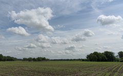
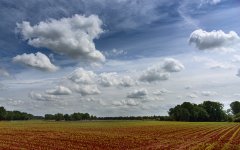
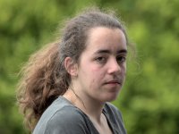
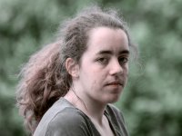
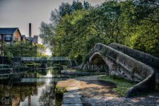
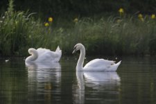
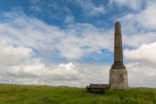
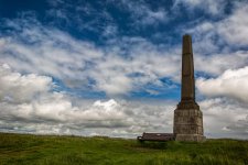
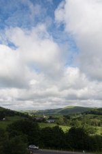
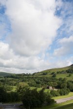
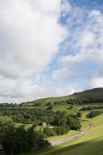
So I have this "Zoner 18" photoshopping program - used it sparingly when I had downloaded it for free - having invested a few dollars in the latest upgrade decided to see what it can do. Lots of interesting ways to play with pictures.
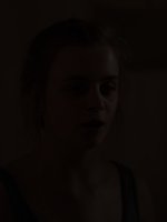
Here is a sample
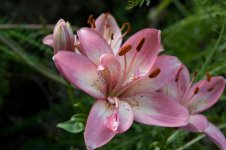
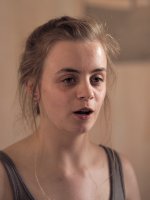
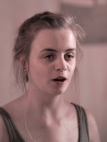
and after some experimental picture processing (aka not having any idea what I was doing, just playing with buttons and sliders)
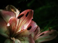
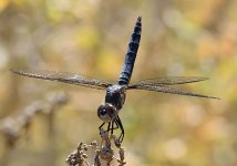
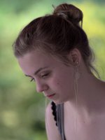
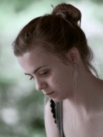
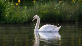
Here is a sample

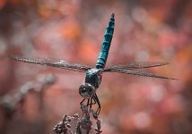
and after some experimental picture processing (aka not having any idea what I was doing, just playing with buttons and sliders)

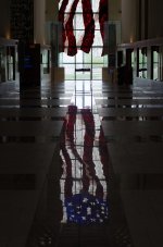
Visited the Robert Dole Institute the other day when my sister and family were visiting us. I only had my 50mm lens and was forced to try and take two pics and then merge them together in order to get the reflection in the floor....next time I'll bring the wide angle. I merged them in LR using pano, and then touched the final one up slightly.
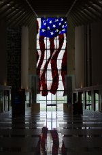
The final version....the largest American Flag stained glass in the world
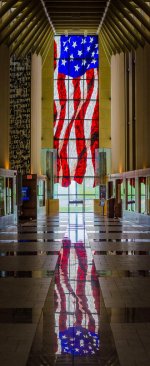


The final version....the largest American Flag stained glass in the world

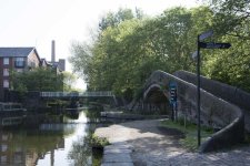
Assignment for out local photo club to post something in the style of Martin Parr. Here are the original and my final for this project.
The goal was to have less distracting elements that kept my eyes literally running around in the image. I think that in my final version, the image is a lot more powerful.


The goal was to have less distracting elements that kept my eyes literally running around in the image. I think that in my final version, the image is a lot more powerful.
subash jeram
Senior Member
Hi every one I'm looking for some good free LR presets please.
[email protected]
Thanks in advance
Sent from my iPhone using Tapatalk
[email protected]
Thanks in advance
Sent from my iPhone using Tapatalk
Assignment for out local photo club to post something in the style of Martin Parr. Here are the original and my final for this project.
The goal was to have less distracting elements that kept my eyes literally running around in the image. I think that in my final version, the image is a lot more powerful.
View attachment 221871
View attachment 221872
Like what you did with the water. A question on the crop though. Why did you leave the space on the left instead of to right in front of the little boy.
Concerning the crop, I started with a square crop but found it too symmetrical. I wanted to leave less space on the right to create an uneasiness feeling of enclosure. If there would have been more space to the right, I think the image would have less impact. But hey, I've been wrong once or twice before in this lifetime.Like what you did with the water. A question on the crop though. Why did you leave the space on the left instead of to right in front of the little boy.

