You are using an out of date browser. It may not display this or other websites correctly.
You should upgrade or use an alternative browser.
You should upgrade or use an alternative browser.
Let's see some reptiles...
- Thread starter N_Addy
- Start date
Clovishound
Senior Member
I was torn with this one. If I crop heavily, there is a lot of really cool detail in the feet and belly. Unfortunately, it also tends to play havoc with the composition.
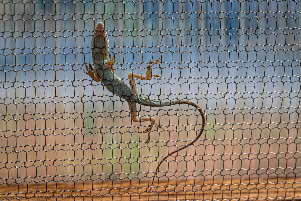
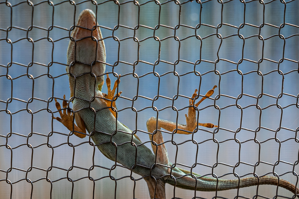
OK, I went ahead and cropped it, and uploaded. Now that I see it on it's own, the first one is definitely the way to go. I'll leave it in the post for comparison.
OK, I went ahead and cropped it, and uploaded. Now that I see it on it's own, the first one is definitely the way to go. I'll leave it in the post for comparison.
It's a great image, but you are fighting the grid of the fence. I think I would go sort of half way between the two -- canting the shot left about 10 degrees to split the difference and square cropping to keep in the sweet curve of the tail.
Hope you don't mind my fiddling.
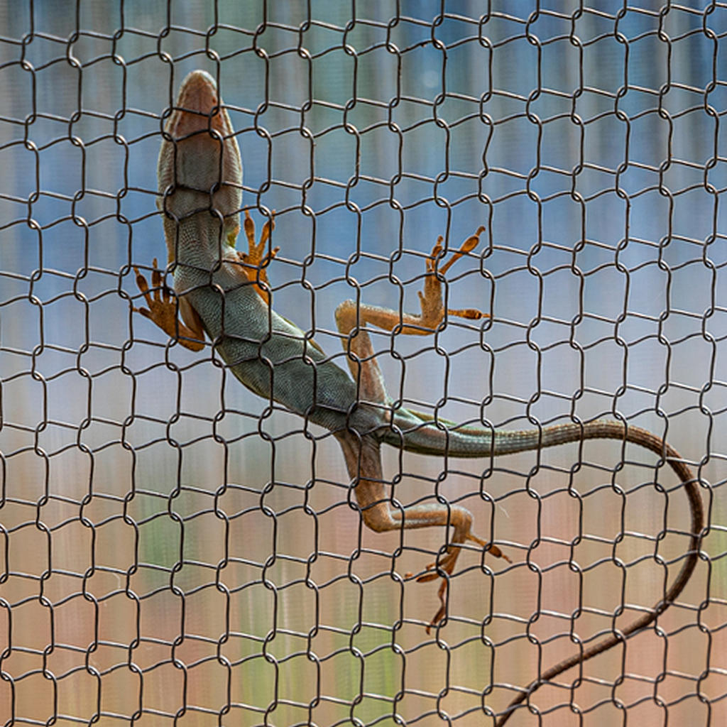
Hope you don't mind my fiddling.
Clovishound
Senior Member
No, I don't mind that at all. I actually did exactly the same thing to this image, but ended up liking the original better.
Here it is edited from the original RAW file to preserve more detail before compressing.
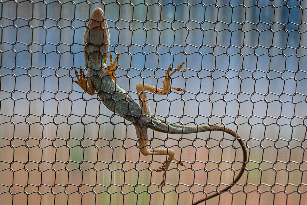
Here it is edited from the original RAW file to preserve more detail before compressing.


