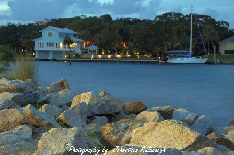
The first one, the focus was missed. you focussed on the rocks in the foreground therefore the background whcih is the point of interest looks a bit soft...unless that is of course what you were going for.
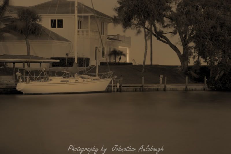
The second looks sharp, but way too dark. the sepia-ish tone you have going doesn't work...a regular black and white with a bit more contrast would have looked better IMO. Also, I like the position of the boat in the frame but would like to have seen it a bit lower so the roof tops and sail mast weren't cut off. I see lots of motion blur in the trees as well. long exposures and wind generally doesn't work in this instance...however, you could have achieved the same picture at faster shutter speeds with a higher ISO
")