You are using an out of date browser. It may not display this or other websites correctly.
You should upgrade or use an alternative browser.
You should upgrade or use an alternative browser.
Tree
- Thread starter jengajoh
- Start date
happlegate11
New member
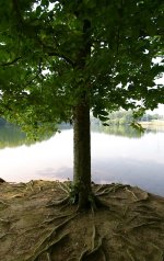
Love this! I like how it looks like you could just flip it upside down and it would still look like a tree (that is still right side up) a dirt tree but still a tree 
happlegate11
New member
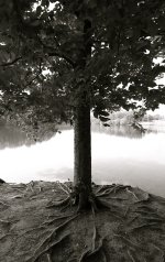
I feel like if it was pulled back a bit then it would help  still like it. Try Black and White at the full spectrum it may add some drama to it
happlegate11
New member
Hmm that was a horrible idea on my side LOL!! NOPE.... SORRY!!
happlegate11
New member
happlegate11
New member
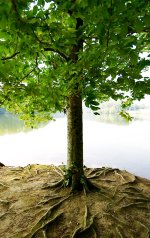
I realize you start to loose the background but that could be masked of really easily so that its not blown like I have it now.
I realize you start to loose the background but that could be masked of really easily so that its not blown like I have it now.
I think you're onto something there...it is all about the roots and leaves...whole photo seems to hang on the trunk...somewhat challenging perspective but I guess it works pretty good...
Last edited:
Vermontster
New member
Vermontster
New member
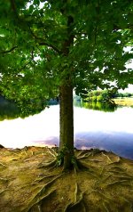
Hey Chris, I like that, can you tell me what you did?
I would be happy to Jen. When I get back to my house later, I will recreate what I did. Honestly, I ended up rushing it to get to my office this morning. It could have been improved further. What PP software are you using? I enhanced this in Photoshop CS5. It has "content aware fill" that easily removed the electrical towers (though you may have wanted them for the photo). The rest I will have to write down when I get home. I did this because I really liked the shot. The roots are awesome.
ohkphoto
Snow White
Very nice shot, Jen. I think you have some competing elements in this photo . . . the root structure is impressive, but so is the top part of the tree. Add to that the brightness behind the tree trunk. So my eyes are not sure where to go first. It all depends on your artistic vision. You stated that you liked the root structure, so I'm guessing that's what attracted you. You might try cropping out the top part so that the brightness of the water reflection is gone or shows very little. Then really bring out the texture and details of the trunk and root structure. The next time you go visit this tree, try to shoot from a different angle so that the water reflection is not behind the tree and get some bokeh in the background.
This is a nice photo to play around with in PP and possibly get something spectacular.
IMHO
This is a nice photo to play around with in PP and possibly get something spectacular.
IMHO
JoeLewisPhotography
Senior Member
I agree with Helene, but will add that, if you do revisit this one, use a CP filter...It will reduce that glare on the water quite a bit.
I like the B&W, but as an alternative I would try lightening the base of the trunk so you can see more detail and somehow lighten certain areas of the leafy area. I did this and am pleased with the results, but I don't know how to post it to this message!!!
You just have to click on the "Go Advanced" button bottom right of the reply window. Then you can browse and add pictures.
Vermontster
New member
Hey Chris, I like that, can you tell me what you did?
I added a vibrance adjustment layer in Photoshop. I increased the saturation (over saturating the whole photo). I then took the paint brush tool (making sure the color picker was set at black) and painted over the areas like the tree and roots to bring those areas back to original saturation. I was trying to bring out some of the colors that were washed out in the background. The water was to over exposed to bring any detail back. Please note that I am a Photoshop novice to say the least. There are numerous folks here that are much more skilled and could give you better advice (i.e. Marcel).
Anyway, I love the idea of your shot. Maybe you will be able to revisit the spot sometime and blow us away with another photo!!!


