Which one? or None?

Joseph Bautsch

New member
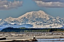
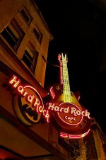
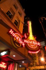
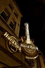
I have a North Georgia Regional Photo Club competition coming up in September. About a dozen clubs from around North Georgia will be entering photos in six categories with a limit of three per photographer. It will be a juried and judged competition. That means a jury of six people will select about a dozen photos from the entries for each category and a judge will chose the placings. The photos must be matted and framed to be hung for judging. I have already chosen two to enter but for the third one there is a difference of opinion between me and my wife (my biggest critic). So I am posting four possibilities for the third entry for your vote, which one? or none? The first two are in B&W sepia. The third one is of a lady behind a nicknack stand at the Pike Market in Seattle. The fourth one is of Mt. McKinley in Alaska.
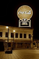
_DSC0489 - Version 2.jpg

_DSC0543 - Version 2.jpg

_DSC0870.jpg

_DSC2228.jpg
 

Tigertail

New member
I know nothing about the techy side of things but just love the landscape, great detail in the rock faces.

( with Hard Rock Cafe as second).


.......only my opinion though!

Heather
 

ohkphoto

Snow White
OK, Joseph, I've come back to this four times since you posted it, and here are my feelings (if I were a judge and were using some of the 12 merits):

All of them are technically sound (except the market pic seems a little soft)

The MicKinley picture is beautiful, but it's just that. It doesn't really doesn't draw me in (like your railroad shot does --I wanted to take a walk down the tracks!)

The third (market picture) is just overwhelming with color . . . there's probably a story there, but because the colors are so "busy" I don't want to go there.

The second one is appealing, but I'm not sure where I should focus, the sign, the temperature, the empty stores, and I'm not sure how all the parts of the picture connect, or if they're supposed to.

So my choice would be the first one: the angle of the shot makes me feel like I'm standing right there and looking up. You've used converging lines to keep the viewer there. Because what's in the picture is a lively, lit-up sign and several dark, empty windows, I find myself wondering what the rest of the building looks like. It almost has an "apocalyptic" feel to it. I'm first drawn to the light and then wander to the empty, gaping windows.

So that's my opinion. All are great shots.
Good luck in making your selection and in the contest!
 
Last edited:

M.Hinch

Senior Member
Well I have spent some time looking at all the picks, and I keep coming back to the Hard Rock Cafe.
But for some reason I feel strongly that the one " cafe " should be in a bold red color.
I have no idea why, it just speaks to me red. But definitely #1.

Just my opinion.

Michael
 

Dave Hamilton

Senior Member
I love the HRC picture! All of them are great, but that one seems to be classic.

I love landscape pictures so you know which is my second choice.
 

Curt

Senior Member
They are all great shots for different reasons, some the color really pops, some its texture, I think I would go with the 1st. one. Its very interesting and a great angle.
 

fotojack

Senior Member
The colour shot looks great, Joseph, but the sepia shot gives a certain "edge" to the overall look of the picture. Just my humble opinion. :)
 

ohkphoto

Snow White
Gotta agree with Jack here . . . really nice in color, but the mood and feeling are much more dramatic in the sepia.
Which one did your wife like, Joseph?
 

Joseph Bautsch

New member
To me it is a toss-up between the sepia and the full color, so I'll probably go with the majority and print it out in sepia for the competition. This one will be entered in the Cityscapes category. Helene was right on about the shot of the lady sitting behind the counter of a nick-nack booth. The foreground is soft (not enough depth of field to cover it). It probably would not have gotten past the first cut by the jury. This is the one my wife thought I should enter. I favored the Hard Rock shot. The other ones just don't have a strong enough point of interest. In any case if anyone is interested I an attaching the original Hard Rock shot before applying any post processing. This is what it looked like right out of the camera. To arrive at the posted sepia shot I applied 401 different adjustments in the form of cloning, dodging, burning and that does not include picture quality adjustments, or the conversion to B&W sepia.

_DSC0490.jpg
 

Browncoat

Senior Member
I dare say this because I know how much you hate it, but...

Have you considered doing selective color on this? A B&W conversion with only the red neon in color? I think it would look cool, and make that "No drugs or nuclear weapons allowed inside" sign really pop out!
 

Joseph Bautsch

New member
Thanks to everyone for your input. It's most appreciated and very helpful. Nokkie I respect everyones opinion, it helps me to keep perspective in what I'm trying to achieve with my photography (even if it means getting my butt kicked).
 
Top