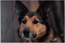
Critique portrait

wud

Senior Member
f/4, iso 400, 1/250

I did a lot of different portraits this weekend, and now Im going through them, gotta send them to the owners. I just wanna hear if you like it, hate it, something in between :)

My concern, I guess, are if the post processing are "too much". If the people expect something more.. common? Simple maybe.


Here goes:

daf_dag_1_3528_web_2.jpg
 

Hminx

Senior Member
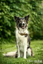
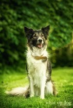
Great pose and expression from the dog, but the things that bother me are, the collar and that bright patch top right. I think a step to the right would have gotten rid of this and allowed you to bring the exposure up a tad on the main subject. The bokeh also seems a little harsh around the bright spot, perhaps the blur tool might help here. Still it's a lovely portrait of a fine animal .
 

Lscha

Senior Member
I thought it was a little harsh too. I put it through glamour glo and I like it better. Just my humble opinion.....
 

Lscha

Senior Member
Oh, sorry, it's a filter in Nik Color Efex Pro 3. It softens edges without losing detail.

daf_dag_1_3528_web_2.jpg
 
Last edited:

Rick M

Senior Member
I really like the shot and agree with the bright spot being a little too much. Pedroj's and Lscha's corrections are excellent!
 

wud

Senior Member
The bright lights through the trees are a distraction...You might want to do something like this...

View attachment 39201

Hmm, you did what? Only removed the bright light? Dont it get to flat?
Thanks for giving ideas :)


Oh, sorry, it's a filter in Nik Color Efex Pro 3. It softens edges without losing detail.

View attachment 39202

Ah okay, thanks :) So you removed the bright spot and then softened the whole image?
Guess Im the harsh type hehe. I see your point with the corner and Ill try to tone it down. Thanks for helping.


Carroll

Senior Member
I give this image a 12 out of 12. IMO, it really pops and makes an outstanding photo.

Anyone that gives you critique should show you some of their images, and then you will be able to tell if they know what they are talking about. To be able to grow in your art, be sure to listen to those that can show you they know what they are talking about. I am not saying that I do, I just enjoy good photos, images, pictures, snaps, captures, whatever you want to call them, and I believe I know *why* I like what I like. I like this one a lot. I bet your customer will absolutely LOVE it, too. You have special talent.

A few snaps of mine are at my website listed below my signature.


Here is why I gave this image a 12: (My reasons are in black)

12 Elements of a Merit Image

Twelve elements have been defined as necessary for the success of an art piece or image. Any image, art piece or photograph will reveal some measure of all twelve elements, while a visually superior example will reveal obvious consideration of each one. They are:

1. Impact
is the sense one gets upon viewing an image for the first time. Compelling images evoke laughter, sadness, anger, pride, wonder or another intense emotion. There can be impact in any of these twelve elements.


My eyes went immediately to the face of the dog, and I smiled, because I really liked your image.

2. Creativity is the original, fresh, and external expression of the imagination of the maker by using the medium to convey an idea, message or thought.


How in the world did you get the dog to pose like that? Wow. THAT is creativity!

3. Technical excellence is the print quality of the image itself as it is presented for viewing. Retouching,
[COLOR=#AC0000 !important]manipulation[/COLOR], sharpness, exposure, printing, mounting, and correct color are some items that speak to the qualities of the physical [COLOR=#AC0000 !important]print[/COLOR].

This image borders on Art, in my opinion, the bokeh, the varied shades and color of background, and the way you processed it are just great.

4. Composition is important to the design of an image, bringing all of the visual elements together in concert to express the purpose of the image. Proper composition holds the viewer in the image and prompts the viewer to look where the creator intends. Effective composition can be pleasing or disturbing, depending on the intent of the image maker.

I think the nice area around the dog gives a perspective of an animal in it's environment, and like the way you have composed it to achieve that.

5. Lighting—the use and control of light—refers to how dimension,
[COLOR=#AC0000 !important]shape[/COLOR] and roundness are defined in an image. Whether the light applied to an image is manmade or natural, proper use of it should enhance an image.

The lighting is fine. The brighter spot on the right hand upper side gives contrast and reality to the rest of the image. It doesn't have that awful "backdrop" look.

6. Style is defined in a number of ways as it applies to a creative image. It might be defined by a specific genre or simply be recognizable as the characteristics of how a specific artist applies light to a subject. It can impact an image in a positive manner when the subject matter and the style are appropriate for each other, or it can have a negative effect when they are at odds.


Your talent sets the style for this image. You obviously love animals, and are very good at photographing them.

7. Print Presentation affects an image by giving it a finished look. The mats and borders used should support and enhance the image, not distract from it.


The image is presented in simple elegance. Any borders, mats, frames should be simple and un-obtrusive to maintain that.

8. Center of Interest is the point or points on the image where the maker wants the viewer to stop as they view the image. There can be primary and secondary centers of interest. Occasionally there will be no specific center of interest, when the entire scene collectively serves as the center of interest.

My initial focus was on the eyes, and went from there. Just great. I think your processing enhanced that center of interest, as all good portraits do.

9. Subject Matter should always be appropriate to the story being told in an image.


The story here, obviously, is "I am being good, when do we go play?" Everything is appropriated in this image.

10. Color Balance supplies harmony to an image. An image in which the tones work together, effectively supporting the image, can enhance its emotional appeal. Color balance is not always harmonious and can be used to evoke diverse feelings for effect.


Your post-processing brings out the tones and colors that make this an excellent image. Anyone that is a dog lover will think it is the "Cat's Meow"....


11. Technique is the approach used to create the image.
[COLOR=#AC0000 !important]Printing[/COLOR], lighting, posing, capture, presentation media, and more are part of the technique applied to an image.

You have evidently done this a lot. Your technique has it going on. How you got that pose is amazing. There is soooo much going on in this image, and going on right!

12. Story Telling refers to the image’s ability to evoke imagination. One beautiful thing about art is that each viewer might collect his own message or read her own story in an image
.

This image makes a connection to my memories of past dogs that lived with me, and it's a beautiful thing....
 
Last edited:

Lscha

Senior Member
f/4, iso 400, 1/250

I did a lot of different portraits this weekend, and now Im going through them, gotta send them to the owners. I just wanna hear if you like it, hate it, something in between :)

I'm sorry WUD. This is the first time I have EVER responded in this thread because I am no 'expert'. By what you posted, I thought you just wanted opinions. I FORGOT this is strictly a professional teaching thread. It won't happen again. :(
 

wud

Senior Member
I'm sorry WUD. This is the first time I have EVER responded in this thread because I am no 'expert'. By what you posted, I thought you just wanted opinions. I FORGOT this is strictly a professional teaching thread. It won't happen again. :(

No, Im glad you write, I been looking at these new rules and having a liiiiittle bit of a hard time, cause I dont know how to answer several of the questions.
But I still dont really get exactly what you did in the picture :) I will say, though, for me there need to be some variations in the background, but think you are right in the bright spot being too bright.


Ozarkite, thank you so much for those kind words! You should come by my house, I got pictures of ... i dont know... 35-40 different dogs, all taken the last 2 days, and I got LOADS of great shots :) The dogs were so fun and easy to work with. Of course some took more shots than others, but thats the fun of photographing dogs.

Only 2 dogs were a bit stressed about the situations, but I reacted instantly, with one dog I fed it goodies on top of the camera, the other one we just took a small walk and played a bit to easy him up, and it helped so much. Thats the one thing you really dont wanna go home with - dog eyes on a picture saying, I HATE THIS.

I am very happy to have tried this, I only looked through 4-5 dogs now, cant wait for the rest!


Carroll

Senior Member
LOL I really liked the part about the goodies on top of the camera...I bet you had to wipe licks off the lens a few times! Keep up the Great work...
 

crycocyon

Senior Member
I like Pedroj's version and agree about the light area in the trees. I would have also shot wider open if possible to get even a softer background bokeh. This is a good image of the dog itself with an almost formal pose and good expression. The dog, however, could use some grooming especially around the face. Also, for us to be able to judge the amount of post-processing, it would be good to see the original image un-processed. Lighting is reasonably good with good separation of the subject from the background and a bit of highlighting on the ears/head region, which is nice.

About the composition, I would think about how one applies compositional and posing rules to a human being and think about how this may be improved upon. The dog is dead center and standing dead straight and almost looking straight into the camera but a bit off camera. This is a pose of the dog being at attention about something and ready to go in the direction of interest. I would like to see the dog a bit off-center and more relaxed, and also turned toward the light source. For example a 3/4 view of the dog's right side rather than a straight front-on view. It is very good that you are shooting at the dog's eye level rather than down to the dog. That's essential.

There is some saturation in the whites on the fur, which I would be careful to guard against. I don't know if that is from the processing or in the original photo.

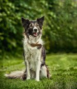
So to illustrate more clearly what I meant about composition, here's my version of the image in terms of how I would compose it.

critiqueportraitdafdog2a.jpg

And here it is with a bit less saturation in the white parts of the fur and the background a bit softer.

critiqueportraitdafdog2b.jpg

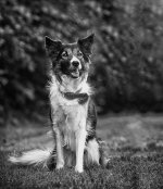
And here is something I actually might prefer for this image, a black and white version.

critiqueportraitdafdog2abw.jpg

I would give it a 6.5-7 out of 12 for the reasons mentioned.

And, yes, I've done some pet photography in my day, just so that I think I know a little bit about that.

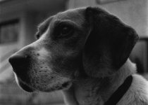
ShadowB.jpg

Sam1983bwb.jpg
 

wud

Senior Member
Crycyon - thanks for your reply :)

I do not think it works with this picture, to clear the bright spot completely. It gets way to flat (in my taste, at lest). I tried to darken it some myself yesterday, but hmm, didn't work for me.

About the composition, for me it doesnt really make sense placing the dog in the left line, as there are nothing else going on in the picture.. Its just dead space on the right? Maybe it would have worked better if the tail were longer and on that side (right side), adding something to that "empty room".

What do you think about that? Am I totally of?


And yeah, I did try b&w and it looked really good so I agree with you, but people only get very few pictures so Im going to do them in color.


***


Does anyone have a suggestion for the bright spot that would be something in between my picture, and the suggested pictures?
 

wud

Senior Member
Btw, I gave the picture a little bit of blur as Lscha suggested (not glamour glo though, dont have that one) and it looks better :) So thanks!


FastGlass

Senior Member
I like the photo. Love the expression. But I agree with the collar and the bright corner.
Its very easy for me to critique a photo. To sit back and see what I would view as faults is so much more easy than taking a photo and coming up with one without any.
Its hard to take a shot and think about all the surroundings while your racing around and trying not to miss it.
I feel we all do such mistakes. And to me there not really mistakes if for the photographer those elements have some significance.
 

Rexer John

Senior Member
I'm sorry WUD. This is the first time I have EVER responded in this thread because I am no 'expert'. By what you posted, I thought you just wanted opinions. I FORGOT this is strictly a professional teaching thread. It won't happen again. :(

Post #10 is the first to use the 12 point system. Your critique is as valid as anyone elses.
Does every reply with a critique HAVE to use the 12 point system, is it a rule or a guideline?

I also think the bright area could do with a LITTLE toning down but as Ozarkite says in post #10.says it's nicer than looking like a backdrop.
​Am I allowed to say that without adding another 11 critique points?
 

wud

Senior Member
I like the photo. Love the expression. But I agree with the collar and the bright corner.
Its very easy for me to critique a photo. To sit back and see what I would view as faults is so much more easy than taking a photo and coming up with one without any.
Its hard to take a shot and think about all the surroundings while your racing around and trying not to miss it.
I feel we all do such mistakes. And to me there not really mistakes if for the photographer those elements have some significance.

Personally, I am happy with this shot. Yes its to bright at right corner but as I said, I did a lot of different dogs over 2 days, at times people were standing in line waiting, saturday we had way to bright sun so I had to move around a lot, to keep the dogs in the shade - but I managed to get shots of everybody that I am okay sending out in the world. Learned a lot!

Oh and she didnt want the collar of, a few even didn't want the leash of. We were standing close to the ring were dog competitions went on, so some wanted to be sure the dog didnt ran of.
 
Top