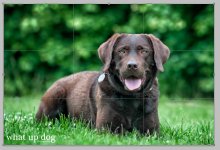
Critique portrait

wud

Senior Member
Post #10 is the first to use the 12 point system. Your critique is as valid as anyone elses.
Does every reply with a critique HAVE to use the 12 point system, is it a rule or a guideline?

I also think the bright area could do with a LITTLE toning down but as Ozarkite says in post #10.says it's nicer than looking like a backdrop.
​Am I allowed to say that without adding another 11 critique points?


Im not sure about the 12 point system. I hope we can still comment on 1 or 2 things we feel we know something about.
 

crycocyon

Senior Member
Crycyon - thanks for your reply :)

I do not think it works with this picture, to clear the bright spot completely. It gets way to flat (in my taste, at lest). I tried to darken it some myself yesterday, but hmm, didn't work for me.

About the composition, for me it doesnt really make sense placing the dog in the left line, as there are nothing else going on in the picture.. Its just dead space on the right? Maybe it would have worked better if the tail were longer and on that side (right side), adding something to that "empty room".

What do you think about that? Am I totally of?


I think ultimately your choice in terms of what you like or do not like in the image is up to you. It is all part of your own personal style, which is perfectly fine. There have been, however, during the course of the history of the photographic art, some ideas about aesthetics and what makes a photograph "work" or make it artistically better, much in the way that paintings have been viewed for centuries. The idea behind the bright area in the background is that it is a distraction to the eye, without us being conscious of it. It might provide a sense of depth or place and I can understand the need to have something more than a sterile green background. But portraiture has traditionally held the notion of making the subject the first thing that they eye should be drawn too. The eyes naturally go to the dogs eyes first, then down the chest to the legs and then to the tail. The white area pulls the eyes away from that natural progression. Imagine your eyes just wandering in an image. Where do they go? It is part of that journey that takes us through the image in terms of what interests us the most. If you wish your viewer to be interested in the white spot in the background then that is your artistic perogative, certainly. Compositionally however, there is the rule of thirds and placing the subject dead center in the photograph defeats that. That is why I placed the dog just slightly off center and having him look into the "dead" space rather than out of it. That creates balance. The eyes lead into the space, the tail leads out of the space. That give us a sense of where the dog might be looking toward or heading toward, as the case might be, rather than the dog statically remaining in that one place locked in position which in my view makes the image feel constrained and the dog itself constrained and confined, like a cage. He's in the open, so I would put him in the open and convey something of that, even with this relatively tight cropping, but including just a bit of place.

The same applies to portrait work. You don't see professional wedding photographers putting their subjects dead center all the time in an image. They are always off center and that makes it more interesting compositionally. The same holds true whether it is a dog or a bride and groom, or even a tree, or a cup.
 

wud

Senior Member
I think ultimately your choice in terms of what you like or do not like in the image is up to you. It is all part of your own personal style, which is perfectly fine. There have been, however, during the course of the history of the photographic art, some ideas about aesthetics and what makes a photograph "work" or make it artistically better, much in the way that paintings have been viewed for centuries. The idea behind the bright area in the background is that it is a distraction to the eye, without us being conscious of it. It might provide a sense of depth or place and I can understand the need to have something more than a sterile green background. But portraiture has traditionally held the notion of making the subject the first thing that they eye should be drawn too. The eyes naturally go to the dogs eyes first, then down the chest to the legs and then to the tail. The white area pulls the eyes away from that natural progression. Imagine your eyes just wandering in an image. Where do they go? It is part of that journey that takes us through the image in terms of what interests us the most. If you wish your viewer to be interested in the white spot in the background then that is your artistic perogative, certainly. Compositionally however, there is the rule of thirds and placing the subject dead center in the photograph defeats that. That is why I placed the dog just slightly off center and having him look into the "dead" space rather than out of it. That creates balance. The eyes lead into the space, the tail leads out of the space. That give us a sense of where the dog might be looking toward or heading toward, as the case might be, rather than the dog statically remaining in that one place locked in position which in my view makes the image feel constrained and the dog itself constrained and confined, like a cage. He's in the open, so I would put him in the open and convey something of that, even with this relatively tight cropping, but including just a bit of place.

The same applies to portrait work. You don't see professional wedding photographers putting their subjects dead center all the time in an image. They are always off center and that makes it more interesting compositionally. The same holds true whether it is a dog or a bride and groom, or even a tree, or a cup.

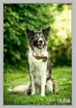
I did actually think a bit about rules of third, I just didnt place an eye in a corner:

Screen shot 2013-06-04 at 21.02.33.jpg

(Screenshot from Photoshop)


Thanks for your reply. Once I read, that when you look at a picture, you "read" it from the bottom and up in right corner, naturally. Could be that the bright spot may just make the viewer leave the picture completely, or maybe your eyes goes from spot to dog to spot and so on. But it still gives something to the picture in my opinion, hmm.

Maybe the spot should been located another place. Maybe closer to/behind the dog.

Well, I hope Ill have all this in consideration next time Im shooting in bright daylight :)
 

snaphappy

Senior Member
Crycocyon has excellent info in both posts. If you flip this upside down your eye would be drawn to the bright area in the trees not the dog so its distracting. The eye should intersect 2 lines in the third so the added green space added by crycocyon puts the dog in a third and adds more interest to the portrait. Having the dog in the centre as you have done is what my instructor calls a money shot, people will buy it and love it :D
 

wud

Senior Member
Crycocyon has excellent info in both posts. If you flip this upside down your eye would be drawn to the bright area in the trees not the dog so its distracting. The eye should intersect 2 lines in the third so the added green space added by crycocyon puts the dog in a third and adds more interest to the portrait. Having the dog in the centre as you have done is what my instructor calls a money shot, people will buy it and love it :D

Hehe well, I'll be happy about my money shot then.

Great idea with flipping the picture!


snaphappy

Senior Member
Money shots aren't artsy or creative though so still have to remove the bright tree area. Money shots capture peoples beloved animals or friends/family members with a great pose and expression right smack in the middle of the frame. My instructor calls them money shots because people buy them because of the expression/pose and those same people are the ones who will not appreciate any artistic creativity. They like and buy the shot because their beloved person or pet is the sole focus and takes up most of the frame.
I'm only learning to take better pics of my family not shooting for anyone but myself so I enjoy "money shots" LOL I am trying though to start using the 12 steps and it does make for more interesting photos
 

wud

Senior Member
Money shots aren't artsy or creative though so still have to remove the bright tree area. Money shots capture peoples beloved animals or friends/family members with a great pose and expression right smack in the middle of the frame. My instructor calls them money shots because people buy them because of the expression/pose and those same people are the ones who will not appreciate any artistic creativity. They like and buy the shot because their beloved person or pet is the sole focus and takes up most of the frame.
I'm only learning to take better pics of my family not shooting for anyone but myself so I enjoy "money shots" LOL I am trying though to start using the 12 steps and it does make for more interesting photos


On one side I agree and understand what you mean, on the other not. You got loads of other composition rules than golden ratio - look here: https://www.google.dk/search?q=gold...DABA&ved=0CAoQ_AUoAQ&biw=1443&bih=802#imgrc=_

This picture can maybe explain my idea about using something more in a composition - dont know if this categories as a money shot, but I myself think it works as surroundings frame the center (the dog):

mocca_valbypark_1037_fb.jpg


crycocyon

Senior Member
Critiquing aside it is still a very nice portrait of the dog. And the one of the dog in mid air is cool. For that one, there is enough landscape and the landscape itself is very well composed, that by placing the dog in mid-air in the center of the frame, attention is drawn to it actually being in mid-air, especially since it is quite small in the frame so it is more of an action shot than a portrait. Pretty cool. Certainly then there are times as you illustrate when centering does have an artistic purpose or statement. Again, that is all part of one's own unique style.

As for that illustration of the rules of thirds, the eyes would ideally fall on one of the intersection points of the grid.
 
Last edited:

wud

Senior Member
For this pic, placing an eye in 2 lines works (imo), as the dog is looking into the picture and the body lays through the pic:

Screen shot 2013-06-05 at 20.58.07.jpg


But anyhow, I am glad for all your answers, its always interesting to hear what other people see and you definitely gave me stuff to think about :)
 

Kodiak

Senior Member
…be sure to listen to those that can show you they know what they are talking about. I am not saying that I do…

Yeah! …right.
 
Top