Advice on composition

Clovishound

Senior Member
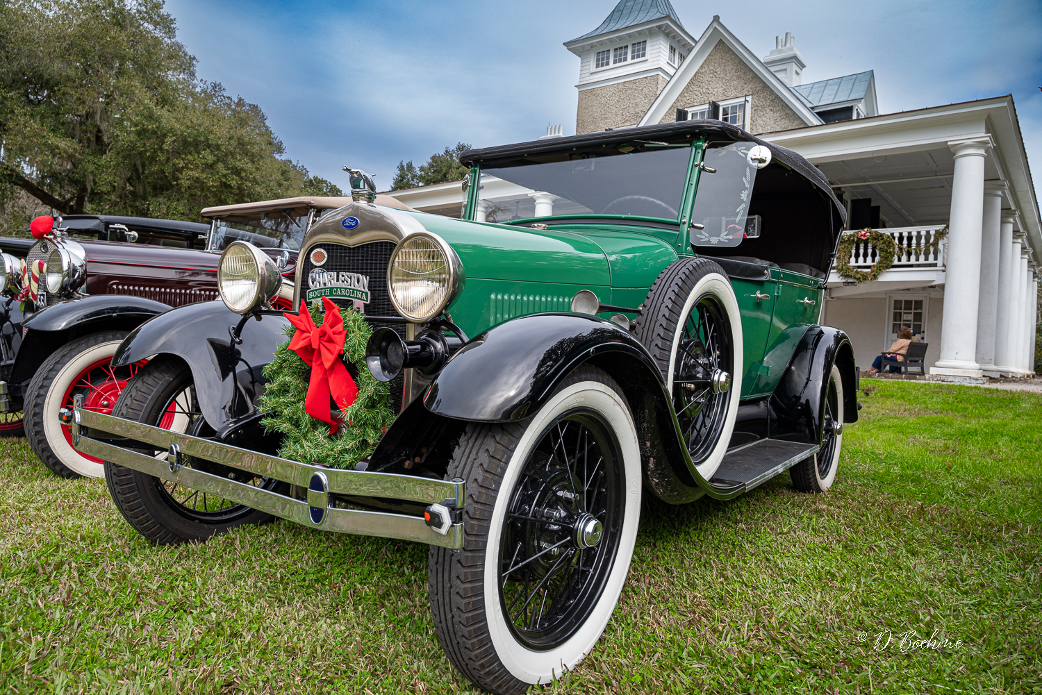
I shot some automotive pictures today. Not in my wheelhouse, but I was happy with some of the results. This one image has me scratching my head about composition.

This is the image as framed in the camera with no cropping.
_DAB6207.jpg


I like the look of the columns to the right as it brings to mind early 20th century life of the well to do with a shiny car parked in front of the big house. However, something seems a little off to me as far as balance.

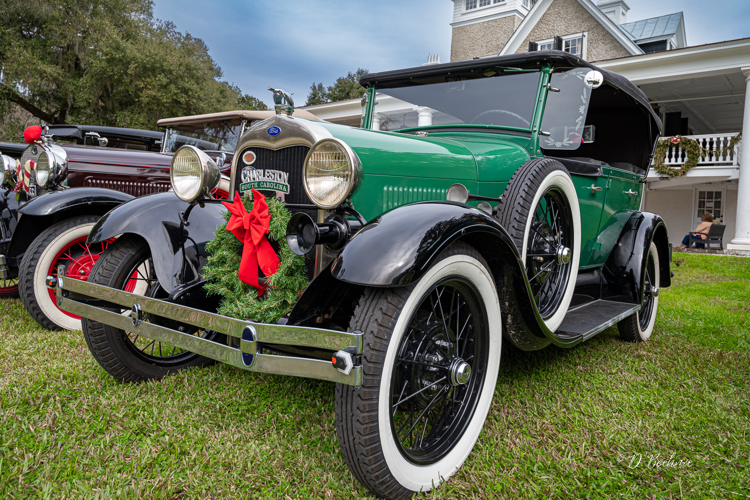
I cropped it a bit and things seem better balanced, but I feel I've lost something with the columns no longer in the frame. What say you? No way to go back and take it from a different angle as this was a one day thing.
_DAB6207-2.jpg


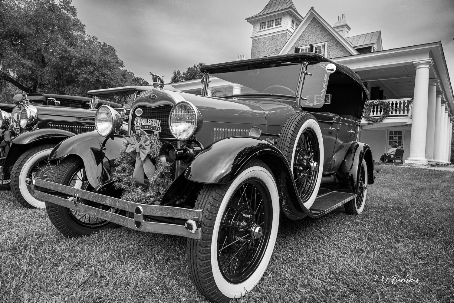
And just for fun, here it is in B&W.

_DAB6207-3.jpg
 

lightcapture

New member
What about playing with the crop while gently correcting perspective to feature the vehicle.
If you like your perspective, I'd correct the tilt counterclockwise a few degrees, as it seems like it's leaning to the right. Wide angle lenses can be tricky up close with scenes like this one, unless you want to exaggerate the subject.
BTW, it looks good in b/w too.

Maybe something like this:
_DAB6207.jpeg
 
Last edited:

Needa

Senior Member
Challenge Team
I too like the inclusion of the columns. Don't care for the second with the column leaning on the side.
What about something like this:
_DAB6207.jpg

Down side more of the tire cut off.
 
Last edited:

Eduard

Super Mod
Staff member
Super Mod
I like the inclusion of the columns to give perspective and scale. I did a quick import to Snapseed on my iPad Pro and auto correct perspective which straightened the columns. Either way it is a compelling image. Well done!


IMG_1431.jpeg
 

Clovishound

Senior Member
I never really noticed the distortion on the columns. To be honest, since it is a forced perspective shot, it really doesn't bother me. I'm sure some may find it distracting.
 

Clovishound

Senior Member
Well, Fred, that does help balance out the image. Problem is that I know Magnolia well enough that that big hedge that I know isn't really there doesn't quite set just right in my mind. Was that AI fill?

After doing some thinking, and playing around a bit in LR and PS, I came up with this:

_DAB6207-5.jpg


Pretty close to the edit Eduard made, only I was able to do it on the full sized picture. The biggest difference was losing just a little of the left front tire. Not a big deal, although I would have liked to retained it. Don't know if it my lack of knowledge in PS and LR, or just the way Adobe handles perspective control. I may think a little more on it, and perhaps come back and try again.

I'm tempted to see when the club has more displays in the future. They are very interesting old cars, and perhaps they will have them at some interesting locations with backgrounds that fit with their history. I think it would also be a good idea to see if I could get some of the owners to pose with the vehicles, if they are in period costume, as there were yesterday. As I said, this type of photography is new to me. Never really been much interested in automotive photography.
 

Fred Kingston

Senior Member
Yeah... I only spent 30 seconds playing with it, and would have regenerated the right side more for a more natural transition without the hedge...
 

lightcapture

New member
I never really noticed the distortion on the columns. To be honest, since it is a forced perspective shot, it really doesn't bother me. I'm sure some may find it distracting.
OK. here's a crop including columns. (w/ 3º straighten, 4º horizontal shift, -1º vertical shift, and slight vignetting.) My issue with the columns is the folks sitting in the chair are a distraction from the car so need to be cloned out.

Your the artist so ultimately it's your choice, but here's my version to include the columns, while slightly correcting for perspective.
_DAB6207.jpg
 

Peter7100

Senior Member
I find the house and columns a bit distracting as I always find with a wide image like this certain straight lines (eg on the house) can appear slightly distorted. I think the car is so good it is worth isolating it from the background and for that reason I would probably go with @lightcapture 's cropped version.
 

Clovishound

Senior Member
Just for comparison, here's another of the series that doesn't have the issue with the folks in the chair, or leaning columns. Unfortunately, this car has a bit of a different look, which doesn't appeal to me as much, and the reindeer accouterments are somewhat distracting.

_DAB6206.jpg
 

lightcapture

New member
This one shows more of the front but with little lens distortion. The other has more character but needs some post work to correct for the distracting wide angle distortion, still the car gets lost in the photo. I've had many 'almost' photos too.
 

BF Hammer

Senior Member
I am never happy with my photos taken at auto shows. The cars are always too close to each other and the background too busy.

I think in future the secret is not to try to capture the whole car so much. Isolate smaller segments I guess. Or else go wide and show an entire line of cars.
 

BF Hammer

Senior Member
I have a small town down the highway from me where in the downtown an auto collector bought a former service station and has his classic cars stored there. Right on the corner of 2 major highways. I've been considering how to set up and take the right photo for a couple of years now. It's problematic, and I think it must be done in unconventional ways. One way I would like to do is ultra-wide angle on the opposite corner so I frame the intersection lines. But then we have that highway sign waving in the middle saying "look at me!"

I have other places that should make a nice photo, but I'm not smart enough to frame it yet.

Google steet view of the target...
Auto collector.jpg
 

Fred Kingston

Senior Member
Take the shot and don't worry about the sign... EVERYBODY is adding an AI removal tool to their photo editing software... In fact, the more you can position yourself and the image so that the sign is clearly defined, the better the software does...
 

Needa

Senior Member
Challenge Team
Getting lower that should move the sign up off the cars. I'd probably crop tighter than shown. Just take some shot and evaluate them at home you can always take more as it is close to home.
 
Top