You are using an out of date browser. It may not display this or other websites correctly.
You should upgrade or use an alternative browser.
You should upgrade or use an alternative browser.
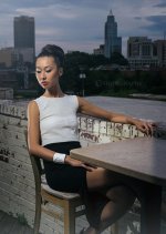
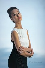
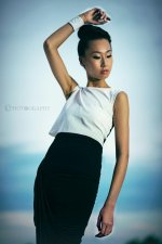
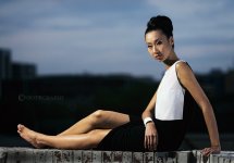
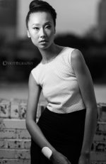
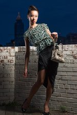
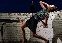
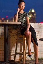
A Little Photo Shoot I Had Today....
- Thread starter ShootRaw
- Start date
sonicbuffalo_RIP
Senior Member
nice shooting Raw.....I know how you get your models and I'm gonna start stealing 'em! lol
nice shooting Raw.....I know how you get your models and I'm gonna start stealing 'em! lol
What!? HOW!? I can pay for this kind of information...
*starts counting out change*
What!? HOW!? I can pay for this kind of information...
*starts counting out change*
I'm sure Raw tells his models he has a big... AHEM.... lens.
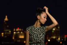
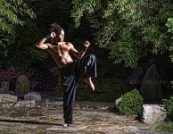
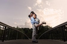
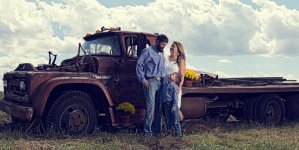
The first is the winner for me. Nice pose, nice expression and even the little flower adds to the image without pulling my eye too much.
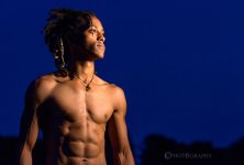
The brightness to the left is a little distracting and it may kind of cool the face into the shadow (if that makes sense). If you decrease the brightness in that area and increase the brightness of her eyes, I think it would be very fine.
The brightness to the left is a little distracting and it may kind of cool the face into the shadow (if that makes sense). If you decrease the brightness in that area and increase the brightness of her eyes, I think it would be very fine.
Blade Canyon
Senior Member
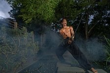
Is that the NC State Arboretum by the fairgrounds?
Last edited:
Browncoat
Senior Member
I can't for the life of me figure out why there is a 6-page deep multiple shoot, multiple image thread in the critique forum...but I digress.
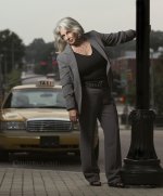
This latest series of the lady in the grey suit caught my eye. The lighting in this series is probably your best work yet, but your posing of this subject is way off the reservation. Way, WAY off. These are poses for a teen, not a woman who is old enough to be the grandmother of a teen. The one of her sitting on the steps is bordering on disturbing for a few different reasons. Maybe she is youthful, maybe she's fun, but everything that's good about these images is overshadowed by the posing.
It's good that you're taking command of posing. There is a clear progression from your earlier shots where your subjects were kind of missing the mark a bit. This lady nailed it, but it's so far out of context that it doesn't even matter.
Last edited:
Blade Canyon
Senior Member
Where did you get the idea to shoot his reflection?


