You are using an out of date browser. It may not display this or other websites correctly.
You should upgrade or use an alternative browser.
You should upgrade or use an alternative browser.
Let me know what you think
- Thread starter silvertip
- Start date
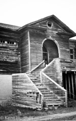
I really like the subject of the second shot but I think it would have been better if you included the entire entrance in the shot, cutting it off destroys the composition. The stairs seem blown out a bit while the walls lose detail, might have been a good HDR shot to capture all the detail in the wood. Very interesting.
I agree with Rick on the 2nd. My eyes climb the stairs and then the doorway is chopped off and I am disapointed.
Maybe from the same distance but the camera lower from a kneeling position and without tilting the camera upwards would work better.
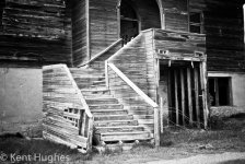
The 1st is nicely framed but something seems out of kilter?? Is it a hillside or is the camera not level? The tree on the left is close to being blown out so I would maybe crop it out and just have a 3 sided frame.
Nice shots
ohkphoto
Snow White
I do like both shots. You may want to crop out the tree on the left side. It's more of a distraction by being tilted. Also, adjusting the tone curve (or increasing the contrast) will give a little more richness to the color.
I agree with Ken and Rick on the second one. Definitely an interesting building, especially the doorway above the stairs. This photo has a nice, vintage (almost Great Depression era) feel to it.
You're on the right track. Keep up the good work!
I agree with Ken and Rick on the second one. Definitely an interesting building, especially the doorway above the stairs. This photo has a nice, vintage (almost Great Depression era) feel to it.
You're on the right track. Keep up the good work!
Carolina Photo Guy
Senior Member
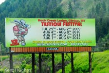
Just wanted to let you know that Montana has some great festivals.
DUDE! Just HOW great would a festival have to be to beat this one? NOT VERY!!!
BTW... I'm guessin' that it took a lot of balls to put THAT sign up!


