Marie the bride

John Young

Senior Member
I have already posted this and the post vanished so I assume the mods removed it....

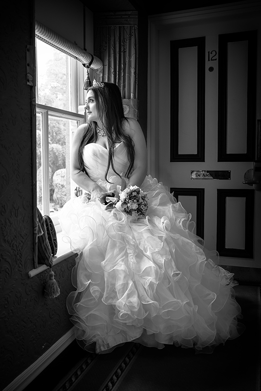
I did post more than one photo and unfortunately missed the rule about only posting one and providing links so sorry about that.

So this time I have just the one

Nikon D600
Sigma 24 - 60mm F2.8
F 4.5
1/40

marie 5.jpg
 

Michael J.

Senior Member
Honestly, a bride should shine happy - the pics looks a bit gloomy and makes sad. The vignetting is in my feeling to much, especially on the right.
 

FastGlass

Senior Member
I actually like it. The high contrast makes for a good B&W. Looking at her face, she seems happy, so I don't get the gloom feeling.
 

John Young

Senior Member
Thank you, yes I did a lot in colour so thought a black & white suited this shot. She was certainly not gloomy at all... really fun, bubbly girl
 

ohkphoto

Snow White
I think this is a very nice pose for the bride. The lighting is beautiful and so is the composition except that there's too much of the background . . . the door, signs, etc. makes for a 'sloppy" look.

I would crop the image as below . . . I also removed the "meter" behind her hear . . . rough edit. Should be more neatly done in photoshop, but you get the idea.

IMHO


marie 5.jpg
 

John Young

Senior Member
I think this is a very nice pose for the bride. The lighting is beautiful and so is the composition except that there's too much of the background . . . the door, signs, etc. makes for a 'sloppy" look.

I would crop the image as below . . . I also removed the "meter" behind her hear . . . rough edit. Should be more neatly done in photoshop, but you get the idea.

IMHO


View attachment 40711

Thank you..... and thanks for the effort.

I do actually have another photo were she is closer cropped, but I don't think I can add any more on this thread.


That makes the photo much better

So you don't think she looks as sad now when cropped closer ?
 

Michael J.

Senior Member
Her smile is now more visible because of the eye-catching vignetting removing. Yes, I think now it is more harmony in that photo.
 

fotojack

Senior Member
I actually had the same idea as Helene, as far as cropping goes, and I added a little blue tinge to it to add a little brightness to the overall shot. All in all, you took a nice shot there, bud. :) Oh...and I brightened it up just a touch....to see her face better. :)

marie 5.jpg
 

John Young

Senior Member
I actually had the same idea as Helene, as far as cropping goes, and I added a little blue tinge to it to add a little brightness to the overall shot. All in all, you took a nice shot there, bud. :) Oh...and I brightened it up just a touch....to see her face better. :)

View attachment 41128

Thanks.... yeah its a different take on it.

I actually had the edge darker on purpose to hide distracting door and focus attention on the bride. Plus I just wanted the front of her lit the most from the window
 

Carroll

Senior Member
Here is yet another take on your image, John.

Probably in the future, I am thinking the Bride or some family member will look at that picture, and one of the comments will be, "Oh, what a beautiful dress!" So, I think the whole dress should be shown, and also where the dress is blown out, I edited it a little to show the dress a little better. Perhaps more work could be done on it, to improve it further. This was a quick edit...

Too close of a crop, in my opinion, takes away from this beautiful scene.

I did crop some of the dark edge to lessen that effect, and I think now it does make your eyes go to the Bride better.

The light from the window makes it tough to not blow out the dress, but with some work, you will end up with a masterpiece.

Just my 1 and a half cents worth.

View attachment 41171
 

RockyNH_RIP

Senior Member
I think this is a very nice pose for the bride. The lighting is beautiful and so is the composition except that there's too much of the background . . . the door, signs, etc. makes for a 'sloppy" look.

I would crop the image as below . . . I also removed the "meter" behind her hear . . . rough edit. Should be more neatly done in photoshop, but you get the idea.

IMHO


View attachment 40711

I like the improvements... Thank you!

Pat in NH
 
Top