You are using an out of date browser. It may not display this or other websites correctly.
You should upgrade or use an alternative browser.
You should upgrade or use an alternative browser.
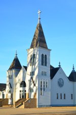
What would you do with these photos?
- Thread starter RussellHons
- Start date
RussellHons
Senior Member
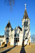
I can take them a different time without the shadow. Will post them when I get some. I was trying to take them with the tree shadows and the low sunlight to see if I could get a somewhat abstract looking picture somehow.
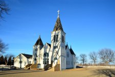
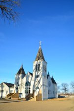
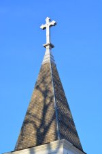
In the first photo, these shadows are actually amusing (being so thick and long, and with that branch up above and a tree on the right). But they are only "getting in the way" on the other photos, making this church's facade kinda "smeared"...
With a little bit of cropping and correcting of the perspective, the first one is quite usable as a "documentary" (photo):
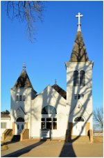
With a little bit of cropping and correcting of the perspective, the first one is quite usable as a "documentary" (photo):

Last edited:
RussellHons
Senior Member
I appreciate the opinions. I take alot of photos, and sometimes I start to wonder if some of them are "good" "bad" or "have potential". It's hard to know sometimes, especially when 90% end up on my computer with no one else seeing them. This is a fantastic board to be able to post some and get opinions, learn, etc.
BackdoorArts
Senior Member
Agreed that in the first image the shadows can make for a great subject with the church being the contrast if taken and processed appropriately, but the other shots are far more miss than hit. Having an "artistic side" is all well and good, but "artistic vision" is what ultimately is needed. I get a feel for what you're seeing in the first and 4th photos, but you missed the target compositionally enough that I don't know what it is you're going for. I love the idea of the shadows being a "dark" against the "light" of the church, but they're just there and not obvious or daunting enough.
I'm thinking something very stark in Black & White would do you much better here. I tried doing some basic edits, but the computer I'm on only has Elements 9. That said, I came close to something presentable, but if you've got Lightroom I think you can knock something out with photos 1 & 3.
I'm thinking something very stark in Black & White would do you much better here. I tried doing some basic edits, but the computer I'm on only has Elements 9. That said, I came close to something presentable, but if you've got Lightroom I think you can knock something out with photos 1 & 3.

