Browncoat
Senior Member
The histogram is an excellent tool for photographers brought about by the digital age. If you're unfamiliar with it, the histogram is the small graph displayed on your camera's LCD screen, usually while in image review mode. This little-used graph can help you take better photographs, and can be utilized in just about any situation.
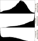
The information contained in the histogram is simply a visual representation of the tonal values recorded on an image. But how do you read this information? It's simple! The left side of the graph represents shadows and the right side are the highlights. If that's too difficult to remember, just think of black and white. Left=black and right=white.
Some graph displays show more information than others. For example, the D90 shows different color values. A high graph peak of red means there is a lot of that tonal value in the image. The same is true for other colors. If the histogram is pushed over to the right side of the graph, you have too much white, or an overexposed image. If all of the histogram is crammed against the left side of graph, it means that your photo is too dark, and underexposed. The camera may have rendered some portions as true black, which means a loss of detail and tonal information.

Ideally, you want a nice curving arc shape to your histogram. In mathematics, this is called a "bell curve". The right side (highlights) of the graph contains about 80-90% of the image information. This is especially important to remember if you do post-processing work using Lightroom or Photoshop. It is much easier to bring out details from highlights than it is from shadows. You will notice that with a properly exposed image, and a histogram that is arced to the right (but not overexposed!), your image files will be much larger because they contain higher degrees of detail. This is referred to as "shooting to the right".
So be sure to check your histogram! It can give you more clues about what you've captured than just a simple image review alone.
The information contained in the histogram is simply a visual representation of the tonal values recorded on an image. But how do you read this information? It's simple! The left side of the graph represents shadows and the right side are the highlights. If that's too difficult to remember, just think of black and white. Left=black and right=white.
Some graph displays show more information than others. For example, the D90 shows different color values. A high graph peak of red means there is a lot of that tonal value in the image. The same is true for other colors. If the histogram is pushed over to the right side of the graph, you have too much white, or an overexposed image. If all of the histogram is crammed against the left side of graph, it means that your photo is too dark, and underexposed. The camera may have rendered some portions as true black, which means a loss of detail and tonal information.
Ideally, you want a nice curving arc shape to your histogram. In mathematics, this is called a "bell curve". The right side (highlights) of the graph contains about 80-90% of the image information. This is especially important to remember if you do post-processing work using Lightroom or Photoshop. It is much easier to bring out details from highlights than it is from shadows. You will notice that with a properly exposed image, and a histogram that is arced to the right (but not overexposed!), your image files will be much larger because they contain higher degrees of detail. This is referred to as "shooting to the right".
So be sure to check your histogram! It can give you more clues about what you've captured than just a simple image review alone.