SacrificeTheory
Senior Member
What lens did you rent (and what camera was it on??
Pat in NH
Nikon D7100 (own) and I'm renting the Tokina 11-16 F2.8 DX II
Going to try and get some nice fall pics today at Hawks Mountain
What lens did you rent (and what camera was it on??
Pat in NH

I would say this is one of my better shots...
I like the stormy mood to it


Which version do you like better?
Or this one?
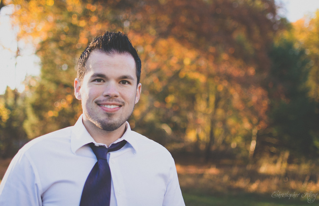
Your tie is crookedI think I'm getting better with portraits, what do you think? This is a self portrait
Your tie is crooked


