Product Shots For My Friend's Website

BackdoorArts

Senior Member
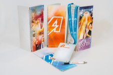
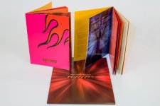
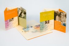
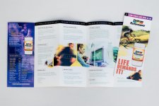
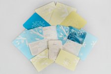
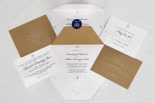
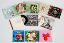
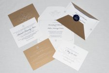
I just finished editing the batch of product shots I took for my friend's website. I think they came out pretty good, particularly given some of the hurdles I had to overcome. I had to spend a lot of time in post to overcome the white sheet I used as a backdrop. I was hoping that I'd be able to shoot in such a way as to minimize it with DoF, but alas that wasn't to be. Between LOTS of Viveza control points reducing structure and shadows on the white, combined with others to reduce the effect on the product, and then blurring and masking, I'm pretty happy with it. I believe the website will have images smaller than these, so keep that in mind.

Let me know what you think. I can see just from the way that they are arranged here that I have some tweaking to do on the background to get consistent brightness (though he didn't seem concerned about that as they will not be displayed side by side). Anything glaring?

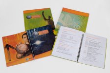
KeenanDesignWebsite-016-Edit.jpg
KeenanDesignWebsite-024-Edit.jpg
KeenanDesignWebsite-030-Edit.jpg
KeenanDesignWebsite-041-Edit.jpg
KeenanDesignWebsite-051-Edit.jpg
KeenanDesignWebsite-057-Edit.jpg
KeenanDesignWebsite-060-Edit.jpg
KeenanDesignWebsite-063-Edit.jpg
KeenanDesignWebsite-070-Edit.jpg
KeenanDesignWebsite-078-Edit.jpg
KeenanDesignWebsite-083-Edit.jpg
KeenanDesignWebsite-091-Edit.jpg
KeenanDesignWebsite-093-Edit.jpg
KeenanDesignWebsite-095-Edit.jpg
KeenanDesignWebsite-096-Edit.jpg
KeenanDesignWebsite-101-Edit.jpg
KeenanDesignWebsite-102-Edit.jpg
KeenanDesignWebsite-105-Edit.jpg
KeenanDesignWebsite-108-Edit.jpg
KeenanDesignWebsite-109-Edit.jpg
 
I just finished editing the batch of product shots I took for my friend's website. I think they came out pretty good, particularly given some of the hurdles I had to overcome. I had to spend a lot of time in post to overcome the white sheet I used as a backdrop. I was hoping that I'd be able to shoot in such a way as to minimize it with DoF, but alas that wasn't to be. Between LOTS of Viveza control points reducing structure and shadows on the white, combined with others to reduce the effect on the product, and then blurring and masking, I'm pretty happy with it. I believe the website will have images smaller than these, so keep that in mind.

Let me know what you think. I can see just from the way that they are arranged here that I have some tweaking to do on the background to get consistent brightness (though he didn't seem concerned about that as they will not be displayed side by side). Anything glaring?

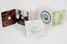
View attachment 57661
View attachment 57662
View attachment 57663
View attachment 57664
View attachment 57665
View attachment 57666
View attachment 57667
View attachment 57668
View attachment 57669
View attachment 57670
View attachment 57671
View attachment 57672
View attachment 57673
View attachment 57674
View attachment 57675
View attachment 57676
View attachment 57677
View attachment 57678
View attachment 57679
View attachment 57680

Not to shabby at all. Good job


Sent from my iPhone using Tapatalk 2
 

hark

Administrator
Staff member
Super Mod
I just finished editing the batch of product shots I took for my friend's website. I think they came out pretty good, particularly given some of the hurdles I had to overcome. I had to spend a lot of time in post to overcome the white sheet I used as a backdrop. I was hoping that I'd be able to shoot in such a way as to minimize it with DoF, but alas that wasn't to be. Between LOTS of Viveza control points reducing structure and shadows on the white, combined with others to reduce the effect on the product, and then blurring and masking, I'm pretty happy with it. I believe the website will have images smaller than these, so keep that in mind.

Let me know what you think. I can see just from the way that they are arranged here that I have some tweaking to do on the background to get consistent brightness (though he didn't seem concerned about that as they will not be displayed side by side). Anything glaring?

View attachment 57672

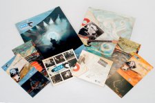
The shadows near the top above the green case (Vol. 7) bother me. It's heavier here than anywhere else. Other than that, I'm VERY impressed! (Actually a little jealous!) ;) Terrific job! :)
 

BackdoorArts

Senior Member
The shadows near the top above the green case (Vol. 7) bother me. It's heavier here than anywhere else. Other than that, I'm VERY impressed! (Actually a little jealous!) ;) Terrific job! :)

Better? It was a very tough one to light, particularly given that my fill-in flash was starting to die and the stupid photographer packed the wrong size spare batteries. :eek:

KeenanDesignWebsite-091-Edit-2.jpg
 

PapaST

Senior Member
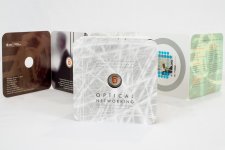
You definitley did your homework on the white background it presents very well. Of the two "Optical Networking" displays, the one that stands up holds my eye whereas the one that is tilted back doesn't hold my attention as much. But the stand up one looks a little pushed pack on the left side.

I think everything looks professional.
 

BackdoorArts

Senior Member
You definitley did your homework on the white background it presents very well. Of the two "Optical Networking" displays, the one that stands up holds my eye whereas the one that is tilted back doesn't hold my attention as much. But the stand up one looks a little pushed pack on the left side.

I think everything looks professional.

Thanks. For the Optical Networking pic, I prefer that one as well. What they wanted was a squared view of the image on the page behind the cover. We shot it both with the front square and tilted and this is the one they preferred. The customer is always right, even when they're wrong. ;)

As for the white background, it is a Blog or Tutorial post in the making. For all intents and purposes it is a white King-sized bed sheet with a thread count insufficient for these purposes (the grey and black I got with it are fine). I'm glad I was able to get these results from what was a little too textured for anyone's uses. Here's an example of what I was left to work with after fixing wrinkles and whatever else wouldn't steam out before the shot (which was at his place, necessitating my not being able to fully prepare it properly ahead of time).
 

Attachments

  • KeenanDesignWebsite-113.jpg
    KeenanDesignWebsite-113.jpg
    183.3 KB · Views: 145

RockyNH_RIP

Senior Member
Jake, Nice Job! Very impressive and you already know the issues.... If I were you, I would be pleased, heck, I am NOT you and I am pleased!! :)

Pat in NH
 

hark

Administrator
Staff member
Super Mod
Better? It was a very tough one to light, particularly given that my fill-in flash was starting to die and the stupid photographer packed the wrong size spare batteries. :eek:

View attachment 57684

Yes! And I'm sure it was a difficult scene to light. Some of the cases are further away from the background so the shadows are different lengths! Nice job! :)
 

Browncoat

Senior Member
Nicely done, sir. You've earned your keep. Color consistency across all the backgrounds is the only issue that I see, and that's a tough job. The colors are vibrant, the products are arranged professionally, and the quality is more than enough for web use.

The only red flag that raised for me isn't anything on your end. There were a couple of those products who displayed customer's personal information...the wedding invitations for example. You might want to advise your client to switch out the text on those with something generic, unless he has his customer's permission to use them. I know if it were me, I wouldn't want my information published like that without my knowledge.
 

BackdoorArts

Senior Member
The only red flag that raised for me isn't anything on your end. There were a couple of those products who displayed customer's personal information...the wedding invitations for example. You might want to advise your client to switch out the text on those with something generic, unless he has his customer's permission to use them. I know if it were me, I wouldn't want my information published like that without my knowledge.

I actually questioned him about that. One of the sets is actually for one of his kids and contains no personal address information. The other? He stated that he received permission to use them to promote his business. That said, the display size on the website will preclude seeing the information (675x450 images). Still it seems dodgy and I offered to obsure the address, but it's his deal.
 
Top