You are using an out of date browser. It may not display this or other websites correctly.
You should upgrade or use an alternative browser.
You should upgrade or use an alternative browser.
Portrait
- Thread starter Moab Man
- Start date

I love it! I love nice, casual and relaxed portraits like this. I am so glad you did not make the amateur mistake of placing her head right in the middle of the frame. The rule of thirds works very well for portaits. You should always try to put their eyes along the top horizontal third, which you did here. You can see some reflections in her eyes, which is good too. If there are no reflections in the eyes, then a portrait like this looks dull.
I would make a few suggestions, but since a picture is worth a thousand words, I will just let you see what I would have tweaked a little to improve on it! Even though it was sunny, she was in shade and I probably would have used a very light (15%) fill flash on her to lighten her up and add some sparkle to the eyes. Below is a real "quick and dirty" tweak, and granted a few are personal preferences like I like to vignette the lower corners of the portrait to help draw you eyes to the lighter areas, but again that is purely a Scott thing, not by any stretch a have-to thing!
I would make a few suggestions, but since a picture is worth a thousand words, I will just let you see what I would have tweaked a little to improve on it! Even though it was sunny, she was in shade and I probably would have used a very light (15%) fill flash on her to lighten her up and add some sparkle to the eyes. Below is a real "quick and dirty" tweak, and granted a few are personal preferences like I like to vignette the lower corners of the portrait to help draw you eyes to the lighter areas, but again that is purely a Scott thing, not by any stretch a have-to thing!
Last edited:
She has both engaging eyes and an engaging smile. It almost seems more like a candid shot rather than a portrait because her eyes are towards the camera but her head is nearly straight ahead, not turned that much to the camera. Also, it looks almost like she's leaning back a bit. The backward tilt of the head gives a more carefree pose, but I would consider having her head tilted towards the camera and try having her not looking right at the lens but looking at you or just above the camera. The bright highlight in the top right corner is a bit distracting. What you want to do, even with the out of focus background, is get her with a more uniform background. If you moved to the right just a bit, then the brown background would be filling that top right corner and it wouldn't take much of a move on your part to achieve that.
Here's my version...

Here's my version...
STM thank you very much for the input. You explained it well and the why. Thank you.
And by the way, she's simply adorable so good luck with that, DAD. Mine are mid to late 20's now but were blonde hair and blue eyes cuties and I always had to watch over them like a hawk! Men are dogs but teenage boys are worse!
Ok sure I understand. The more casual pose does suit her personality very well, so nice work capturing that bit of essence of her.
Please don't feel that I was trying to explain away your comments. Don't want to be perceived as someone that asks for input and then argues away the critiques given. The comments I replied with were only meant to point out that you hit many of my thoughts put into the picture.
Thank you again.
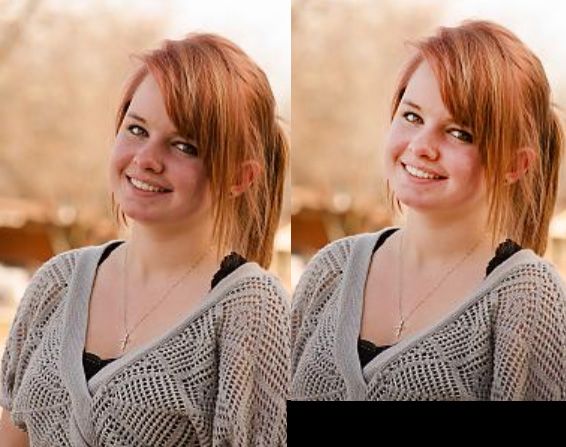
I really love this portrait and if this is truly your first attempt, then I'm quite impressed. From this portrait its less of location and lighting (since those are on point along with composition) but more about editing. The contrasting reds are very distracting for the eye and are slightly harsh. look at detais of hair and facial redness and see what you can do to make them more natural and more pleasant.
My edit:

My edit:
I really love this portrait and if this is truly your first attempt, then I'm quite impressed. From this portrait its less of location and lighting (since those are on point along with composition) but more about editing. The contrasting reds are very distracting for the eye and are slightly harsh. look at detais of hair and facial redness and see what you can do to make them more natural and more pleasant.
Looks great. So what exactly did you tweak and the program?
I think I like Atlas&Elm's edit the best. Looks very natural, IMO.
Agree
Sent from my iPad using Tapatalk HD
Thanks guys
Looks great. So what exactly did you tweak and the program?
Uhm all i did was some color adjustments and balance. i also painted a little highlight on the face. did the teeth. took out some hair. catch light in eyes.
i think thats about it *shrug*
minimalism goes a long way
")