You are using an out of date browser. It may not display this or other websites correctly.
You should upgrade or use an alternative browser.
You should upgrade or use an alternative browser.
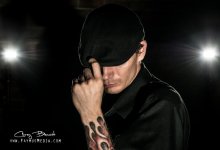
Outdoor Modeling Shot (from my NC photoshoot)
- Thread starter Corey @ Faymus Media
- Start date
Don Kuykendall_RIP
RIP :(
Sorry, I just get a broken icon.
Sent from my iPhone using Tapatalk 2
Sent from my iPhone using Tapatalk 2
Don Kuykendall_RIP
RIP :(
Now it is up.
Sent from my iPhone using Tapatalk 2
Sent from my iPhone using Tapatalk 2
")
Cowboybillybob1
Senior Member
Great photo. The only thing i would change is that the guy should not be centered. Just one light in the background.
Corey @ Faymus Media
Senior Member
Great photo. The only thing i would change is that the guy should not be centered. Just one light in the background.
I should have tried that. Would have been cool to have an extra shot with different style.
Horoscope Fish
Senior Member
... the guy should not be centered. Just one light in the background.
Agreed. The shot is good but looks static with everything so perfectly balanced. When I cropped out the right side, so the subject is looking into the frame and throwing in some two-thirds (almost), I think it looked much better. Would probably be better still shot vertically.
Stangman98
Senior Member
I would agree with the vertical idea. I wanna see more ink. I would have like to see the two lights behind him closer together. I think that would make it look more like headlights.
Corey @ Faymus Media
Senior Member
A little fix based on comments.
