I want to like this photo

Clovishound

Senior Member
But, there is a small voice in my head that says "No!". I like the concept. It is supposed to be "artsy". I tried it in color, and that really didn't work for me. I quickly changed over to B&W, better. There are no deep blacks, which is OK for high key. I brought down the texture to give it a soft look. Perhaps the issue for me is composition. I'm not sure. Go ahead an open fire here, but tell me what you like or don't like about it. I'm definitely open to trying suggestions for improvement, if it is worthy of that.
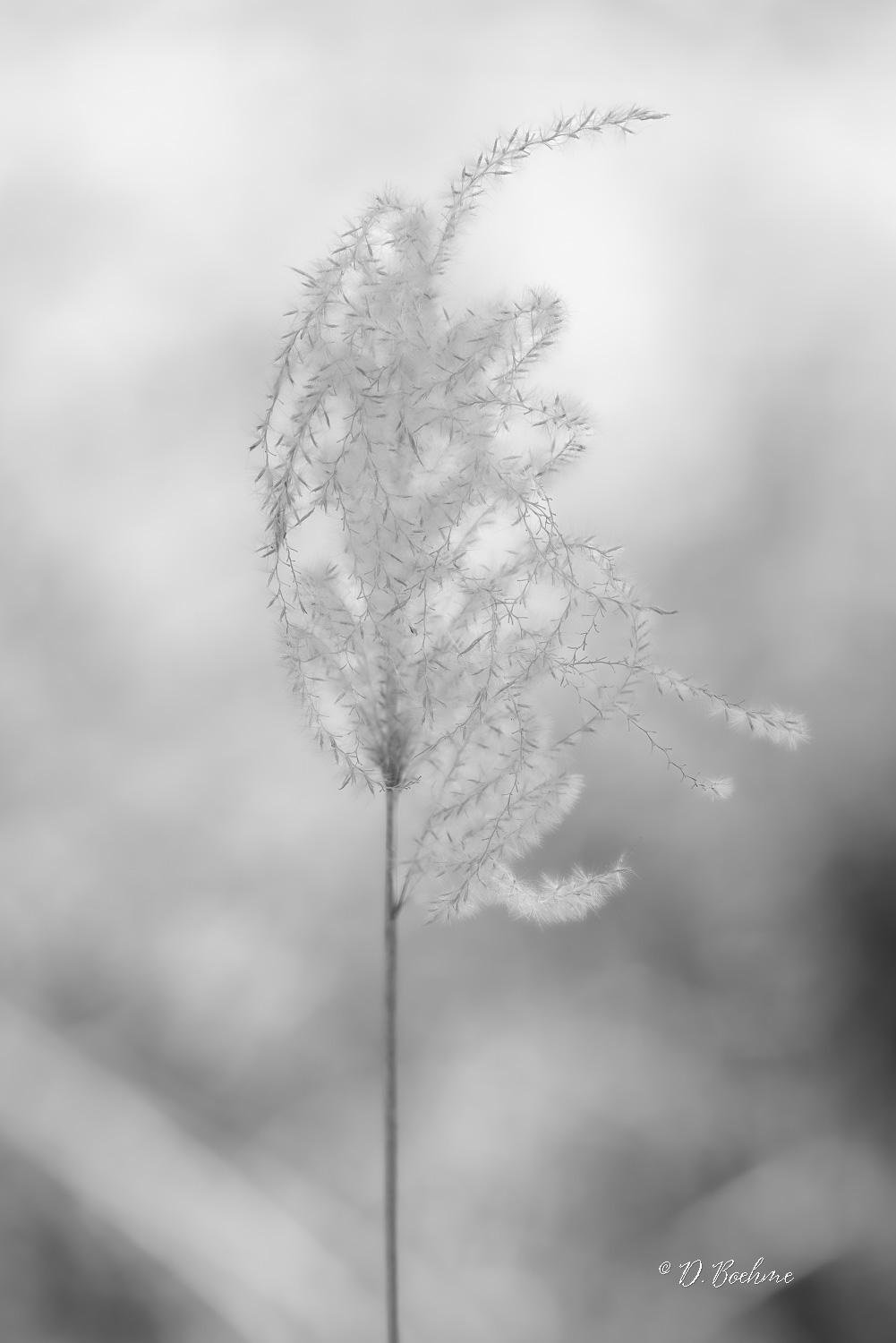
_DAB8486-topaz-denoiseraw-sharpen.jpg
 

BF Hammer

Senior Member
I can see you went for maximum separation from the background by narrowing the depth of field. But in my mind it would benefit from more depth so the fuzzy branches would look sharper. Then the sharp/soft elements would be the separation. It just looks so soft in the middle of the subject and that makes it blend into the background.
 

Clovishound

Senior Member
Here's one from the same series. It is a little sharper. I actually preferred the softer version myself. Perhaps a matter of individual taste.

_DAB8483-topaz-denoiseraw-sharpen-4.jpg


I also worked a little more on this one and came up with a color version that is in the running IMO. I went soft on this one.

_DAB8483-topaz-denoiseraw-sharpen-5.jpg
 

BF Hammer

Senior Member
I was already wondering with the first photo what it would look like in sepia-tone. I liked what you had to work with better on the 2nd b/w image. So here is me taking liberty. I sharpened some, and I added local contrast. Then I changed to sepia and I like it. I think it bridges the b/w and the color image.

Hammer_edit_DAB8483-topaz-denoiseraw-sharpen-4.jpg
 

wev

Senior Member
Contributor
A thought -- the centering of the stem bothers me, but this is also with a blind optimize in Faststone

_DAB8483-topaz-denoiseraw-sharpen-5.jpg
 

Clovishound

Senior Member
WEV, I had a little room in the original image to de center the stem. Here it is.

_DAB8483-topaz-denoiseraw-sharpen-2.jpg


I'm thinking that if I have a chance to reshoot this, I might try highlighting the seed head with some fill flash. The backlighting from the sky gives most of the fuzzies a blue tint, hard to get rid of without producing undesirable effects. There is a section up near the top that was lit by some foreground light, and it has a more pleasing look about it. I like the soft pastel, almost watercolor look of this one, but the seed head could be better.
 

Needa

Senior Member
Challenge Team
The thing that keep bothering me the most is the two branches that stick off to the right maybe even the third one. They seem to straight compared to the look of the others. I'd be temped to clone them out and see how it looks. Anyway some interesting example of and ideas.
 

Peter7100

Senior Member
Here's one from the same series. It is a little sharper. I actually preferred the softer version myself. Perhaps a matter of individual taste.

View attachment 402194

I also worked a little more on this one and came up with a color version that is in the running IMO. I went soft on this one.

View attachment 402195
Like the colour version the best but also agree with wev, with less of the stem in the picture improves it a lot IMHO.
 
Top