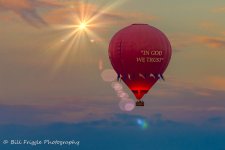
Hot Air Balloon Photo Input Request

Fred Kingston_RIP

Senior Member
I think I would dramatically increase the "glow" of the balloon. You've titled it "at Sunset" so I would expect to see dramatic lighting on the balloon
 

wev

Senior Member
Contributor
These things are always so personal

48703220376_49ac4e6462_c.jpg
 

TwistedThrottle

Senior Member
I would like input into this shot. What do you think of it? What could make it better? Is it worth putting more time into editing it? What would you do to it? Any other input? Thanks.


09082019-519-2 by Bill Friggle Photography, on Flickr

"In Archimedes Principle We Trust"
just kidding.
I wish there was the top of a mountain or something in the background for perspective but certainly not missing one to tell the story. Nice shot and interesting vantage point, you must be in another balloon or on top of said mountain.
 

Friggs

Senior Member
"In Archimedes Principle We Trust"
just kidding.
I wish there was the top of a mountain or something in the background for perspective but certainly not missing one to tell the story. Nice shot and interesting vantage point, you must be in another balloon or on top of said mountain.

I was on the ground where it took off and I shot it at 300mm so it was a pretty good distance from me when I took it. So it has that look of almost being eye level. But I was on solid ground in my power chair when I took it. Would be cool to go up in one though. But it is so expensive it will never happen. I agree a mountain would have been nice. But being in farm country, there aren't a lot of hills or mountains around here. A farm would have been nice but it was to high at this point to get that.
 

Dangerspouse

Senior Member
I guess I'm the odd one out here. I honestly, and overwhelmingly, prefer the original photo. It has a sense of serenity and grandeur that the edits - skillfully done as they are - only serve to diminish. The negative space of the original imparts a real feeling of vastness, and shouldn't be cropped out. The muted colors of your original make the glow of the burner stand out all the more, like those photos of a single lit window seen in the distance of a nighttime snow scene, or a Thomas Kinkade picture. Saturating the surrounding colors reduces the dramatic luminosity of that lone burner. All in my opinion, of course.

I wouldn't touch it.
 

Horoscope Fish

Senior Member
Here's my take on this; just a few quick and dirty edits.

I want to say I didn't intend to remove your watermark but among a few other things I thought the shot needed straightening and the watermark got clipped in the process, so I just removed what was left. No offense intended.
.....
.....
48703220376_49ac4e6462_c.jpg

.....
 

Needa

Senior Member
Challenge Team
There are aspect of different photos posted here i like.
What I would do is:
Some haze removal to saturate the balloon and flags.
Pull up the orange a bit, the will compensate for the darkening caused the haze removal.
Then some LAB sharpening to define and make the gold pop.

Remember salt to taste. :)

I like your edit in the second but for the loss of detail in the sky.

I think this is a great shot and worth the editing time spent. I have some I keep going back and redoing.
 

Chris@sabor

Senior Member
Maybe because I concentrate mainly on wildlife, I really like wev's edit. The message on the balloon is facing off screen to me.

I like the flare addition but, in my opinion it is too close to the subject and should be further left.
I might bring up the exposure on the text also, like it were aglow from the flame...

Take care!
 

Woodyg3

Senior Member
Contributor
I like Paul's edit the best. I don't favor adding sun and lens flare that weren't there. Bumping the contrast and saturation just a bit, and a little crop, as Paul did, seems best to me. It seems like Paul's edit retains the mood and atmosphere of your original and accentuates the important elements of the composition.
 

STM

Senior Member
I like Paul's edit the best. I don't favor adding sun and lens flare that weren't there. Bumping the contrast and saturation just a bit, and a little crop, as Paul did, seems best to me. It seems like Paul's edit retains the mood and atmosphere of your original and accentuates the important elements of the composition.

I have to agree on the ghosts. I usually try to clone out any ghosts in the image rather than add them. They tend to be distracting as they are lighter than the subject and our eyes tend to be drawn to aspects of the image that are lighter.
 

compasiune

Senior Member
The lens flare is doesen't look very natural. The first version with the crop it is the best solution for this image and don not forget the rule of thirds.
 
Top