Hi guys,
Hopefully this is in the right section and my apologies if it isn't!
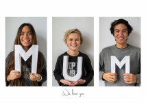
I have been doing a Christmas project for my mum and it was going brilliantly until it went to print. What I've been doing is making a triptych, as you can see in the top photo, for a Christmas present for Mum that would be special. I edited the photos in LR4 then assembled the triptych in PS and saved it as a jpeg. I then uploaded it to Snapfish UK because they had a sale on for poster prints and ordered it. Then it arrived a few days later and to my disappointment, it looked nothing like the file I uploaded! The skin tones were very desaturated and looked almost greyish which ruins the whole thing - the second photo is an example of how it pretty much looks (I desaturated it a bit in LR to show an example). I've bought small 6x4 prints and a 18x12 print (same size as this triptych) from Snapfish before and they came out great so I'm wondering if something went wrong with printing or if it was me doing something funky in PS? I put a lot of hours into this so hopefully you can understand my frustration. Also, before anyone critizes the letters, yes I made them out of paper - I'm a poor student ok! Also, my camera is set to RGB colour and in PS it says the mode is RGB colour and 8 bit/channel if that makes a difference?


If anyone knows a possible fix it'd be great so I can hopefully have a nice looking present ready in time for Christmas I'd really appreciate it.
Cheers,
Jaye
Hopefully this is in the right section and my apologies if it isn't!
I have been doing a Christmas project for my mum and it was going brilliantly until it went to print. What I've been doing is making a triptych, as you can see in the top photo, for a Christmas present for Mum that would be special. I edited the photos in LR4 then assembled the triptych in PS and saved it as a jpeg. I then uploaded it to Snapfish UK because they had a sale on for poster prints and ordered it. Then it arrived a few days later and to my disappointment, it looked nothing like the file I uploaded! The skin tones were very desaturated and looked almost greyish which ruins the whole thing - the second photo is an example of how it pretty much looks (I desaturated it a bit in LR to show an example). I've bought small 6x4 prints and a 18x12 print (same size as this triptych) from Snapfish before and they came out great so I'm wondering if something went wrong with printing or if it was me doing something funky in PS? I put a lot of hours into this so hopefully you can understand my frustration. Also, before anyone critizes the letters, yes I made them out of paper - I'm a poor student ok!


If anyone knows a possible fix it'd be great so I can hopefully have a nice looking present ready in time for Christmas I'd really appreciate it.
Cheers,
Jaye
