You are using an out of date browser. It may not display this or other websites correctly.
You should upgrade or use an alternative browser.
You should upgrade or use an alternative browser.
Be gentle with me, please...
- Thread starter brads
- Start date
Don Kuykendall_RIP
RIP :(
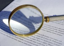
I'll put this up for complete criticism and suggestion. Slaughter it if you will but please tell me why. I'm here to learn from all you good folk. I have resized it for uploading here. Cheers, Brad
View attachment 50595
Interesting concept BUT one thing that will make it better is to orient the magnifying glass so that the writing is all magnified and sharp and readable.
Sent from my iPhone using Tapatalk 2
Great picture (I'll have trouble to come to this), if I have to be less gentle:
I limit myself to 4 elements of product photography (learned from Kodiac):
Subject is unclear for me; is it the (magnified) text or the magnifying glass. Neither seems clear on the picture. The text is blurred, the object is only partially represented. Both the text and object are partially out of focus, the subject should be in focus (as a rule to be broken by creativity).
Background, if the text is the background it seems a bit harsh to me, better a softer colour and structure?
Light: the shade is a very good idea, but again it comes out harsh for me and half of the shade is missing from the picture.
Organisation: it seems that the light source is not in line with the part that you want to catch, size of background and subject do not seem to correspond, it seems to alignment (more perpendicular or parallel) could improve to make it stronger.
Now, that is just an opinion, I think the best is for yourself to look at this, see if you agree/disagree, find some other things you do not like, decide what you want to/can improve and take a picture to see if it works.
The above might just be how you want the picture to be in the end and honestly that is perfectly fine with me.
BackdoorArts
Senior Member
Brad, like others I am enamored with the concept but struggle with the execution. Looking at it, I want the magnifying glass in focus, the page largely or completely out of focus, and some or all of the words within the glass in focus. I'm not sure if that's optically possible, but I think it would say more as a photo. As is, it's just a nice idea. You'll likely need to prop the glass up somehow to do what I'm suggesting, or use Photoshop to blur the paper.
brads
Senior Member
Brad, like others I am enamored with the concept but struggle with the execution. Looking at it, I want the magnifying glass in focus, the page largely or completely out of focus, and some or all of the words within the glass in focus. I'm not sure if that's optically possible, but I think it would say more as a photo. As is, it's just a nice idea. You'll likely need to prop the glass up somehow to do what I'm suggesting, or use Photoshop to blur the paper.
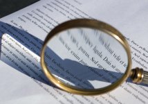
Thank you to everyone who has commented and suggested. There's an enormous range of possibilities. I'll admit to not really having a fixed idea when I went outside to shoot the picture. A silly mistake. Anyway, here are two (cropped only) shots from the same group. They may appeal more to some. Cheers, Brad


BackdoorArts
Senior Member
I prefer this one if only because, unintentionally or otherwise, it shows the glass distorting rather than clarifying the words, which with the Latin can have the overtone of "when holding a magnifier to the law do we really distort it?", if you want to dive deep for a message in a photo. With this one I'd likely want the lighting to be a little less harsh, perhaps with some backlight to lessen the severity of the shadow. Realizing that this was just an nice idea quickly executed, I do think it's something worth revisiting with more planning and intention, as it's a nice looking glass.
Browncoat
Senior Member
I agree with what others have already said. It's difficult to come up with a "why" this photograph was taken. What are our eyes supposed to be drawn to? What is interesting here? What are you trying to say? The good news is, there's something to work with here.
For starters, it's unbalanced. Either fill your frame with the entire white page, or don't. Zoom in or back away to show more of the table and show some black in the top left and bottom right. Some other props would add interest here too. An old pair of glasses, a book, an interesting pen.
The page is fake latin, which is what a lot of site templates use to show the page layout. They're just fake words to fill up a page. The best thing I can come up with conceptually, is to have the magnifying glass change the words to actual text. That's going to require some editing on your part.
Lastly is the positioning of the magnifying glass. It should be parallel with the page. Either get a helper to hold it for you, or rig something up to hold it in place for the photo. The viewer of the photo should be able to read the magnified text.
Last edited:
singlerosa_RIP
Senior Member
Here's a shot I took last year after seeing something similar in an ad for a "trick photography" book. UV filter instead of the magnifying glass. The story is in the shadow.


