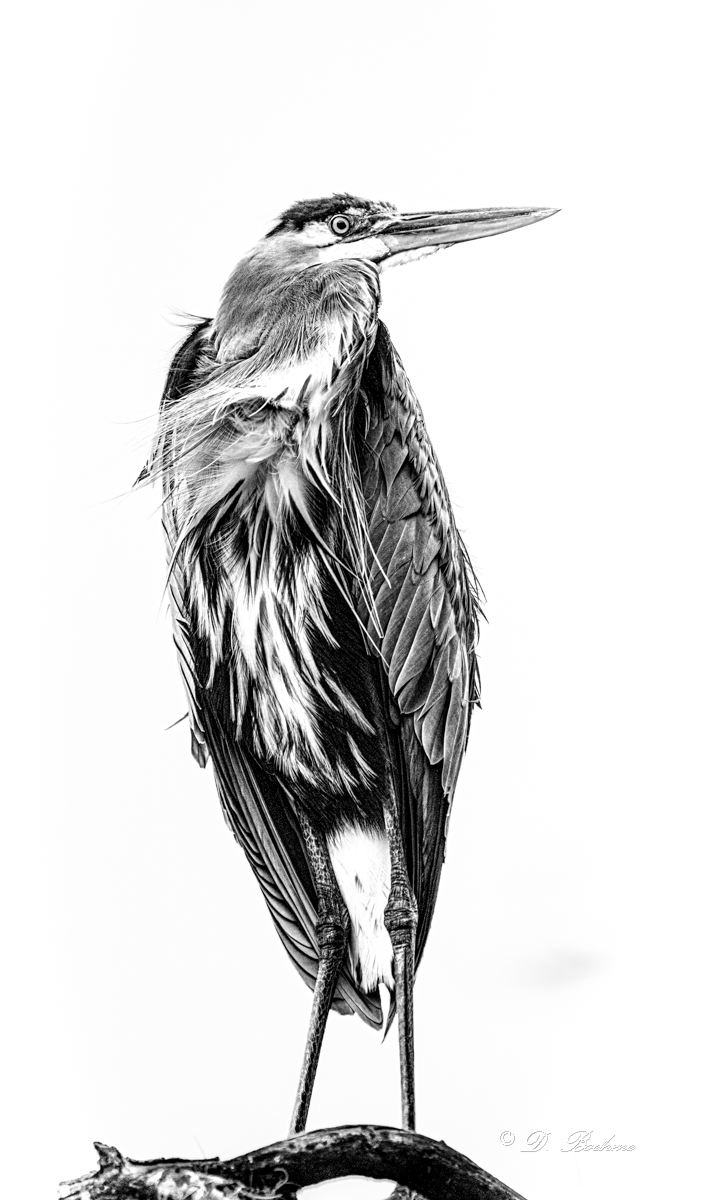
Anyone try this editing style?

Clovishound

Senior Member
At a recent CNPA meeting we had a presentation on artistic rendering of images. One of the techniques made them look like pen and ink, or charcoal drawings. I found that some hummingbird pictures work quite well for this. I found that these print rather well, and make nice greeting cards when printed on matte presentation paper.
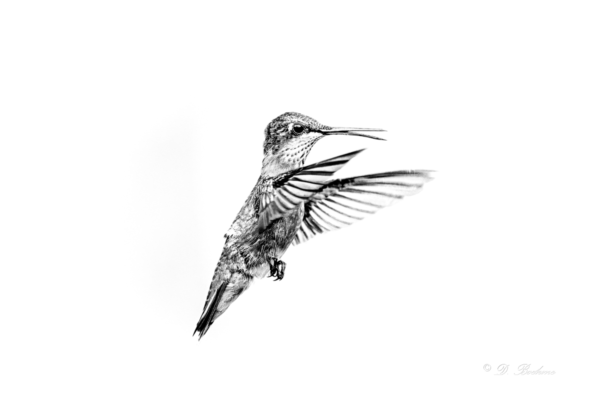
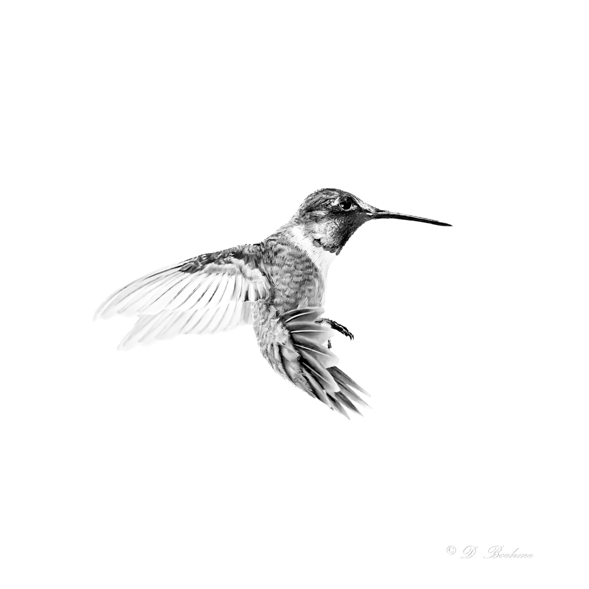
DSC_1316.jpg
DSC_4588-topaz-rawdenoise.jpg
DSC_8067.jpg
 

BF Hammer

Senior Member
Also investigate your Z8 picture controls. I think "Charcoal" "Binary" gets you fairly close to being the pen and ink style.
 
Last edited:

Clovishound

Senior Member
Thought I might try a color version. This looks a little like pastel chalk drawings. Hard to get the colors just right. I'm not entirely happy with the turquoise green along the top of the head. The wings aren't quite right either. They usually have a bit of an off rose color to them that just doesn't look natural and is hard to get rid of, and not enough black to give good detail. Overall, this doesn't have as much of a drawing quality to it. I might have to try printing it on the matte paper and see how it might look. It might print better than it looks on the monitor. Plus, there is the factor of personal taste. Some folks might just like color.

DSC_4588-topaz-rawdenoise-3.jpg
 
Top