You are using an out of date browser. It may not display this or other websites correctly.
You should upgrade or use an alternative browser.
You should upgrade or use an alternative browser.
Critique of this portrait
- Thread starter wud
- Start date
RockyNH_RIP
Senior Member
Wud, in accordance with the rules for the Critique section, can you please add the EXIF data to your posting?
Thanks!
Pat in NH (NOT a moderator just trying to help you out...)
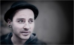
PS: I like the expression, focus and composition... Bokeh is good but the other person, though blurred is a distraction to me. Curious on skin tone, looks somewhat un-natural, was this intended???
Thanks!
Pat in NH (NOT a moderator just trying to help you out...)
PS: I like the expression, focus and composition... Bokeh is good but the other person, though blurred is a distraction to me. Curious on skin tone, looks somewhat un-natural, was this intended???
wud
Senior Member
Wud, in accordance with the rules for the Critique section, can you please add the EXIF data to your posting?
Thanks!
Pat in NH (NOT a moderator just trying to help you out...)
I could but dont think that has much to do with the expression of the picture?
Its with aperture 1.4, iso too high and therefore shutter too high. Oh well.
PS: I like the expression, focus and composition... Bokeh is good but the other person, though blurred is a distraction to me. Curious on skin tone, looks somewhat un-natural, was this intended???
Yes the girl in the back are a bit annoying, I agree. Well, maybe I'm actually asking for critique of the post processing. I'm just looking for - is it working, is it too dark/bright, is it missing some vignette on left side, is right eye to blurred etc.
Michael J.
Senior Member
don't do landscape crop it
Sent from my iPhone using Tapatalk
Sent from my iPhone using Tapatalk
Wud, in accordance with the rules for the Critique section, can you please add the EXIF data to your posting
I could but dont think that has much to do with the expression of the picture?
Please review the Critique Forum guidelines. The intent of including EXIF is twofold: 1) it assists in making recommendations regarding technical aspects of the capture (e.g. aperture and bokeh, shutter speed and sharpness, etc.) and 2) allows members to learn from each other. Thank you in advance for your understanding.
I think if you really want to keep the lady in the background, you might try an 8x10 crop (horizontal, removing dead space on the right). This would eliminate the dead space to her right and bring him in a little more. She is a bit of a secondary subject, without her, a portrait crop would be better in my opinion. I like the sotfness created by the low DoF, but would prefer his face is fully in focus, a bit sharper, perhaps f1.8-2.8 (ya, I know, you really want to use that 1.4  ). I think you pulled off what you wanted in an artistic sense, it is very interesting.
Again, posting the data really helps everyone. Nice work.
Again, posting the data really helps everyone. Nice work.
wud
Senior Member
wud
Senior Member
I think if you really want to keep the lady in the background, you might try an 8x10 crop (horizontal, removing dead space on the right). This would eliminate the dead space to her right and bring him in a little more. She is a bit of a secondary subject, without her, a portrait crop would be better in my opinion. I like the sotfness created by the low DoF, but would prefer his face is fully in focus, a bit sharper, perhaps f1.8-2.8 (ya, I know, you really want to use that 1.4). I think you pulled off what you wanted in an artistic sense, it is very interesting.
Again, posting the data really helps everyone. Nice work.
Thanks, I didn't think about closer crop at all
Yes, I'll get over the 1.4 someday, lol.
wud
Senior Member
I love the image from an artistic sense and am amazed at the results regardless of the ISO. I agree with the recommendation of a vertical crop. I hope Helene comments as she has a great eye for cropping and framing.
Only thing is, with that high shutter speed, I think it sometimes looses some details. But maybe not that big a problem, since i used f/1.4.
Great to hear, I hope she'll come by. Would love to know more about that.
Michael J.
Senior Member
looks great to me. love it
Sent from my iPhone using Tapatalk
John Young
Senior Member
Hoping for som critique on the artistic expression.

I really like it, it has a nice dream like quality to it and the guy has a great expression on his face. I also think the girl is best left in and left landscape just like you have it above. For me the girl in the background adds a bit of intrigue... like who's that and what's her story
RickSawThat
Senior Member
I would slightly darken the right (brighter) eye. Just a subtle bit...
Picture is great overall I like it both with and without the girl
Picture is great overall I like it both with and without the girl
The out of focus woman in the background is rather distracting and the vignetting seems overdone to me. The far eye is also slightly out of focus. If you clone her out, then there is too much wasted negative space to the right of the subject. I cloned her out and changed the crop to place the subject's right eye on a vertical third, sharpened the far eye and darkened the area around the far eye a little bit.


Last edited:
wud
Senior Member
I really like it, it has a nice dream like quality to it and the guy has a great expression on his face. I also think the girl is best left in and left landscape just like you have it above. For me the girl in the background adds a bit of intrigue... like who's that and what's her story
Looks like she's texting. Kids nowadays, ey? ;-) And thank you.
I would slightly darken the right (brighter) eye. Just a subtle bit...
Picture is great overall I like it both with and without the girl
Good point, thanks
The out of focus woman in the background is rather distracting and the vignetting seems overdone to me. The far eye is also slightly out of focus. If you clone her out, then there is too much wasted negative space to the right of the subject. I cloned her out and changed the crop to place the subject's right eye on a vertical third, sharpened the far eye and darkened the area around the far eye a little bit.

I see your point, but I still think there are too much dead space in your suggestion, for my taste. Well, maybe I'll remember all this next time I try a portrait
My critic is a little simplistic. When I do portrait, I try to use the portrait orientation. Portraits in landscape orientation are not so great unless you deliberately want to add an object or person that will add to the portrait.
Portraits are hard to critic since there is so much open to intention and sometimes the relation between the photographer and the subject. The photographer might feel something for the subject or the moment of capture that the outsider viewer cannot feel.
The light is a little flat and so is the colour treatment (IMO), choice of lens is a little on the wide side for me (the subject's nose looks disproportioned).
So, if I'd go with the 12 merits scale, I'd give this picture a 9 (-1 for lens choice, -1 landscape crop, -1 post processing)
wud
Senior Member
My critic is a little simplistic. When I do portrait, I try to use the portrait orientation. Portraits in landscape orientation are not so great unless you deliberately want to add an object or person that will add to the portrait.
Portraits are hard to critic since there is so much open to intention and sometimes the relation between the photographer and the subject. The photographer might feel something for the subject or the moment of capture that the outsider viewer cannot feel.
The light is a little flat and so is the colour treatment (IMO), choice of lens is a little on the wide side for me (the subject's nose looks disproportioned).
So, if I'd go with the 12 merits scale, I'd give this picture a 9 (-1 for lens choice, -1 landscape crop, -1 post processing)
Whats the other 9 then?
Yes, it sounds so obvious, portrait orientation for.. portraits, lol. Well at least, after someone pointed it out for me. I'll defiently remember that or I will pay more attention to the background, to use it in the picture.
Regarding to the feeling, Im thinking if me and the guy (its a friend and I took the shot to show him how my camera pictures look), were connecting, it should show in the picture? Thats probally really hard to do, but if he looked straight into the camera and "said" something with his eyes, it would maybe be visible for others?
Last edited:


