You are using an out of date browser. It may not display this or other websites correctly.
You should upgrade or use an alternative browser.
You should upgrade or use an alternative browser.
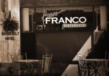
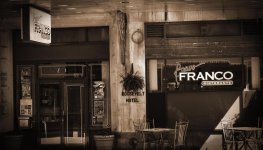
A friends restaurant......
- Thread starter Smoke
- Start date
Nothing wrong with the tone of the photo and yes it would look good antique but ...
(there is always a "but")
the photo needs straightening, the pillar is too central ( to my eye a shot from the right pushing the pillar to the left might be better) and the bright diagonal sunshine on the right bottom corner is distracting.
What's the food like?
(there is always a "but")
the photo needs straightening, the pillar is too central ( to my eye a shot from the right pushing the pillar to the left might be better) and the bright diagonal sunshine on the right bottom corner is distracting.
What's the food like?
Don Kuykendall_RIP
RIP :(
Michael J.
Senior Member
rocketman122
Senior Member
I see it different than the others. the vignette distracts, the lighting is not consistent. and shame you cropped the tables and chairs. nothing you can do about the main pillar. and shooting from the left more woulddnt allow you to see the hanging sign. personally I would have shot it something like this, but with the tables legs and chairs to the floor. and I probably would have shot it with either a 24mm or a 28mm to give it a feel thats its bigger than it is. I would have brought the tables out to me a bit before and shot a bit closer to them to give a TINY bit of exaggerated perspective. the fl you shot it at gives a flatter perspective with less perceived depth.


dennybeall
Senior Member
Who's your audience and what do you want to give them. B&W looks artistic but not inviting.
Thanks for all of your input. I guess this is a case of "To each his own". I wanted to get the hanging sign and the logo on the window. Also, the amount of cropping that I needed to do was horrible because the adjoining buildings had tons of garbage sitting out on the sidewalk. I actually LOVE the distraction of the sunlight on the table and chair on the right.....I actually waited for the sun to get there to create a break in the photo.....again, to each his.I appreciate everyone's honestyNothing wrong with the tone of the photo and yes it would look good antique but ...
(there is always a "but")
the photo needs straightening, the pillar is too central ( to my eye a shot from the right pushing the pillar to the left might be better) and the bright diagonal sunshine on the right bottom corner is distracting.
What's the food like?
singlerosa_RIP
Senior Member
How did you get ISO to 220?
No idea haha. Shot it in portrait mode. And I didn't include the sidewalk an legs of chairs because they were hosing it off and there was a huge red hose laying there that I didnt feel like photo shopping out.How did you get ISO to 220?

