You are using an out of date browser. It may not display this or other websites correctly.
You should upgrade or use an alternative browser.
You should upgrade or use an alternative browser.
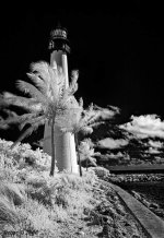
Lighthouse
- Thread starter Oz1
- Start date
Browncoat
Senior Member
I think the composition is good...but I'm not digging the B&W conversion at all. There's black and there's white, and not a whole lot in between. It's as if most of the tonal range has been lost, because to me at least, the clouds appear to have the same value as the palm trees. It's also difficult to make out the outline of the lighthouse against the sky.
In addition, I think a tighter crop would make for a more impressive image. Perhaps trimming some off the top and on the bottom, just short of the base of the nearest tree.
In addition, I think a tighter crop would make for a more impressive image. Perhaps trimming some off the top and on the bottom, just short of the base of the nearest tree.
I agree with part of the above critique but not all. I do like the B&W. The stark contrast is dramatic to me. Very cut and dry in the photo. I would crop out some of the foreground though. It would focus the attention closer to the light house. Some of that is lost due to the monochromatic view and the top of the light house is dark. Over all I like this picture a lot. Nicely done.