You are using an out of date browser. It may not display this or other websites correctly.
You should upgrade or use an alternative browser.
You should upgrade or use an alternative browser.
Making the best of it.
- Thread starter BigNicG
- Start date
Ok, this is just MY opinion, so feel free to take it with many grains of salt if you have to.
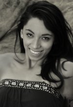
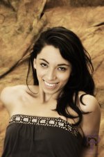
The crop is too wide and the model's nose is right in the center of the image. Also her right shoulder has a funny shape with her arm behind, the cropping could get rid of this. I find the color cast annoying and would prefer B&W on the sepia side. I think there is just too much light (I'd like the shoulders darker) and the print could be on the darker side.
It's about it.
This is what I'd like it to look like:

I agree with marcel's assesment and would add that the background (in both original and B&W) is distracting. The model seems to blend into it, instead of making her stand out. The positioning looks uncomfortable causing the shoulders to look distorted. The facial expression is excellent, she looks great in the lighting you provided.
Last edited:
Browncoat
Senior Member
Very nicely put, Marcel...couldn't have said it better myself. Good job on the crop, too. I think your edit is a tad on the dark side, though.
To the OP: You have to be very careful with poses like that, when you're shooting from above the subject. Unless you're going for a full-body shot, that perspective is rarely flattering. Because your model is leaning back on her elbows, her entire right arm looks amputated at the shoulder.
To the OP: You have to be very careful with poses like that, when you're shooting from above the subject. Unless you're going for a full-body shot, that perspective is rarely flattering. Because your model is leaning back on her elbows, her entire right arm looks amputated at the shoulder.

