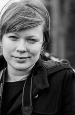
B & W Portrait

Elliot87

Senior Member
Portrait photography isn't something I'm all that into, unless its taking a picture of my wife like this. So I don't practice much and don't really know what I'm trying achieve for the most part.
So what is good about this shot and what do I need to work on? My only thought when taking this really was trying to use leading lines, something I don't normally manage to get right but I might have here??
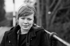
DSC_1246.jpg
 

FastGlass

Senior Member
Nice shot. I would have shot her in portrait orientation. Also the white dot to the right seems to catch my eye. I do like this in B&W though.
 

Elliot87

Senior Member
Nice shot. I would have shot her in portrait orientation. Also the white dot to the right seems to catch my eye. I do like this in B&W though.

Thanks, I think I shot a couple in portrait first but they didn't turn out well in turns of facial expression etc. will try more in portrait next time I head out. I hadn't noticed the white dot but I see what you mean. Will go back and see if I can sort that.
 

Byram Lass

Senior Member
The hair across her eye and along the cheek distract from what I think is an otherwise well composed photo. I've learned to just watch for those gusts and wait for everything to fall back into place.
 

Elliot87

Senior Member
The hair across her eye and along the cheek distract from what I think is an otherwise well composed photo. I've learned to just watch for those gusts and wait for everything to fall back into place.

I agree, I only noticed that afterwards in post.

Nice but you need a 150-600 for this type of work :D

Most definitely! I'll have to convince my wife that 600mm is the most flattering focal length :)
 

Horoscope Fish

Senior Member
Well first and foremost, I like the shot. :D

What would make it stronger, I think, would be having shot it in portrait orientation to begin with. Cropping could work here, but cropping is a harsh Mistress.

Another really important thing I try to remember when shooting portraits: "head in a clean space". This means I want my subject's head framed with NO distracting elements in the background immediately behind, or too close to, their head. This can be tough, but it appears to me there is a direct correlation between how much clean space there is around the subject's head, and how much power the portrait carries.

Lastly, in a full face portrait like this one the eye's of the subject will connect with us and create an invisible Leading Line. That kind of eye-contact creates a Leading Line more powerful than any physical leading line you can insert into the frame. Your Leading Line is well executed here methinks, I just don't think it's necessary.

Just two-cent's from someone learning to shoot portraits himself...
....
 

Elliot87

Senior Member
Thanks, some really great feedback and a good few things for me to work on. I tend to look at the picture and either like it or not and I often struggle to see how to make it better. This feedback has been very helpful and exactly what I was after!
 

Marcel

Happily retired
Staff member
Super Mod
To me the horizontal uncropped version is better because it leaves her breathing space and is less formal than the vertical crop (in this case). For standard portraits, business or obituary, vertical is the usual standard. But for informal shots like this one, horizontal is fine.

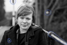
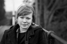
I took the liberty of circling a few things that are very distracting to me in this case. When I look at a picture, I like my eyes to rest on the eyes or the person. And when there are contrasting points around the face, I find my eyes just go back and forth and can't stop moving around in the image. So with this in mind, I circled the stuff I found distracting and then did a bit of photoshop edits (just using the brush on a layer to literally paint out the offending distractions) and added a bit of burning to create a bit of a vignette.

Here's the original with distractions circled out:
Elliot's.jpg

And here's after the retouching:
Elliot's copy.jpg

I think this kind of small stuff makes the image more peaceful.
 

Byram Lass

Senior Member
So with this in mind, I circled the stuff I found distracting and then did a bit of photoshop edits (just using the brush on a layer to literally paint out the offending distractions) and added a bit of burning to create a bit of a vignette.

I'm just getting started with masks and brushes. Is there a good you tube or web page that would describe what you did? My current technique is limited to copy/paste with a little bit of healing to smooth out the lines. I'm finding that's not the best method for the stuff you did.
 

Elliot87

Senior Member
To me the horizontal uncropped version is better because it leaves her breathing space and is less formal than the vertical crop (in this case). For standard portraits, business or obituary, vertical is the usual standard. But for informal shots like this one, horizontal is fine.

I took the liberty of circling a few things that are very distracting to me in this case. When I look at a picture, I like my eyes to rest on the eyes or the person. And when there are contrasting points around the face, I find my eyes just go back and forth and can't stop moving around in the image. So with this in mind, I circled the stuff I found distracting and then did a bit of photoshop edits (just using the brush on a layer to literally paint out the offending distractions) and added a bit of burning to create a bit of a vignette.

Here's the original with distractions circled out:
View attachment 156855

And here's after the retouching:
View attachment 156856

I think this kind of small stuff makes the image more peaceful.

Subtle improvements that make a big difference.

At the moment I'm going between free trials of software to see what I like using and what I don't. Currently have a trial of lightroom and I'm not sure how I can deal with unwanted objects in that programme. Photodirector 6 I was using before gave more of the features which I guess I'd find in photo shop, like object removal etc. That software seems to have stopped opening correctly half way through my trial which is annoying.
 

Horoscope Fish

Senior Member
To me the horizontal uncropped version is better because it leaves her breathing space and is less formal than the vertical crop (in this case). For standard portraits, business or obituary, vertical is the usual standard. But for informal shots like this one, horizontal is fine.
Nothing wrong with all that extra space but it's not really doing anything to strengthen the shot and, in my opinion, if an element isn't strengthening the composition, it's weakening it. Personally, I'd go with a simple, classic 8:10 crop here, after removing some of the junk.

Just my take:
.....
b-w-portrait-elliots-copy.jpg
 

Bourbon Neat

Senior Member
Firstly in my opinion, a gorgeous subject. I like what Marcel did with the distractions and keeping the format. It is open and comfortable with the background bokeh, and the diagonal railing does not get in the way.

Did she reciprocate the portrait with her Nikon? Will you show that shot too?

The story I get from your capture is of a casual pose during a wandering stroll.
 

Elliot87

Senior Member
Firstly in my opinion, a gorgeous subject. I like what Marcel did with the distractions and keeping the format. It is open and comfortable with the background bokeh, and the diagonal railing does not get in the way.

Did she reciprocate the portrait with her Nikon? Will you show that shot too?

The story I get from your capture is of a casual pose during a wandering stroll.

Firstly thanks and I agree! Everyone has there personal preference re crop etc. but I also like Marcel's edit best so I agree with you there.

She didn't take my picture this time although she has done in the past. I can guarantee that she makes the better subject so no one is missing out there!

That is the story exactly, a wandering stroll from the nature reserve we visited, along a path we'd never walked by the railyway track which took us to the station where I took this portrait.
 

Elliot87

Senior Member
Nothing wrong with all that extra space but it's not really doing anything to strengthen the shot and, in my opinion, if an element isn't strengthening the composition, it's weakening it. Personally, I'd go with a simple, classic 8:10 crop here, after removing some of the junk.

Just my take:
.....
View attachment 156956

I would like to have taken some tighter head shots and will take more of a variety next time. It certainly works this way but my preference is still the wider shot but with fewer distractions. I will definitely take note of the idea that elements that aren't strengthening a shot are, or at least very well could be weakening it. All these little rules of thumb will help me in the future I'm sure!
 
Top