Texture

Lawrence

Senior Member
I have been struggling with finding something different that fits with the theme of this month's competition which is "texture'

I saw this weeping wound on a tree and think it has potential. Been at it all day and can't see the wood for the trees now.
So I would like opinions.

My gut tells me I haven't quite nailed what I am trying to convey by using textures - and I think I am trying to convey the pain this tree feels from the cut with the dripping sap representing tears!

Your honest thoughts - be harsh if you will.
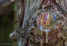
Wound texture-.jpg
 

sonicbuffalo_RIP

Senior Member
Lawrence.....I like the picture, but think the idea is stretching "texture" a bit much. It just doesn't cut it for me (no pun intended, but I applaud your efforts).
 

Fred Kingston

Senior Member
I think if you changed the lighting and used a side/raking light, that the "texture" would be enhanced... texture is best emphasised by the use of shadows... It's one of those things you have to get right in the camera before post processing...
 

Blacktop

Senior Member
Whats been said above, plus the strait on shot of the wound seems to be making it appear flat. Side lighting and a bit of an angle may help.

I agree with this as well. I try not to shoot anything straight on if I can help it. The shot always looks flat to me with no depth. Also try some different lighting angles as well.

I am trying to convey the pain this tree feels from the cut with the dripping sap representing tears!


Sorry, but no matter how well you take this shot, it will not happen for me.
 

Lawrence

Senior Member
Thanks guys - appreciate the feedback. Its great to have a forum to bounce this sort of thing off.
I am going to try this from a different angle.
 

Lawrence

Senior Member
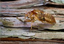
OK for now I have put aside the wound - may have another look later but in the meanwhile ...

I found this.

So @Blacktop what do you think of this one?
Does it pass muster for "texture"?

Golden years-.jpg
 

kevy73

Senior Member
I would maybe change the angle to to get the edge of the tree in, showing all the different angles, levels and 'texture' rather than a flat front on which makes it hard to see.
 

Lawrence

Senior Member
I would maybe change the angle to to get the edge of the tree in, showing all the different angles, levels and 'texture' rather than a flat front on which makes it hard to see.

I thought of, and tried, that Kevin but on both sides of the tree it was very bright and distracting.
In the end to stop some of the light I held an umbrella over the subject - the reflection off the shell was unreal bright.
 
Top