You are using an out of date browser. It may not display this or other websites correctly.
You should upgrade or use an alternative browser.
You should upgrade or use an alternative browser.
What do you think & what does it need
- Thread starter bub307
- Start date

What is your intended purpose for this shot ?
It's for a website.
jazzjunkie
Senior Member
is it to show products for sale?
is it to show products for sale?
yes it will be on a banner
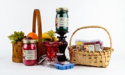
Kimberlie's Candles, The best candles & wax melts you can buy.
How would you correct the fonts I don't want to redesign the labels.Got to agree with @J-see it needs more punch.
Also because of the small font size its impossible to know whats in the jars.
How would you correct the fonts I don't want to redesign the labels.
The labels look nice I agree. All I can suggest is increase the font size of the line that says what is in the jar and perhaps make it bold.
Tighten up the crop and make sure you have the focus spot on.
Why don't you rearrange it and focus closer. That directly solves a part of the emptiness and maybe the font problem too. Unless the tree is a product, you can cut quite some of it before it stops working. It's such a well-known prop, even a part of a branch already triggers the "vibe" intended.
jazzjunkie
Senior Member
With product shots the products have to be the absolute hero of the pic. Whilst the lighting and background are great for a product shot, you can't really see the products. The products that are in the basket are a mystery, try standing them up to show how many are in there, if they don't stand up enough put something in the bottom for them to stand on. There is some sort of brown wire on the tree, it distracts the eye a little, should it be a decoration, does it need to be there? Agree with Wornish about tightening the crop a little too, maybe just tighten everything together a bit more and focus closer as J-see says.
Technically it is correct. It is well illuminated. I like the white background and little shadows. There is a darker patch in the top-right corner, I'm not sure if it is from vignetting or just a shadow. You could remove it in post-processing.
It's funny you mention the white background as a plus; I was going to say that detracts from the photo, makes a warm, sentimental, Christmas-y kinda shot look sterile and dull. I'd shoot this on a hardwood table with a fireplace roaring in the background. Assuming one has access to such a scene, of course.

Yes but still leaning.
My $0.02 worth is …
nice photo but I thought it was advertising jam or something breakfast related. I would NEVER have connected it with candle wax!
I would ditch the fruit and the baskets and put a couple of different (fat) candles in the red jar and on the pedestal - make it obvious.
nice photo but I thought it was advertising jam or something breakfast related. I would NEVER have connected it with candle wax!
I would ditch the fruit and the baskets and put a couple of different (fat) candles in the red jar and on the pedestal - make it obvious.

Attachments
Last edited:
My $0.02 worth is …
nice photo but I thought it was advertising jam or something breakfast related. I would NEVER have connected it with candle wax!
I would ditch the fruit and the baskets and put a couple of different (fat) candles in the red jar and on the pedestal - make it obvious.
Ok got the get rid of the baskets, are you saying put more candles behind the red candle?