You are using an out of date browser. It may not display this or other websites correctly.
You should upgrade or use an alternative browser.
You should upgrade or use an alternative browser.
Please Critique
- Thread starter Dsobo
- Start date
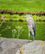
looks a little overexposed and slightly oversaturated on my monitor , id also probably look at cropping so you only get the little plant and just some of the rock and a lot less grass, in fact id crop all the grass
the rocks distract from the bird as they are bright , id also run a grad filter over the rocks
love it if you cropped that way and posted back , i usually copy and try to see if it works but i see you have it blocked
the rocks distract from the bird as they are bright , id also run a grad filter over the rocks
love it if you cropped that way and posted back , i usually copy and try to see if it works but i see you have it blocked
BackdoorArts
Senior Member
I'm with MoabMan. I'd also add a little soft and oversharpened/overstructured when viewed at full size. And just to be thorough, it's a Great Blue Heron, not a crane (from the photo filename). 
It can be tempting to boost saturation to make colors pop, so be careful, particularly with reds and greens. Also learn what you can do to highlight your subject a little more, like with a very subtle vignette centered on the subject - not just the basic darken/lighten edges type. The LR Radial Filter tool is great for that.
It can be tempting to boost saturation to make colors pop, so be careful, particularly with reds and greens. Also learn what you can do to highlight your subject a little more, like with a very subtle vignette centered on the subject - not just the basic darken/lighten edges type. The LR Radial Filter tool is great for that.

