You are using an out of date browser. It may not display this or other websites correctly.
You should upgrade or use an alternative browser.
You should upgrade or use an alternative browser.
Trying to Learn Light Room 4
- Thread starter MoabLady
- Start date
.jpg")
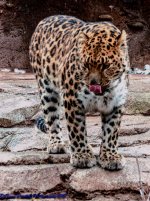
Looking at the image a little closer, it appears that the face of the leopard is a little blurry. Possibly due to camera shake at longer focal length. Can you share the camera settings? Shutter speed and aperture? I normally do minimal post processing such as increase contrast and black to make the image pop out a bit. If you were shooting at 200mm, I would increase the shutter speed a little bit more i.e. 1/400. Good portrait overall.
BackdoorArts
Senior Member
Might be a monitor difference, but the white balance seems a little cold. I've found that using the eyedropper tool is often easier than hunting and pecking with the sliders. The only thing I did in this edit was click the eyedropper on the white section on the cat's left shoulder.

Horoscope Fish
Senior Member
To my eye the original has a definite greenish cast. Here I've adjusted the color balance using the Levels Eyedropper tool, adjusted the hue and brightness sliders to increase the contrast to give kitty a little more "pop" and flattened the layers. This leopard should look a little more tawny and majestic now.
Attachments
Last edited:
I'm in the same boat. The images below are just not right IMO, I need to play with the settings in Lightroom a bit more and learn, learn, learn...
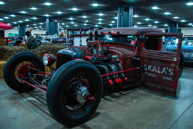
Skalas by MichiganClassics.com, on Flickr
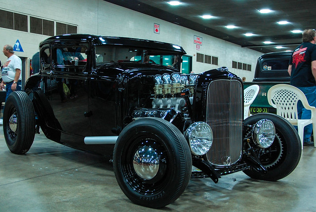
Black Beauty by MichiganClassics.com, on Flickr
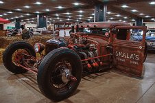
Skalas by MichiganClassics.com, on Flickr
Black Beauty by MichiganClassics.com, on Flickr
RockyNH_RIP
Senior Member
Joe, that green cast would cause me to look at WB.. Did you try adjusting that in LR??
You got some nice shots...
Pat in NH
You got some nice shots...
Pat in NH
BackdoorArts
Senior Member
I'm in the same boat. The images below are just not right IMO, I need to play with the settings in Lightroom a bit more and learn, learn, learn...
In your case there are 2 steps. First, you're dealing with a blue cast from the indoor lighting, so you need to fix the white balance. Second, the images are a little dark, but not so much in the way of overall exposures but that the lighting is dark in some areas and not others. Two things only did I do (sounding a bit too much like Yoda): 1) Use the eyedropper to grab a white spot (panel behind the car in photo 1, guy's shirt in photo 2), and 2) use the Shadow slider to bring up the dark areas until they looked right. You could do more, but this is a start.
Horoscope Fish
Senior Member
The quickest way, IMO, to correct color cast is to start by balancing everything against a midtone in the shot and then fine tune using a Hue adjustment. That's what I did here in about three clicks and most all of the color correcting is done.I'm in the same boat. The images below are just not right IMO, I need to play with the settings in Lightroom a bit more and learn, learn, learn...
Sharpen it up a tiny bit and you're good to go:
Attachments
BackdoorArts
Senior Member
The quickest way, IMO, to correct color cast is to start by balancing everything against a midtone in the shot and then fine tune using a Hue adjustment. That's what I did here in about three clicks and most all of the color correcting is done.
Sharpen it up a tiny bit and you're good to go:
Remember, these guys are using Lightroom, not Photoshop. They'll have an impossible time finding a "Midtone" adjustment, and Hue is a whole different set of sliders.
Horoscope Fish
Senior Member
I assumed the methodology would be different but surely LR allows for tonal adjustments; meaning shadows, mid-tones and highlights... Right? I'm trying to address concepts I guess, leaving out the specifics of the mechanics because yeah, I do know LR and PS have entirely different layouts and menus.Remember, these guys are using Lightroom, not Photoshop. They'll have an impossible time finding a "Midtone" adjustment, and Hue is a whole different set of sliders.
BackdoorArts
Senior Member
LR3 used to have a midtone slider but not LR4 or 5 - not even in the curves section where you would expect it (it's broken down into lighter and darker mids). One would hope that once you get rolling you understand what that is, but I'm assuming these are fairly new users and don't want to confuse them. I just want to make sure that they understand that if they can't find what you're telling telling them about it's OK.
Horoscope Fish
Senior Member
Oh... Oh my. Thank you for that clarification.LR3 used to have a midtone slider but not LR4 or 5 - not even in the curves section where you would expect it (it's broken down into lighter and darker mids). One would hope that once you get rolling you understand what that is, but I'm assuming these are fairly new users and don't want to confuse them. I just want to make sure that they understand that if they can't find what you're telling telling them about it's OK.
Sorry for any confusion caused!
*cough*getphotoshop*cough*
In your case there are 2 steps. First, you're dealing with a blue cast from the indoor lighting, so you need to fix the white balance. Second, the images are a little dark, but not so much in the way of overall exposures but that the lighting is dark in some areas and not others. Two things only did I do (sounding a bit too much like Yoda): 1) Use the eyedropper to grab a white spot (panel behind the car in photo 1, guy's shirt in photo 2), and 2) use the Shadow slider to bring up the dark areas until they looked right. You could do more, but this is a start.
View attachment 33740
View attachment 33741
Nice, thank you for the tips. I do have PS7, but have never taken the time to dive into it much more than basic settings and cropping
 I'll take a look.
I like that look as well, adding these tips to my editing filesThe quickest way, IMO, to correct color cast is to start by balancing everything against a midtone in the shot and then fine tune using a Hue adjustment. That's what I did here in about three clicks and most all of the color correcting is done.
Sharpen it up a tiny bit and you're good to go:
Lr is an organized workflow, so really just go through each section in order and adjust what's required. You can't mess up anything by experimenting. The best advice I can give is that a little goes a long way. People tend to over do the adjustments to make them "pop" when really a light touch lends to a more "natural" looking end result.
I don't know all the details of how this was shot, but it looks like your camera is back-focusing....or the AF target was about 3' behind the cat. You can clearly see the ground behind it as super sharp and the foreground fuzzy where the front paws are placed. I'd do a simple test to see if it's the camera, technique or it could have been the cat moving forward.
I don't know all the details of how this was shot, but it looks like your camera is back-focusing....or the AF target was about 3' behind the cat. You can clearly see the ground behind it as super sharp and the foreground fuzzy where the front paws are placed. I'd do a simple test to see if it's the camera, technique or it could have been the cat moving forward.