I wasn't quite sure how to go about this, so what I decided to do was to go thru the edits on a photo and then present the original along with screen shots of the steps.
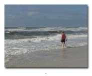
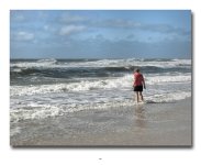
Here's the final image (click to enlarge, right-click and open in a separate window to view in full resolution)...
I started out making camera profile and CA adjustments in Lightroom, and then sending it directly into Photoshop which is what I use to make the rest of my adjustments.
Here's what it looked like as it entered PS:
View attachment 61816
My first step in PS is to adjust the basic light levels. I do this non-destructively by first hitting Command-J to create a duplicate layer. Then I hit Command-L to bring up the level adjustments. Depending on the image I will either use the eyedropper tool to select a neutral spot to adjust white balance, or if I'm happy with WB I will simply adjust the left and right marks (holding the Option key and moving until I see something) and then adjust the middle mark to get the contrast I want. In this case I did the latter.
View attachment 61817
From here my next step, if I'm at a high ISO level, would be to invoke Dfine 2.0 to remove noise. Since that's not the case here, I skip that step and go straight to Viveza 2.0. The colors and textures on this image were a little flat, so the first thing I did was bump up the Saturation, and then boosted the Contrast and Brightness a bit to make them pop. I also cranked the Structure slider to about +35 and the 3-dimensional look of the mural really popped. I'll often use the Structure slider to enhance the textures in my shots by increasing it, or to enhance bokeh and the softer aspects of the photo by decreasing it. I really liked what the Structure adjustment did to the main building, but it also made the red building to the left appear very harsh. So, I added a Control Point to the top of the building and slid the Structure slider into the negative until it softened it back to where it was. I then duplicated that control point, sized it so it would only cover the red building and not the yellow, and applied it further down and repeated in several spots along the building until it was fully softened (4 Control Points in total).
Here's what it looked like coming out of Viveza:
View attachment 61819
I could have stopped here, but I got curious as to what else I could do to make the subjects in the mural pop. So I invoked Color Efex Pro 4 and used the Detail Extractor to bring out the bricks and the 3D aspects of the mural even more. I love this tool for popping textures, and it allows you to choose between Fine, Normal and Large details. I chose "Fine" and adjusted the level of detail until I got a result I liked that wasn't too over the top. I added some negative Control Points to pull the effect from the other buildings. I also played a little with the Color Contrast Filter as well, but decided that while I could do some cool things with the yellow-to-green contrast, it muted the other colors too much, so I went with only the Detail Extractor.
View attachment 61820
And that's it. The only thing I did after this was to adjust sharpness using Unsharp Mask when I produced the image for uploading to Flickr. I've used this so long and am so used to it that I prefer using it to Sharpener Pro. That's not to say it's not a good tool, it only means I don't use it that often. From here I typically flatten the image and save the PSD file for later access.
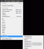
I hope this gives you guys some idea of how I use the Nik Collection. As I come up with other examples I'll try and do a similar walkthru. I hope this helps. In the future I'll try and remember to do a screen shot of the control layouts in the Nik tools. I didn't think of this until after I was almost done, so I only did after shots since I still had the layers.

