You are using an out of date browser. It may not display this or other websites correctly.
You should upgrade or use an alternative browser.
You should upgrade or use an alternative browser.
Portraits
- Thread starter esh1692
- Start date
Don Kuykendall_RIP
RIP :(
did the building fall on her?
JoeLewisPhotography
Senior Member
The first one is not great. the angle is awkward and does give the effect that the wall is falling on her. The composition is just not there either. you cut off her left hand and right fingers, which is a big no-no, and left way too much empty space above her head. The 2nd one is much better, but would like to see the top of her head (however that does not kill it for me, just a personal preference) and perhaps a touch more in post processing to make her eyes and hair pop a bit more.
Edit: just looked at your sets on Vimeo...You are pretty close, and you have what could be some great shots...you just have a bad habbit of cutting off hands, fingers, feet and toes. Also, it you are going to take a shot below the knees, make sure the feet are showing as well. Also, slight angles are ok, but you have a few that are extreme, and just kill the photo.
Edit: just looked at your sets on Vimeo...You are pretty close, and you have what could be some great shots...you just have a bad habbit of cutting off hands, fingers, feet and toes. Also, it you are going to take a shot below the knees, make sure the feet are showing as well. Also, slight angles are ok, but you have a few that are extreme, and just kill the photo.
Last edited:
Browncoat
Senior Member
...you have what could be some great shots...you just have a bad habit of cutting off hands, fingers, feet and toes. Also, it you are going to take a shot below the knees, make sure the feet are showing as well. Also, slight angles are ok, but you have a few that are extreme, and just kill the photo.
I agree with everything Joe said, but this part especially.
One of the things that separates photographers from fauxtographers is good composition and noticing details like this. There are some soft "rules" about cropping off body parts, but generally speaking, try not to do it all all if you can help it. Especially hands and fingers.
Thank you guys for the hints! Did another senior session and really tried to follow these rules...
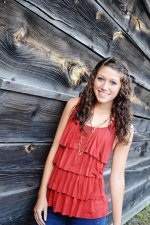
Here is one of my favorite pictures that I captured!

Rebecca on Vimeo <<< more pictures from this session!
Here is one of my favorite pictures that I captured!

Rebecca on Vimeo <<< more pictures from this session!
Last edited:


