You are using an out of date browser. It may not display this or other websites correctly.
You should upgrade or use an alternative browser.
You should upgrade or use an alternative browser.
Oddball Histogram Question about Thin Line
- Thread starter Scrayen
- Start date
Maybe we need to see an example to be sure what you mean, but you said in the "good area", so am assuming you specifically do Not mean a vertical line at the extreme right end of the histogram field.
It does not need to be handled. A histogram is a bar chart showing the relative count of image pixels for each tonal value from 0 to 255. A spike at the extreme right end denotes clipping (cannot go brighter than 255, so it stacks up there), which should be handled by reducing exposure. But a little spike at any other point is merely the count of pixels with that particular tonal value. For example, white is bright, and common, and a white cloud or a white house or sign or shirt might cause a higher count of that value, as a little spike. It is what it is, and how it should be. A spike is just a pixel count, which just means the image AREA of that bright tone is large enough to stand out in a pixel count. But if it is in the picture, then it should be there.
If you use Adobe, both the white point slider in the Levels tool, or the Raw slider for Exposure will identify what your spike is.
In one of these two tools, hold the ALT key down (I think Options key in a Mac) while slightly adjusting that slider. Adjust it brighter, causing intentional clipping (just for this test, then cancel out of it). The preview image goes dark then EXCEPT for the clipped tones at the value of the slider. So as you adjust to slide the spike point to the right, causing clipping, then you see pixels light up where that point is (of that value), and so you know the image area, and then you can see what detail is there. This will be clear when you try it.
So you can identify the spike detail. This identifies your spike, and depending on what it is, in general, it helps judge if a bit of clipping is important or not, or can be tolerated as helpful or not. It tells you what you're doing, and if you really want to do it.
There is no preferred shape of a histogram. It reflects whatever the image data is. A black cat in a coal mine will be mostly all dark tones (large dark areas). A white polar bear on the snow in the sun will be mostly all bright tones (large bright area). Neither shape is necessarily preferable, it depends on how the image should be.
I suppose the white bear in a coal mine would look unusual, but if that's the situation, the histogram ought to show it.
We really only have one or maybe two reasons to look at a histogram.
We normally want to avoid clipping, which causes a tall spike at the far right 255 end. That is clipping, and then bright detail is lost, and cannot be recovered. So we back off on exposure to avoid that clipping. This check is extremely important. In the camera, only examine it in the three RGB histograms. The single gray histogram is Not real data, but only a math simulation which is useless to inspect clipping (see Two types of Histograms )
And we might increase exposure so the data approaches (but does not touch) that right end. That assumes an average scene (containing a wide mix of subject colors, particularly bright or white.). Assuming there are bright colors present, then we want most images to be reasonably bright, extending towards the right, but Not touching the right border (which becomes clipping).
However, we can also easily judge that (maybe better) by simply looking at the rear LCD preview image, to note its brightness. I set my rear LCD level to -1 to better match how I will see the image in the photo editor. This does not help seeing it in bright sun, but it is more more accurate to judge exposure. The importance is about how the image looks, not what the histogram looks like. The histogram might be a helpful guide though.
Last edited:
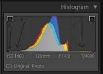
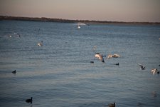
Happy Easter and thank you for the very informative reply. Very good information and I will put it to good use. I have attached a jpg version of a photo which has the horizontal line in the histogram. Also attached a screen clipping of the histogram of the same photo RAW version with arrow pointing to the line in question because the horizontal line in the jpg histogram is not very distinct. I suppose there could be a few pixels in that range. It just seems odd there would be an even horizontal line for that far. In the photo, numbers 1 and 2 point to the horizontal lines and number 3 points to the area of no line.
I am calling it a line because it looks like a line to me on each side. On the far left side there is an area of no "line".
This was a test photo hence the poor subject and composition.


I am calling it a line because it looks like a line to me on each side. On the far left side there is an area of no "line".
This was a test photo hence the poor subject and composition.


Scott Murray
Senior Member
Happy Easter and thank you for the very informative reply. Very good information and I will put it to good use. I have attached a jpg version of a photo which has the horizontal line in the histogram. Also attached a screen clipping of the histogram of the same photo RAW version with arrow pointing to the line in question because the horizontal line in the jpg histogram is not very distinct. I suppose there could be a few pixels in that range. It just seems odd there would be an even horizontal line for that far. In the photo, numbers 1 and 2 point to the horizontal lines and number 3 points to the area of no line.
I am calling it a line because it looks like a line to me on each side. On the far left side there is an area of no "line".
This was a test photo hence the poor subject and composition.
View attachment 148926View attachment 148927
Looks like you have clipped the blacks and whites.
EDIT: Since realised this is wrong as per Wayne and Fish. Tells you what I do not know about the histogram lol.
Last edited:
The horizontal lines at each end are just areas of very low pixel count.
The horizontal dark line is the few black ducks. The horizontal bright line is the few bright ducks. Small areas, not many pixels there to register, and not all the same color to combine and cause a peak.
Brightness is shown in histogram from left to right, from darkest possible at 0 at left edge, to brightest possible at 255 at right edge.
Height simply shows the count of pixels of each of those 256 brightness values.
The "vertical line" at right end of middle peak does NOT denote that it was clipped. If it were up against the right edge, it would, but it's not at the right edge.
Obviously is not clipped because the horizontal line of brighter ducks across the middle of the picture are much brighter than the "vertical line" at the edge of the middle area. The image is near normally exposed, any more would clip some of those bright ducks (but they are not clipped now). And the black ducks are darker than the main peak too.
Holding ALT key while sliding the Levels White Point (or which is the Exposure slider in Raw) shows that the bright line of ducks is shown across the nearly-but-not-quite-zero portion in the empty top third. There are a few pixels there (but no height). The histogram height of the ducks is very low simply because their area (their pixel count) is very small. This does not detract from their brightness. The histogram is a bar chart of pixel count of each brightness value.
The 'vertical line" at right edge of middle peak is seen to be the count of the pixels of the bright sky above that boat in the middle. It is a larger area pixel count (hence a histogram peak), and the right and left edges of sky are not as bright (not as far to the right). The plume of the boat is almost as bright, but it is a very tiny area, little impact on the histogram.
The blackest is the black ducks. Then starting around 32 begins the main peak of the dark treeline in the background (larger area, more pixels, more peak). You can hold ALT key and slide the Black Point (which is "Blacks" in raw) and identify that too.
The tallest middle peak is the water... a quite large area of pixels, all in the same brightness range.
This is all trivially verified with the ALT key, as described before.
Histogram height is NOT brightness. Brightness is toward the right edge. Histogram height is just a relative pixel count. Relative because histograms are automatically scaled so the tallest peak (of pixel count) is always very near full height.
I put up a quick screen capture showing how this analysis is done. Raw Exposure and Blacks will do same thing (same tools). Enlarging the video to full screen will show better. This is something we all ought to know.
Last edited:
Horoscope Fish
Senior Member
Your arrows indicate what is, effectively, "digital noise". In such situations, I create a Levels Adjustment Layer and bring the Shadows and Highlights sliders toward the middle until they abut the edge of the histogram where the data really starts to spike.
....
Horoscope Fish
Senior Member
Ducks... It's almost always ducks. 16:9 Ducks if I had to guess...It is not noise, it is black and bright birds, probably ducks.
....
Thank you. This is good information.
So the thin line is probably the ducks.
I did not know about holding the ALT-key and moving the levels sliders around. That method is so much easier to see where clipping begins and adjust it out if necessary. Also did not know a reason to use the individual R and G and B histograms. I had only been looking at the combined histogram.
I rely heavily on the histogram because my eyes are not very good for details at age 66. It is my "crutch".
Thank you. This is good information.
So the thin line is probably the ducks.
I promise, a quick look shows that in this case, the thin lines absolutely are the ducks.
I did not know about holding the ALT-key and moving the levels sliders around. That method is so much easier to see where clipping begins and adjust it out if necessary.
Sometimes extreme contrast is such that a bit of clipping is simply necessary (to avoid a too-dark image).
This method allows us to identify WHAT is clipping, and to judge if the detail there is necessary or not.
Adobe Camera Raw (like Lightroom) works that way too (holding ALT, or OPTION in Mac). It works slightly different, but shows same thing when advancing Exposure to show what starts clipping. Often provides more information about the image than we otherwise realize.
For that purpose, I like Levels better. And Levels provides the center slider, which Adobe Raw now does not.
If we want a brighter image in raw, we increase Exposure, but which increases risk of clipping the right end.
The Levels center slider also increases brightness (boosting gamma actually), which increases the brightness of the dark and central areas, WITHOUT shifting the bright end, so therefore, it does not increase clipping. It is like raising the center in Curves. Why Adobe removed this in the latest Raw is a mystery to me. You can get it back by selecting the Adobe 2010 Process curves (called Fill Light there).
Also did not know a reason to use the individual R and G and B histograms. I had only been looking at the combined histogram.
That was not speakng of Adobe. That is speaking of only the camera histograms, where the single gray camera histogram is useless (Not real data - does not show clipping).
The Adobe histograms (like Levels RGB) overlays the the three channels, and is showing real data for all three overlaid channels. Two types of Histograms shows this difference. We may not care which channel it is, but we should care about clipping. Generally, the red channel is pretty bad about clipping in sunshine, which is due to the boost of Daylight white balance. Incandescent WB is the opposite, it boosts blue.
That Adobe way is greatly different (vastly better) than the cameras single histogram. The camera single histogram is NOT showing real data, but instead just a math manipulated simulation about the way the human eye and B&W film responds to color. It is called Luminosity, but it is a crummy histogram for photographers purposes. So in the camera, only look at the three separate RGB histograms, which do show real data. But that statement was NOT about Adobe.
I rely heavily on the histogram because my eyes are not very good for details at age 66. It is my "crutch".
About all we need to check in the histogram is if we have clipping at the right end. Then we may need to judge what it is, and how important it is. Some clipping is not always avoidable in extreme contrast cases.
Last edited:
