You are using an out of date browser. It may not display this or other websites correctly.
You should upgrade or use an alternative browser.
You should upgrade or use an alternative browser.
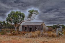
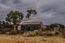
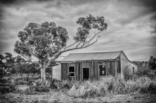
HDR Settlers Cottage
- Thread starter Ijustwant1
- Start date
I find it hard to answer your question concerning the image since I don't know which software was used to produce the HDR. The light around the three is from over processing HDR. Removing it could be done different ways depending on the program you used. So I would suggest giving us a little more meat around the bone (more details, exif) if you want someone to really help.
BackdoorArts
Senior Member
I'm with Marcus. I'm not getting the punch I want and expect from HDR, and instead of balancing the light it seems to be compressed all over - except the overabundant haloing. Would help to know what you're using.
Ijustwant1
Senior Member
The sky looks a whole lot better in the second image. I wonder if you had thought about, rather than HDR, using a layer mask with two layers, one exposed for the sky and the other exposed for the cottage. Also I would crop the concrete post on the right, it looks out of era with the cottage, plus this would help the composition by moving it out of centre. the image might be leaning to the right a bit as well. A rather fascinating building worth your attention I think.
Ijustwant1
Senior Member
Horoscope Fish
Senior Member
Original image needs cropping, IMO. It's a little junky on the right side of the frame, there's a little too much foreground and the composition is a bit static because the subject is almost centered in the frame.
The B&W version is showing improvement, I see you've cropped the right edge and removed some of the foreground, much better. The subject is still a bit too centered in the frame, though, and I'd still crop the left side of the frame a bit. The subject will still be too centered in the frame but some isolation will help, I think.
.
Last edited:


