You are using an out of date browser. It may not display this or other websites correctly.
You should upgrade or use an alternative browser.
You should upgrade or use an alternative browser.
Dying glow
- Thread starter canuck257
- Start date
Horoscope Fish
Senior Member
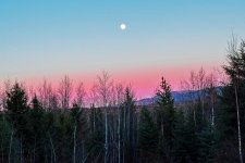
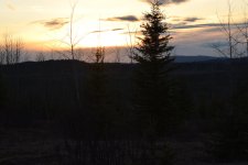
Agreed. Your shot is way heavy at the bottom with all those shadows. The eye is drawn to the brightest area and the subject of your photo but it's the smallest part of the frame. As Mike points out, about a third of the frame should be foreground and the rest subject (speaking to this shot in particular). The dynamic range of shots like this one stretch the limits of our current technology so the best thing to do (IMO) is expose for the highlights; squeeze in as much as you can but without clipping (your Histogram is your friend here). Do not eeeeven worry about how the shot looks in preview at this point. I say again for emphasis: NO CLIPPING. Once in post you pull up the shadows and mid-tones (ah ha!), tweak the color... et voila: Joy!I'm far from being an expert, but I think next time move the horizon to the bottom third of the frame. This captures more of the sky and won't chop off the tops of the trees.
.....
Last edited:
As a general rule, if you are showing the sky then 2/3 sky 1/3 ground. If you're showing something on the ground then 2/3 ground 1/3 sky.
To capture the colors of the sky you will need to underexpose a bit and not rely on your light meter. The light meter is always trying to bring the image up to "proper" exposure which will cause you to lose the colors.
Again, all of this is general instruction. As photographers we need to know when to deviate.
I love this kind of shot but, as you can see, I'm not very good at it yet! Some pointers and suggestions would be appreciated.
View attachment 153863
I see you used a 70mm focal length. This shot screams for a wide angle FL. I see you have the 18-55mm lens. Nothing wrong with it, in fact I have taken lots of shots with it and still do on occasion.
Also as others have mentioned the most interesting part of your shot is at the top 1/3rd of the frame. Exposure, IQ and light manipulation means absolutely nothing in a badly composed shot.
You can have the best gear, the best light and the best subject matter in the world, it will still be at worse, a bad shot and at best, un-interesting.
Sorry to be harsh, but you need to learn composition first and foremost.
canuck257
Senior Member
2nd attempt is much better. In post, bump up the shadows too to try and get some details in there.
I'm using Photoshop Elements 13 for post or I will be when I learn a little more about it. Can you point me at the PSE "tool" that will achieve this? Can it be done in ACR?
kevy73
Senior Member
Dodge and burning in PS Elements... https://www.youtube.com/watch?v=nQBElvRhYhA
ACR will have a shadow slider than you can use to brighten or darken area's of shadow...
ACR will have a shadow slider than you can use to brighten or darken area's of shadow...
canuck257
Senior Member
Dodge and burning in PS Elements... https://www.youtube.com/watch?v=nQBElvRhYhA
ACR will have a shadow slider than you can use to brighten or darken area's of shadow...
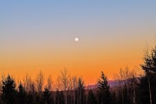
Gave it a go!

Horoscope Fish
Senior Member
Personally, I think the exposure is spot-on; I wouldn't touch it. Nothing wrong with black Blacks.I hope this shows some improvement and the incorporation of a few of your suggestions for which I thank you all?
View attachment 154449
I would have framed the shot with the moon much more off-center, both vertically and horizontally to improve the composition, but even so this shot is a HUGE improvement over the last.
.....
Horoscope Fish
Senior Member
If this were my shot I'd crop it 5 x 7, drop the midtones a little, bump the Vibrance about ten points and call it good (image was resized):
......

.....
......
.....


