Decaying old pub

Waxed

Senior Member
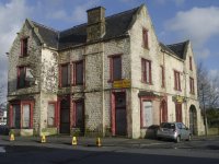
Any tips on how to improve this - colours, composition, angle & vantage point of the shot etc. What I really want to show/highlight is the decayness of the building. Lighting wasn't great when I took the photo.
b1.jpg

I have only cropped the original image slightly and corrected the lens distortion. All comments appreciated.
 

Sharin

Senior Member
First off, I'd give it more head room if you have it on the original file. Then, I'd like it better if the modern parts were removed. I know...big hassle. But I think the cones and the car don't add to the picture at all.

And you're right about the light not helping. The light is rather strong/harsh, making the white paint look brighter. I'm not sure how to bring out the decayed parts any better. Maybe someone else with chime in with some suggestions. ...perhaps a texture or action would help. (?)
 

wev

Senior Member
Contributor
I think that this is a good candidate for a B&W image -- carries the mood better. I cropped the image as it wasn't framed too well and got rid od distracting bits. I adjusted the lighting and added a touch of contrast t emphasize the decay. It is just a quick fiddle and would be better using the original file.

Nice building to shoot

Gray.jpg
 
Top