You are using an out of date browser. It may not display this or other websites correctly.
You should upgrade or use an alternative browser.
You should upgrade or use an alternative browser.
Believe in fitness
- Thread starter ewick
- Start date
Don Kuykendall_RIP
RIP :(
Would be better if you limited it to only one photo for feedback.
It's just my old skool eyes, but the people look rather freaky and unattractive to me. If these photos appeared in a magazine, I'd pass by them without a second look. Again, it's just me and I'm not likely the target market for such.
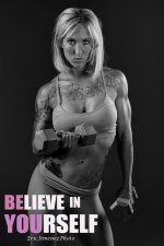
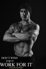
Portraits of fitness people are suppose to look edgy. Especially on someone having tatoos. The light is meant to show the muscle tone. Having light that is softer hides allot of the character.
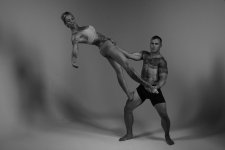
The first two are a little dark--there isn't enough separation between them and their backgrounds. The third one has separation between them and their background, but both of the people appear a little too dark. I can't see enough detail on their faces.
I worked in a health club for years. The bodies of these models are quite sculpted, but I'm not fond of the tattoos. I've seen bodies with tattoos but am having a hard time trying to decide if their sculpted bodies or the tattoos are the subject in the first two photos.
I worked in a health club for years. The bodies of these models are quite sculpted, but I'm not fond of the tattoos. I've seen bodies with tattoos but am having a hard time trying to decide if their sculpted bodies or the tattoos are the subject in the first two photos.


