You are using an out of date browser. It may not display this or other websites correctly.
You should upgrade or use an alternative browser.
You should upgrade or use an alternative browser.
Another Bum Hotel Pic
- Thread starter Cowboybillybob1
- Start date
BackdoorArts
Senior Member
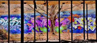
I could only wish for a straighter line with the graffiti'd wall, but what are you gonna do?
I do find the brightness of the area above and below the wall to be a little distracting. If you could tame those areas (not including the overhang of the building, but between that and the wall) it would have a little more impact. Tough to do with the tree, I know.
I do find the brightness of the area above and below the wall to be a little distracting. If you could tame those areas (not including the overhang of the building, but between that and the wall) it would have a little more impact. Tough to do with the tree, I know.
Having the tree dead center is confusing. Looking at it I am not sure if it is the main story of the picture, or the back ground is.
Maybe move it a panel or two sideways and crop out some of the lower foreground clutter will help the picture tell a story.
It is an interesting picture.
Maybe move it a panel or two sideways and crop out some of the lower foreground clutter will help the picture tell a story.
It is an interesting picture.
Cowboybillybob1
Senior Member
no picture - no avatar electron gods must not like u this morning
http://i1072.photobucket.com/albums/w372/cowboybillybob1/BumsHotelWindow2.jpg
Try that. Iknow it showed for others.
Don Kuykendall_RIP
RIP :(
I like it as is. I think it tells a story.
Cowboybillybob1
Senior Member
I like it as is. I think it tells a story.
Thanks Don. I feel it tells a story as well. The tree is tired and old but still looking to bloom in the spring. The graffiti also depicts decay but there is still joy in it. The colours are bright and hopefull.
I imagine if I spent more time it could have been marginally better but I was frezzing my butt off. Besides this is not the safest place to hang out.
Thanks to all for your comments. I take them all seriously in hopes of improving my technique and ability to communicate through photography.

