You are using an out of date browser. It may not display this or other websites correctly.
You should upgrade or use an alternative browser.
You should upgrade or use an alternative browser.
A Few Shots Around The City
- Thread starter gohan2091
- Start date


Don Kuykendall_RIP
RIP :(
On the feedback section you really need to only post on picture so people can comment on it. Kind of hard on multiple photos.
Michael J.
Senior Member
A feedback is a feedback to get something to read about the pics what other thinks - Therefore a feedback is no good or bad, it is just an opinion of others. What you're doing with the opinions is in your hand
Maybe you delete some photos and show only one in your posting. (Personally I have one favorite as subject already)
Maybe you delete some photos and show only one in your posting. (Personally I have one favorite as subject already)
Michael J.
Senior Member
As subjects I like the houses on the lake with the boat in foreground the best - The other I like is the bridge.
WhiteLight
Senior Member
Great pics!
Am guessing you've used Photomatix? It's just right, not over done..
I may have a lttle bit of a problem with the framing of some of the pics, but otherwise really nice
Am guessing you've used Photomatix? It's just right, not over done..
I may have a lttle bit of a problem with the framing of some of the pics, but otherwise really nice
I will pick the 2nd photo to comment on.
Overall I like the photo, but what troubles me about it, is, when my eye is drawn up the road to the car, then the person, they are not horizontal.
I think it would have a lot more impact if you adjusted it to have them sitting horizontal/vertical at the expense of the buildings to the right.
Edit~ just looked at it again. I think if you adjust the roofline of the brown building at the end of the road, to horizontal, it would improve it for me greatly.
Last edited:
Horoscope Fish
Senior Member
Of the five shots you posted the three on the left numbers 1, 3 and 5, are your strongest. The ones on the right have a disjointed, snapshot sort of quality to them. The crooked horizon line killed shot #2 for me while #4 had me searching for a subject. That big white arrow wants to lead my eye right out of the frame in #4 as well and that's not helping. The three shots making up the left column are much stronger.
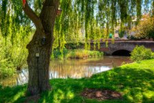
Shots #1 and #3 have very strong, organic, leading lines that deliver a pretty hefty payload thanks to some good composition. You leave some room on the left edge for my eye to fall on so I'm not lead off the edge and out of the shot. An anchoring element in both helps here as well, it just so happens they're trees in both shots, not that matters. I love the white boat in shot #1. The leading line effect is especially powerful in shot #3 with the looming tower on the right and the subordinate elements trailing left. Also some very nice composition. This shot also has a nice foreground vs background distribution with 2/3 horizon and 1/3 foreground. Shot #5 I like but I'd like it a whole lot better without all the electrical apparatus attached to/hanging off the tree. It's a minor thing but it interjects technology, if you will, in an otherwise idyllic and natural scene. This shot is why God created "content aware" tools in Photoshop... Too salvage shots like this one. Okay, maybe that's just the Irish Coffee talking but really, little s--t like that can really get under my skin. It's still a strong, well composed shot.
......
Yes, I used Photomatix for all of these. I like the HDR look but I don't like to overdo it. I feel I made the HDR look realistic and then I boosted it up a touch or two but not so much that it looks overdone.
Ironwood, thanks for your feedback. I have done what I think you suggested. Could you take a look and tell me if you think this is a stronger image?

Composition and framing is something I need to work on.
Horoscope Fish, I see what you mean by the arrow drawing you away from the photo. How would you approach this building and photograph it? The photo with the boat is actually wider than this but I cropped in because I wanted the boat at that position rather than it being more towards the lower centre. This came at a cost to the pink building to the right as it's cut in half.
I actually never paid attention to the electrical apparatus in the last photo, that's a good point, it doesn't look good being there. Here is a revision:

Horoscope Fish, you seem to know your stuff about framing, composition and leading lines. Do you have any websites or videos I can look at to learn what you know? I feel this is an area I need to address. I could go onto Google and search about this but if you know of some really good sources, I'd appreciate it if you could share them with me here.
Ironwood, thanks for your feedback. I have done what I think you suggested. Could you take a look and tell me if you think this is a stronger image?
Composition and framing is something I need to work on.
Horoscope Fish, I see what you mean by the arrow drawing you away from the photo. How would you approach this building and photograph it? The photo with the boat is actually wider than this but I cropped in because I wanted the boat at that position rather than it being more towards the lower centre. This came at a cost to the pink building to the right as it's cut in half.
I actually never paid attention to the electrical apparatus in the last photo, that's a good point, it doesn't look good being there. Here is a revision:
Horoscope Fish, you seem to know your stuff about framing, composition and leading lines. Do you have any websites or videos I can look at to learn what you know? I feel this is an area I need to address. I could go onto Google and search about this but if you know of some really good sources, I'd appreciate it if you could share them with me here.
Horoscope Fish
Senior Member
I think your edits make huge improvements. That crooked horizon line being fixed makes for some good angles. Removing the electrical elements from the bridge shot really helped as well. That's a good exercise in "taking out the trash".... Horoscope Fish, you seem to know your stuff about framing, composition and leading lines. Do you have any websites or videos I can look at to learn what you know? I feel this is an area I need to address. I could go onto Google and search about this but if you know of some really good sources, I'd appreciate it if you could share them with me here.
As for composition, this has been the hardest thing about photography for me to begin to grasp. It's an ongoing thing and I've learned, mainly, how much there is I have to learn. Still, if you want to elevate your photography from, "Oh, nice shot" to something more like "Wow! That's amazing!" then you have learn composition. I hate to call them "Rules" but they exist for a reason and that reason being, they work. They're universal, and they work and we as photographers ignore this fact at our own peril of self-imposed mediocrity. Some good starting points I can suggest are here:
Searching for "photographic composition" on YouTube or Google should give you good hits to follow up with. If you want something more in depth (!), take a look at Micheal Freeman's The Photographer's Eye That link goes to very large .pdf file that will take it's own sweet time to open, so be patient. Once it does open, I suggest saving it to your hard drive; it's an excellent resource.
Personally I find a few particular concepts are almost foolproof: Leading Lines, S-Curves, Isolating a Subject, Rule of Thirds and, my new favorite... Negative Space. Remember, though, these rules do flex and have broad application... The Rule of Thirds applies not only to where to place the subject of a photo but also horizontal and vertical balance as well. 1/3 foreground, 2/3 sky is just one example. You can reverse the proportions to redirect emphasis, depending on what your subject is, but it's much harder to get a good shot by ignoring these proportions altogether.
.....
Ironwood, thanks for your feedback. I have done what I think you suggested. Could you take a look and tell me if you think this is a stronger image?
View attachment 52387
Yes, I like that version a lot better.
I agree with what everyone is saying and it's feedback like this that will make me a better photographer (and editer  ) I'll check out that large PDF file and also the links you posted in your message Horoscope Fish. I've heard of all the following terms Leading Lines, S-Curves, Isolating a Subject, Rule of Thirds and Negative Space but I don't know much about any of them (Rule of Thirds I understand the most).
Thanks people, I appreciate it a lot.
) I'll check out that large PDF file and also the links you posted in your message Horoscope Fish. I've heard of all the following terms Leading Lines, S-Curves, Isolating a Subject, Rule of Thirds and Negative Space but I don't know much about any of them (Rule of Thirds I understand the most).Thanks people, I appreciate it a lot.