You are using an out of date browser. It may not display this or other websites correctly.
You should upgrade or use an alternative browser.
You should upgrade or use an alternative browser.
Trying to better my photography
- Thread starter cichy1012
- Start date
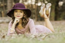
I like the image, but it looks over exposed, which may be the conversion, my monitor, etc. I think she is pushed just a bit too close to the top -- the hat and her shoes have a good deal of visual weight and need to be a touch (say 5%) lower in the frame. Your horizon is also off and distracts. Leveling it off would have no affect on the model and might even add a bit more emphasis to the pert look of her pose.
But I just shoot silly birds as I find them, so grain of salt.
But I just shoot silly birds as I find them, so grain of salt.
The colors are a bit washed and a bit overexposed. However, I know upload and conversion to jpeg can goof things up. On the other hand, maybe your were going for that bit of a washed look which is some photographers style.
For the above reasons I will just focus on composition. The distance behind her (photo right side) is larger than in front of her (photo left). Your subject also sits high in the photo. You need better placement on the thirds (if you're not familiar - study study study the rule of thirds). For these two reasons she seems crammed into the upper left side/corner. Here is your photo with the thirds overlaid.
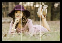
With the thirds do you see how cramped it is on the left and open on the right.
Here is a photo crudely recomposed getting her in line with the thirds and her eye on the thirds intersection and the other eye on the third line.
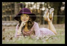
A little more room in front of her so she's not crammed against the wall and the eye at a point of interest - thirds intersection.
Hope this helps. It's a great photo idea, but needs to be further polished.
For the above reasons I will just focus on composition. The distance behind her (photo right side) is larger than in front of her (photo left). Your subject also sits high in the photo. You need better placement on the thirds (if you're not familiar - study study study the rule of thirds). For these two reasons she seems crammed into the upper left side/corner. Here is your photo with the thirds overlaid.

With the thirds do you see how cramped it is on the left and open on the right.
Here is a photo crudely recomposed getting her in line with the thirds and her eye on the thirds intersection and the other eye on the third line.

A little more room in front of her so she's not crammed against the wall and the eye at a point of interest - thirds intersection.
Hope this helps. It's a great photo idea, but needs to be further polished.
The colors are a bit washed and a bit overexposed. However, I know upload and conversion to jpeg can goof things up. On the other hand, maybe your were going for that bit of a washed look which is some photographers style.
For the above reasons I will just focus on composition. The distance behind her (photo right side) is larger than in front of her (photo left). Your subject also sits high in the photo. You need better placement on the thirds (if you're not familiar - study study study the rule of thirds). For these two reasons she seems crammed into the upper left side/corner. Here is your photo with the thirds overlaid.
View attachment 185991
With the thirds do you see how cramped it is on the left and open on the right.
Here is a photo crudely recomposed getting her in line with the thirds and her eye on the thirds intersection and the other eye on the third line.
View attachment 185992
A little more room in front of her so she's not crammed against the wall and the eye at a point of interest - thirds intersection.
Hope this helps. It's a great photo idea, but needs to be further polished.
Very nicely done and explained.
Don Kuykendall_RIP
RIP :(
Great idea and pose but I have to agree on the overexposed and framing. Already explained.
You have a great eye for the art and that is a better start than most people have so just time to polish the craft no.
You have a great eye for the art and that is a better start than most people have so just time to polish the craft no.
rocketman122
Senior Member
criticism, you will always get in bulk. but I have mad respect for a photog who is open and willing to learn. I didnt read the comments above but a bit warm, abit overexposed and composition is a just a bit off center. but I think your conversion may be off. but basically just subtle tweaks. if you were using iso 3200 and 1/100 with f/4, then you were in very low light. and you did well. cheers.
This is fantastic from all. I really do appreciate it. I definitely see what you all are saying. I didnt take into account about the model being crammed and to high. Composition...composition. The rule of thirds, I know this, ive heard this, just seems easier said then done sometimes.. I sit there like a hunter through my view glass concentrating on the focus and just getting the shot.---I will learn.. practice...practice..
I thank you all
I thank you all
. Composition...composition. The rule of thirds, I know this, ive heard this, just seems easier said then done sometimes.. I sit there like a hunter through my view glass concentrating on the focus and just getting the shot.---I will learn.. practice...practice..
I thank you all
Seeing your response I have no doubt you will do well. The analogy of being a hunter is dead on. And just like a persons first hunt you're excited to see something and not much else registers. However, with time and experience more and more things become second nature and you will be able to manage more things at once.
To Rocketman's point, the fact you were shooting at ISO 3200 you did freaking amazing. That ISO level is well outside of the comfort range of the sensor.
To Don's point, you have an eye for what you did and a beautiful model. Having an eye is not something you can readily learn, but these other things, editing, composition, etc... that will all come.
Keep shooting and sharing, you're on your way.
I have no experience in portraits, but I do know what I like.
For some reason my eyes keep shifting to her raised up feet, where the focus should be her face. Also enlarging the picture ,I notice that the eyes are a little soft. Where is that focus point in that shot? It should be on the eyes. If it was on the eyes, then you may need to AF tune the lens for better focus accuracy.
Also the WB looks a bit on the warm side to me.
I have no experience in portraits, but I do know what I like.
For some reason my eyes keep shifting to her raised up feet, where the focus should be her face. Also enlarging the picture ,I notice that the eyes are a little soft. Where is that focus point in that shot? It should be on the eyes. If it was on the eyes, then you may need to AF tune the lens for better focus accuracy.
Also the WB looks a bit on the warm side to me.
interesting.. another thing i didnt notice. I believe I was focusing on her eyes. AF tune...is there any easy way to check this? its a new camera could it be out of adjustment?
The focus he was referring to was not the image being in focus but where the point of interest was, what caught his attention. However, that can be subjective. I am drawn instantly to the eyes and then eventually down her back towards the raised legs. For me it's a good natural flow through the picture.
Your image is in focus on her face.
If I remember correctly, because I'm on my phone at the moment, you are shooting with a D7100. The D7100 does have a fine tune for your lenses.
Your image is in focus on her face.
If I remember correctly, because I'm on my phone at the moment, you are shooting with a D7100. The D7100 does have a fine tune for your lenses.
Last edited:
I am not a Portrait guy (for that matter not much of any kind of photographer. Ha!), but it appears to me that the focus point was on the face. The feet look to be starting to blend into the bokeh, but I am blind on some days and can't see on others. Ha! As has been stated, it is just a little "bright", but that is a matter of personal taste.

