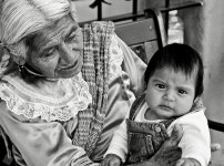
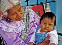
Mexican woman and child

DW_

Senior Member
This image is from a trip to Jalisco in 2009. I like the flow that starts at the older woman thru her gaze to the baby and back out to the viewer. It has a natural feel to the flow.

But I keep going back and forth between between the B&W and the color version and can make arguments for both. I like the vivid colors of the woman's dress and the background but the B&W seems to be more expressive once you remove the distraction of all the colors.
Suggestions?

D70s
18-70mm F/3.5-4.5; ISO 200; f 6.3, 1/160 sec @70mm
Color Efex 4 and Silver Efex pro 2, respectively.

Color
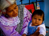
DSC_0257-Edit-sm.jpg

and in B&W

DSC_0257-Edit-2-sm.jpg
 

Carolina Photo Guy

Senior Member
This one is interesting. I love the subject matter, how-ever the color version seems to be over saturated to me.

But the B/W version needs more contrast to really pop off the screen. Bear in mind that my critiques are my opinion ONLY

and do not reflect the opinions of the management of this website. Your mileage may vary due to varying shooting conditions.

We are professionals here. DO NOT TRY THIS AT HOME! Ah, go ahead and try this. But if you get hurt, it ain't my fault. :)
 

Marcel

Happily retired
Staff member
Super Mod
I think the color shot could be used if processed properly. I find it way too dark and over saturated.

Here's what I did in CS5: reduce saturation -32, using curve bring the mid tones lighter a tad and a little bit of hue correction.

This is what I got just to give you a hint.

DSC_0257-Edit-sm copy.jpg
 

Marcel

Happily retired
Staff member
Super Mod
Oh and I forgot, I would also photoshop her finger out in the bottom right corner.
 

Dr Daniels

Senior Member
Great composition! The old lady looking at the child, and the child looking at the photographer. It makes an excellent flow of eye-lines using diagonals.
I like the contrast of colors and also the rich texture which is great for B&W.
 
Last edited:

bluenoser

Banned
Hi Dave.

I'm with Pete (Lord help me :D) on this one. I'd go for the B&W but IMHO it definitely needs more contrast and less brightness. Also, to my eye seems a tad over-sharpened.

Thanks for posting this compelling image.
 

DW_

Senior Member
Yeah, you might be right about the sharpening. I'll tell ya, I have gone back and forth with this photo so many times. I think I currently have over 15 iterations at the moment and that's not counting the ones I've not exported. I just can't seem to get it right, everything I do just doesn't quite feel right. Frankly, I don't know why I've labored so much over this one, something about it that I can't quite put my finger on that just doesn't seem complete and I can't quite put my finger on it. Maybe it's one of those "forever" work in progress shots?
 

Rick M

Senior Member
I was drawn first to all of the wonderful and contrasting textures as mentioned by Doc. Coarse/fine fabrics and hair, new skin and mature skin, wood/metal/cement. To me these are all brought out more in the B&W. Fantastic composition and work!

Suggestions- The water bottle, can it be cloned out? The edges of the photo are busy, cut off items like hair and hands, perhaps some vignetting to blend them off the edge?
 

ccoulson

Senior Member
I really Enjoy the black and white image. It looks crisp and clear and to me. I feel the emotion of this photo more without all of the colors. I focus more on the people and the intricate details and lines in her face, which to me, seem to get lost in the color version.
 
Last edited by a moderator:
Top