Fall Attention

hotrocks

Senior Member
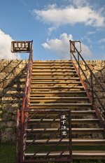
I went out to Zakimi-jo castle runins (in Okinawa) a few days ago, and besides the cool stone work and awesome views, I was particularly drawn to this ruggedness, texture, and color of this old railing that had a loosely translated sign on it. "Fall Attention," as in Pay Attention, because when you get up to the top there are no railings. I took a few pictures from one angle, and then this happened by chance. The gentlemen (biker) was actually pointing out to the view and explaining it to the other, but I like the effect it gives with the sign in and facial expressions in play.

I am curious to hear what people think about the photo, so I decided to post it. -Cheers
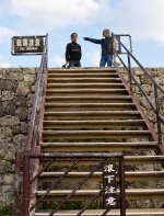
fallattention.jpg

Nikon D90
18-105
ExposureTime: 1/30
MaxApertureValue: 3
FNumber: 22.0
ISOSpeedRatings: 200
Focal Length: 18 mm
 
Last edited:

fotojack

Senior Member
What grabs my attention right away is the stairs, not the people at the top. They're superfluous to the main subject matter in my view. I like the texture of the stone against the sleekness and straight lines of the stairs, both vertical and horizontal. I would perhaps crop out from the top of the wall or Photoshop out the people. They add nothing to the overall shot. Those are my views and I'm sticking to them. :)

You should have added the EXIF to this shot, as we know nothing of what lens you used, filter, distance, etc. It's clearly stated in the Critique Rules.
 

Ruidoso Bill

Senior Member
Brought back memories, I remember that site, was there in 1975 or so (not when the ruins were newly built). I also like the contrast of the rock and sleek steel. Without the guys it looks like the stairway to heaven or nowhere, it is slightly tilted up on the right (easy fix) and with something as straight as the stairs caught my eye. I think even more contrast or crank up the blacks slider a little would look great, maybe "Burn" and darken the clouds a little would add some drama. Shots like this also make great HDR candidates. Thanks for sharing and bringing back old memories.
 

Browncoat

Senior Member
Ah yes, Engrish. Gotta love it! A friend of mine recently visited Japan and sent home many photos of these off-kilter translations, which are always good for a chuckle. Thank you for editing and posting your EXIF data...now on to the critique:

After reading your description of how this photo came to be, I get it. I can place myself at the scene of the crime and see those events unfolding. The composition here is an accurate depiction of those events. However, for me at least, this is one for the recycle bin. It's one of those shots that almost was...but not quite. Good idea, poor execution. Not the fault of the photographer, it's just that a better angle (and probably closer) would've done this scene better justice. If the focus is the sign, it should be more prominently featured. I don't know if cropping off 80% of the photo would add attention to the sign or not, or if the photo would lose too much detail, but that is what my gut is telling me here.

On technical merits, you exposed for the foreground, which is good in this case. But, I tend to agree with Bill. Exposing for the foreground has left the sky a bit washed out, which could easily be fixed in post processing.
 

hotrocks

Senior Member
Here is the same shot with some suggestions (minus the recycling bin)

fallattention22.jpg

NIKON D90
ISO: 200
ExposureTime: 1/200
MaxApertureValue: 4
FNumber: 11.0
Focal Length: 25 mm
 
Last edited:
Top