Composition

stvn

Senior Member
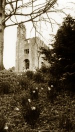
I have taken this shot so the eye leads up to the ruins like an upside down 'V' shape.
I am now thinking that perhaps I should have used the rule of two thirds to compose this image.
Hindsight is a wonderful thing :confused:
Any thoughts?


image10_zps1d958b20.jpg


The photo was taken with a Nikon F2as with a 28mm f2.8 lens and Ilford XP2 Super 400 Black & White film.
 
Last edited:

fotojack

Senior Member
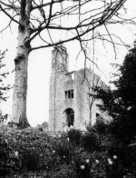
Steve....this is my version of what you posted. A little different perspective, and different "toning". Many different ways of cropping and toning this shot, but this is what I saw in my mind's eye. What do you think? Better? Worse?

image10_zps1d958b20b.jpg
 

wud

Senior Member
Not sure you need to crop differently. The first thing my eye landed on, was the house. You got the flowers leading up to, dark at the bottom, light where you want focus. Well, I like the shot :) Maybe you could crop of a bit on the left side, so you didnt have that light grapping your eyes to go there?
 

stvn

Senior Member
Steve....this is my version of what you posted. A little different perspective, and different "toning". Many different ways of cropping and toning this shot, but this is what I saw in my mind's eye. What do you think? Better? Worse?

View attachment 32151

Hi Jack,
Thanks for your cropped version.
I like the way the ruins sits in the 'portrait' frame making it look more prominent but not sure if there is too much foliage in front?
 

wud

Senior Member
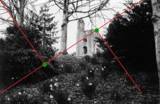
Have you read about triangle composition?

I've placed the lines in your picture and I think you got something with your composition.

test.JPG
 
Last edited:

stvn

Senior Member
I have never heard of triangle composition?
I will have to Google it to find out more...watch this space :)
 

stvn

Senior Member
Ok, I have just visited some sites on Triangle Composition and I do like the theory and will try this out next time on purpose. In my image here I deliberately wanted to capture part of the tree on the right edge to give the picture a feeling of depth, all the rest just happened.
 

crycocyon

Senior Member
So the tree is competing with the church for attention and the center of attention which is the church is too far away with the foreground taking too much weight and pulling the eye down instead of drawing it back to the building. Even with cropping it is difficult. I would have moved physically closer so that you are almost just behind the small pine tree on the right and compose it so the white tree isn't even there, or that its branches would be higher above the top of the church and just barely on the left as a frame as shown by Jack. Also please read my signature line LOL. ;)

That being said, I do very much like the textures and tonal range in this black and white version of the photo.
 

wud

Senior Member
No offens to the golden ratio, but there are SO many more lines to go for to get a dynamic picture.

I dont quite understand the suggestions with this huge crop, but guess we see the picture differently, I saw it as a scenery of a landscape - with a touch (the house). What is the reason you guys think that crop is better? Hope you dont get me wrong, I am just curious.


Crycocyon, your signature are good :)
 

stvn

Senior Member
So the tree is competing with the church for attention and the center of attention which is the church is too far away with the foreground taking too much weight and pulling the eye down instead of drawing it back to the building. Even with cropping it is difficult. I would have moved physically closer so that you are almost just behind the small pine tree on the right and compose it so the white tree isn't even there, or that its branches would be higher above the top of the church and just barely on the left as a frame as shown by Jack. Also please read my signature line LOL. ;)

That being said, I do very much like the textures and tonal range in this black and white version of the photo.

For the record this is an original 35mm Black and White photo and not touched up in any way whatsoever, it is simply scanned from the original print.
 

Horoscope Fish

Senior Member
I dont quite understand the suggestions with this huge crop, but guess we see the picture differently, I saw it as a scenery of a landscape - with a touch (the house). What is the reason you guys think that crop is better? Hope you dont get me wrong, I am just curious.
IMO, crycocyon pretty much nailed what the photo needs...

The trees are competing with the building for attention while the subject is small (far off) and too centered. Adding to that there is too much dark foreground weighing down the frame. Good composition would give equal thirds to foreground and background in this frame. Cropping helps bring the attention to the subject... In this shot it only helps "so much" but IMO it needs a hard cropping to better frame and isolate the subject. Now how, and how much, exactly, it needs to be cropped I'll agree is open to debate. :)

Having re-read your post I do see your point, but if the shot is a landscape then the building in competition with the land and if the subject is the building then the landscape is in competition with that. This shot needs to be about one or the other because it can't be about both.

Just my take...
 
Last edited:

wud

Senior Member
IMO, crycocyon pretty much nailed what the photo needs...

The trees are competing with the building for attention while the subject is small (far off) and too centered. Adding to that there is too much dark foreground weighing down the frame. Good composition would give equal thirds to foreground and background in this frame. Cropping helps bring the attention to the subject... In this shot it only helps "so much" but IMO it needs a hard cropping to better frame and isolate the subject. Now how, and how much, exactly, it needs to be cropped I'll agree is open to debate. :)

Having re-read your post I do see your point, but if the shot is a landscape then the building in competition with the land and if the subject is the building then the landscape is in competition with that. This shot needs to be about one or the other because it can't be about both.

Just my take...

Okay :) Thanks for explaining. I agree in some of your points but actually I like that you have to look around at the picture and for me the cropped version gets to... BAM. This is what you are gonna look at and nothing more.
 
Top