You are using an out of date browser. It may not display this or other websites correctly.
You should upgrade or use an alternative browser.
You should upgrade or use an alternative browser.
Here's another let me know what you think
- Thread starter shakedown
- Start date
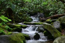
This is actually a very lovely scenic. You have blurred the water just enough to give a nice sense of motion. If you want to create an "etherial" atmosphere to it, you can go for as long as a second. If I might make one more recommendation on composition. If you place the water in the middle of the frame, it makes the image look kind of static. By moving the right margin over some, you have the water starting close to the edge of the frame and moving INTO the frame. This makes the composition a lot more interesting and adds even more motion to the overall image. Also, all that foliage in the upper half of the frame is rather distracting, I would get rid of most of it, Below is an example of what I am talking about:
Lovely image, but I find it to be slightly out of focus. Not by much, but still out.
I like it too. However, I noticed the same thing. I am thinking a slight shake / vibaration during camera actuation or unstable ground using his tripod. It appears to have some noise also but I couldn't check the exif data. What was the ISO that you used?
Lovely image, but I find it to be slightly out of focus. Not by much, but still out.
I am thinking that may be more due to camera movement Jack, owing to the longer exposure. Usually you have to have the shutter open a good 1/4 second or even longer, to get water blurring that smooth. Which is why, especially with older film cameras, it is always adviseable to lock the mirror up, if your camera has that capability, and either use the self timer or a cable release to trip the shutter.
Last edited:
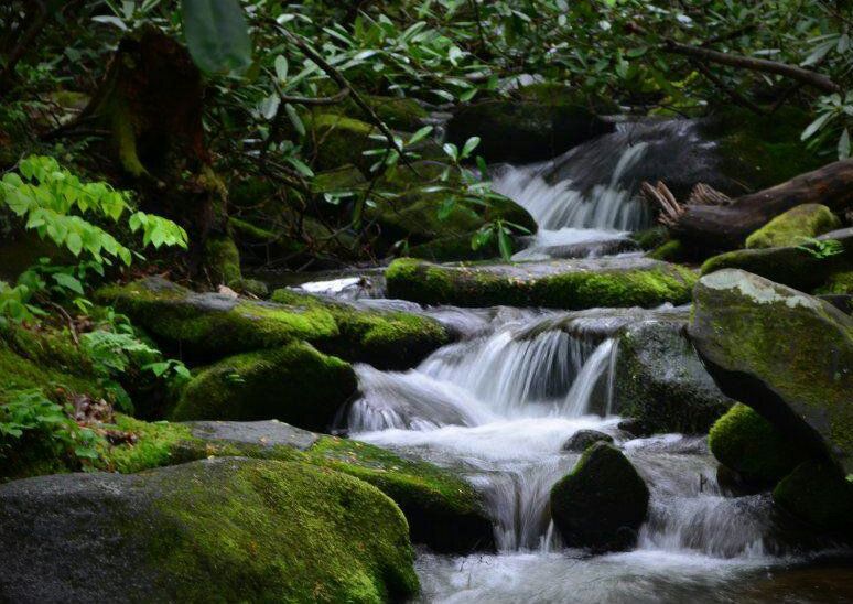
Concurring with what's been already said, I took a stab at composing it the way I would like to see it. I would almost shoot vertical on this because there is a nice step-wise progression of water down the different levels to the bottom of the frame and that should be emphasized. I also think that if it is even a little bit bright, that brightness somehow flattens the image and makes it less three-dimensional. I've adjusted the brightness, sharpness, and cropped a bit, and actually ended up putting it more center just because it emphasized the pattern of the waterfall itself.

Another thing about nature scenes, I find even just a few leaves that are brighter than the others distracting (particularly the ones on the left of the original image. There should at least in my mind be very few highlights in a photo like this that would distract from the "movement" of the water. I always think in terms of a pastel painting and that everything should be balanced in terms of intensity.
Another thing about nature scenes, I find even just a few leaves that are brighter than the others distracting (particularly the ones on the left of the original image. There should at least in my mind be very few highlights in a photo like this that would distract from the "movement" of the water. I always think in terms of a pastel painting and that everything should be balanced in terms of intensity.
Last edited: