You are using an out of date browser. It may not display this or other websites correctly.
You should upgrade or use an alternative browser.
You should upgrade or use an alternative browser.
Hark's 2014 Occasional Photos
- Thread starter hark
- Start date
Are you seeing any turtles?
I've never seen any at the park, but there is a creek that runs from one side of the roadway to the other (the creek run underneath the road). Plus there is one huge lake as well as smaller bodies of water in the park so no doubt there are turtles there somewhere. We even have turtles in my development plus at a quarry behind the development so turtles are becoming more common to see.
")
wreckdiver1321
Senior Member
Just been catching up on this thread... You have a great eye! You really like experimenting with light, and I like it. Very nice work!
Just been catching up on this thread... You have a great eye! You really like experimenting with light, and I like it. Very nice work!
Thanks for the kind words, wreckdiver1321! Your comment is very much appreciated. I've been side-lined lately but was able to get out for the first time in a while yesterday. It was literally like a breath of fresh air!
wreckdiver1321
Senior Member
Thanks for the kind words, wreckdiver1321! Your comment is very much appreciated. I've been side-lined lately but was able to get out for the first time in a while yesterday. It was literally like a breath of fresh air!
Happens to the best of us.
Keep it up! How do you like that D610? I have changed my mind and I'm pretty sure I'll be getting one of those soon instead of a D7100.
Happens to the best of us.
Keep it up! How do you like that D610? I have changed my mind and I'm pretty sure I'll be getting one of those soon instead of a D7100.
I learned photography on a 35mm camera so I LOVE my D610. With the way you shoot wide angle shots, a D610 will serve you well!!! All your work is awesome, but I always gravitate towards your wide angle because you do them so well.
wreckdiver1321
Senior Member
I learned photography on a 35mm camera so I LOVE my D610. With the way you shoot wide angle shots, a D610 will serve you well!!! All your work is awesome, but I always gravitate towards your wide angle because you do them so well.
Thank you very much!
It's been a while since I posted any photos (health problem that's much better now). I've been away from photography long enough to forget how to format the text for my copyright. Got it figured out.
Autumn is a spectacular time of year here in Pennsylvania especially when the leaves change. What usually happens is we get a huge storm that blows off most of the leaves before they turn color, but this year is different. We've enjoyed some beautifully colorful scenes!
I went to Bowman's Tower. This tower sits high atop a hill. Supposedly the hill was used as a lookout point by George Washington before he invaded the troops over in New Jersey. Bowman's Tower was built around 1930 to commemorate what he did.
This is the top part of the tower.

Bowman's Tower 1 by *Hark*, on Flickr
In case you didn't get a good look, here's a closer view.

Bowman's Tower 2 by *Hark*, on Flickr
It's a very steep drive up the hill which makes me wonder just how they managed to transport the stones to the top of the hill.

Bowman's Tower 3 by *Hark*, on Flickr
Here is the view from the top of the tower. That is the Delaware River with New Jersey on the opposite side.

Bowman's Tower 4 by *Hark*, on Flickr
And here's another view from the top looking in the opposite direction.

Bowman's Tower 5 by *Hark*, on Flickr
And here is a zoomed in look from the top.

Bowman's Tower 6 by *Hark*, on Flickr
Got it figured out.Autumn is a spectacular time of year here in Pennsylvania especially when the leaves change. What usually happens is we get a huge storm that blows off most of the leaves before they turn color, but this year is different. We've enjoyed some beautifully colorful scenes!
I went to Bowman's Tower. This tower sits high atop a hill. Supposedly the hill was used as a lookout point by George Washington before he invaded the troops over in New Jersey. Bowman's Tower was built around 1930 to commemorate what he did.
This is the top part of the tower.
Bowman's Tower 1 by *Hark*, on Flickr
In case you didn't get a good look, here's a closer view.
Bowman's Tower 2 by *Hark*, on Flickr
It's a very steep drive up the hill which makes me wonder just how they managed to transport the stones to the top of the hill.
Bowman's Tower 3 by *Hark*, on Flickr
Here is the view from the top of the tower. That is the Delaware River with New Jersey on the opposite side.
Bowman's Tower 4 by *Hark*, on Flickr
And here's another view from the top looking in the opposite direction.
Bowman's Tower 5 by *Hark*, on Flickr
And here is a zoomed in look from the top.
Bowman's Tower 6 by *Hark*, on Flickr
Horoscope Fish
Senior Member
Nice to have you back, Hark...
....
....
Here is the inside of the tower's top. The photo came out of the camera looking more like a sketch than a photo.

Bowman's Tower 7 by *Hark*, on Flickr
And here is a more majestic view of the tower.

Bowman's Tower 8 by *Hark*, on Flickr
It's difficult to get a good shot of the entire tower because there are steps behind where I'm standing. Fortunately I had a wide enough lens with me to fit it all in. Unfortunately perspective distortion starts to kick in when the lens is aimed up slightly.
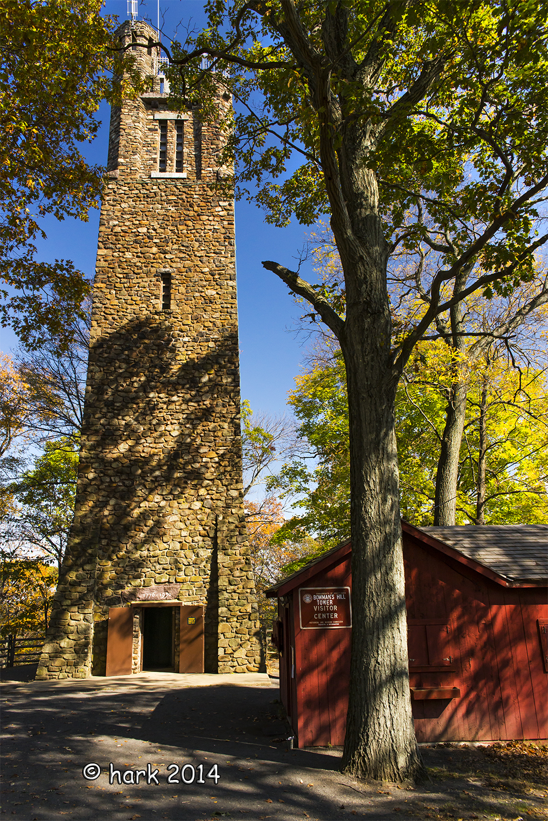
Bowman's Tower 9 by *Hark*, on Flickr
Here is the office that sits outside the tower. The cost to go to the top of the tower is $6 per person. There is an elevator installed, but when I was a kid, the only way to the top was to climb the circular stairs. The stairwell narrows considerably when you reach the top. It's only 2-feet wide or so at the very top, and the steps are VERY steep.

Bowman's Tower 10 by *Hark*, on Flickr
And here is a parting shot of the grounds before I left. It's a gorgeous place to visit and an area that is rich with history!

Bowman's Tower 11 by *Hark*, on Flickr
Bowman's Tower 7 by *Hark*, on Flickr
And here is a more majestic view of the tower.
Bowman's Tower 8 by *Hark*, on Flickr
It's difficult to get a good shot of the entire tower because there are steps behind where I'm standing. Fortunately I had a wide enough lens with me to fit it all in. Unfortunately perspective distortion starts to kick in when the lens is aimed up slightly.
Bowman's Tower 9 by *Hark*, on Flickr
Here is the office that sits outside the tower. The cost to go to the top of the tower is $6 per person. There is an elevator installed, but when I was a kid, the only way to the top was to climb the circular stairs. The stairwell narrows considerably when you reach the top. It's only 2-feet wide or so at the very top, and the steps are VERY steep.
Bowman's Tower 10 by *Hark*, on Flickr
And here is a parting shot of the grounds before I left. It's a gorgeous place to visit and an area that is rich with history!
Bowman's Tower 11 by *Hark*, on Flickr
BackdoorArts
Senior Member
Haven't been there since I was a kid. Been meaning to get back. I thought I'd heard that they were going to shut down public access because of park funding. Glad to see it's open.
Haven't been there since I was a kid. Been meaning to get back. I thought I'd heard that they were going to shut down public access because of park funding. Glad to see it's open.
It's definitely open. In fact, they invested a lot of money to repair the hydraulics in the elevator. The first time I went (October 6th), I had to climb the stairs as the elevator was closed. It was repaired but needed to be inspected. Before I went up, I kept wondering why people weren't staying up top for very long. When I reached the top, I was very dismayed to find a swarm of hornets buzzing just a few feet above my head!
I made a quick exit as well. When I returned last week, I rode the elevator. I didn't even feel the elevator move when I rode it so they did a really good job!
Jake, the tower always closes for the winter, but offhand I don't know the date.
Driving up and down the hill is the only time I stick my SUV into 1st gear--that drive is steep especially going up. On the way down, it isn't as steep, but using 1st gear keeps me from riding my brakes.
If I remember correctly, I took these photos around October 6th. The leaves hadn't changed much, and overall I wasn't too happy with what I shot that day. After editing a few photos, my laptop was almost completely filled with files and photos so I needed to remove a lot of items. I thought I backed these up, but somehow I accidentally skipped the folder with these images and deleted them altogether. So I pulled these from my Facebook profile. Sorry...I don't think the EXIF will show up.
After reading @BackdoorHippie's thread about correcting perspective distortion, I tackled editing these a second time. If Jake would let me know how I did, I'd really appreciate his constructive criticism. First you will see the original edited photo followed by its corrected perspective distortion photo. All constructive criticism will be appreciated, but because Jake can spot even the tiniest flaw, I will be all ears.
Camera: Nikon D610
Lens: Nikon 18-35mm f/3.5-4.5
Original photo of Bowman's Tower with the starburst of the sun. I remember using a very small aperture but can't recall the exact setting. My intent was to get the sun to show up as a starburst.

Below I corrected the perspective distortion while trying to keep as much of the starburst intact. Granted it would have been nice to have a little more room to crop while straightening. Sigh. Live and learn, right?!!

Next up is a side view of the tower--the original edited file. I do remember adjusting the perspective distortion a little in this one.

And here is the corrected version where I added a little more correction to the perspective distortion along with a tweak of lightening the shadows slightly.
EDIT: I only rotated the photo below. Since there isn't much room for cropping, I did not attempt to straighten the trees. Should have taken my 14mm lens. I believe the photos in this post were shot at 18mm.

So I pulled these from my Facebook profile. Sorry...I don't think the EXIF will show up.After reading @BackdoorHippie's thread about correcting perspective distortion, I tackled editing these a second time. If Jake would let me know how I did, I'd really appreciate his constructive criticism. First you will see the original edited photo followed by its corrected perspective distortion photo. All constructive criticism will be appreciated, but because Jake can spot even the tiniest flaw, I will be all ears.
Camera: Nikon D610
Lens: Nikon 18-35mm f/3.5-4.5
Original photo of Bowman's Tower with the starburst of the sun. I remember using a very small aperture but can't recall the exact setting. My intent was to get the sun to show up as a starburst.
Below I corrected the perspective distortion while trying to keep as much of the starburst intact. Granted it would have been nice to have a little more room to crop while straightening. Sigh. Live and learn, right?!!
Next up is a side view of the tower--the original edited file. I do remember adjusting the perspective distortion a little in this one.
And here is the corrected version where I added a little more correction to the perspective distortion along with a tweak of lightening the shadows slightly.
EDIT: I only rotated the photo below. Since there isn't much room for cropping, I did not attempt to straighten the trees. Should have taken my 14mm lens. I believe the photos in this post were shot at 18mm.
Last edited:
dh photography
Senior Member
Great shots. Glad to see you're back and doing better!
Great shots. Glad to see you're back and doing better!
Thanks, David!
Here in the eastern US, we are about to be hit with a COLD front. Brrrr!!! With winter approaching, it is my least favorite time of year. I need to find some indoor subjects to occupy my photography.
BackdoorArts
Senior Member
It's very difficult to see the differences as displayed, so I've had to save and open them in PS to give you the critique you're looking for. Before that, however, I'll say that I probably wouldn't have noticed anything in the second photo just from seeing it here. And only because you've asked I'm going to dive deep into these - far more than I would during simple observation.
OK, Photo 1 - Side by Side:

This one was/is problematic in a couple ways. The original image had some skewing issues (plural) and you can only fix one, and I believe you corrected it properly. The tower has a definitely left lean (pink lines), and that's the most important and obvious aspect to correct. Your correction is more than sufficient and is a big improvement over the original. With that said, I just want to show you just how ridiculous it can get.
While the tower appears straight, the lack of alignment of the windows suggest that it isn't - even thought it is. Why? You weren't standing dead center but slightly to the left of center (yes, I obsess about this when shooting symmetry, but only because I hate it when I notice that it's not perfect when I bring it onto the computer). The yellow line should run straight down the center, which would also correct the sky triangles, making them equivalent (the left triangle was drawn from the photo and then mirrored and brought to the right side for comparison). As you can see, the corrected photo is much better, but does not have perfect symmetry (which it doesn't have to have - I'm just being REALLY picky).
Can you fix it?

Thank you Free Transform. But is it "fixed"? Hell no!! It's even more broken!! Now I've skewed the lines in the stones, and while the lower window is centered it's now skewed. I could fix that by masking out the transformed tower and painting in the original stone work.... Aaaaahhhhhhh!!!!!!
My point is, your original correction is perfectly fine. The rest is just obsessing, and were this for the front of a park brochure or something I would probably recommend a reshoot with all the obsessive stuff fixed (though the printer would probably cut it off-center - LOL), but if I were asked to judge this in a contest or something I would likely never even mention it in the critique, assuming I even saw it in the first place.
And just to be complete, here's a side-by-side of the second photo. Yes, it had a left-lean, but not much at all and is hardly noticeable as is, but the correction is perfect.

Aren't you glad you asked?
OK, Photo 1 - Side by Side:
This one was/is problematic in a couple ways. The original image had some skewing issues (plural) and you can only fix one, and I believe you corrected it properly. The tower has a definitely left lean (pink lines), and that's the most important and obvious aspect to correct. Your correction is more than sufficient and is a big improvement over the original. With that said, I just want to show you just how ridiculous it can get.
While the tower appears straight, the lack of alignment of the windows suggest that it isn't - even thought it is. Why? You weren't standing dead center but slightly to the left of center (yes, I obsess about this when shooting symmetry, but only because I hate it when I notice that it's not perfect when I bring it onto the computer). The yellow line should run straight down the center, which would also correct the sky triangles, making them equivalent (the left triangle was drawn from the photo and then mirrored and brought to the right side for comparison). As you can see, the corrected photo is much better, but does not have perfect symmetry (which it doesn't have to have - I'm just being REALLY picky).
Can you fix it?
Thank you Free Transform. But is it "fixed"? Hell no!! It's even more broken!! Now I've skewed the lines in the stones, and while the lower window is centered it's now skewed. I could fix that by masking out the transformed tower and painting in the original stone work.... Aaaaahhhhhhh!!!!!!
My point is, your original correction is perfectly fine. The rest is just obsessing, and were this for the front of a park brochure or something I would probably recommend a reshoot with all the obsessive stuff fixed (though the printer would probably cut it off-center - LOL), but if I were asked to judge this in a contest or something I would likely never even mention it in the critique, assuming I even saw it in the first place.
And just to be complete, here's a side-by-side of the second photo. Yes, it had a left-lean, but not much at all and is hardly noticeable as is, but the correction is perfect.
Aren't you glad you asked?
You can fix that one using lens correction if you are willing to sacrifice a part of the shot and can live with some mild distortion. This one might need another degree here or there but it's just an example. We might know there's some distortion but that doesn't mean anyone else sees it.

If you got LR, I can give you the values I used for this one.
Just in case:

If you got LR, I can give you the values I used for this one.
Just in case:
Last edited:
It's very difficult to see the differences as displayed, so I've had to save and open them in PS to give you the critique you're looking for. Before that, however, I'll say that I probably wouldn't have noticed anything in the second photo just from seeing it here. And only because you've asked I'm going to dive deep into these - far more than I would during simple observation.
OK, Photo 1 - Side by Side:
View attachment 121050
This one was/is problematic in a couple ways. The original image had some skewing issues (plural) and you can only fix one, and I believe you corrected it properly. The tower has a definitely left lean (pink lines), and that's the most important and obvious aspect to correct. Your correction is more than sufficient and is a big improvement over the original. With that said, I just want to show you just how ridiculous it can get.
While the tower appears straight, the lack of alignment of the windows suggest that it isn't - even thought it is. Why? You weren't standing dead center but slightly to the left of center (yes, I obsess about this when shooting symmetry, but only because I hate it when I notice that it's not perfect when I bring it onto the computer). The yellow line should run straight down the center, which would also correct the sky triangles, making them equivalent (the left triangle was drawn from the photo and then mirrored and brought to the right side for comparison). As you can see, the corrected photo is much better, but does not have perfect symmetry (which it doesn't have to have - I'm just being REALLY picky).
Can you fix it?
View attachment 121051
Thank you Free Transform. But is it "fixed"? Hell no!! It's even more broken!! Now I've skewed the lines in the stones, and while the lower window is centered it's now skewed. I could fix that by masking out the transformed tower and painting in the original stone work.... Aaaaahhhhhhh!!!!!!
My point is, your original correction is perfectly fine. The rest is just obsessing, and were this for the front of a park brochure or something I would probably recommend a reshoot with all the obsessive stuff fixed (though the printer would probably cut it off-center - LOL), but if I were asked to judge this in a contest or something I would likely never even mention it in the critique, assuming I even saw it in the first place.
And just to be complete, here's a side-by-side of the second photo. Yes, it had a left-lean, but not much at all and is hardly noticeable as is, but the correction is perfect.
View attachment 121052
Aren't you glad you asked?
Aren't you glad you asked? Actually yes I am!
This is exactly the type of critique I was hoping for! In all honesty, I SWEAR I thought I was standing smack in the middle for the first shot. Maybe I need to turn on the in-camera grid lines for these types of corner shots. I'm not sure how you created all the colorful lines in PS, but it helps to see exactly what is going on...well, in this case exactly what ISN'T going on that should be fixed! Many thanks for your time and explanation, Jake! :excitement: