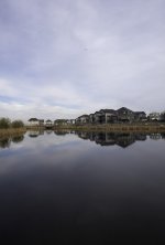
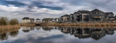
Lake Photo - Any suggestions?

mcedm22

New member

Attachments

  • DSC_0964.jpg
    DSC_0964.jpg
    36.1 KB · Views: 103

Lawrence

Senior Member
Interesting ...
My initial reaction was "too central" - that is to say the horizon should either be higher or lower and correspond with the law of thirds.
But then I quite liked it as is.
But on reflection ('scuse pun) I would move it up and crop 2/3 the sky out (as it doesn't have much exciting detail) and 1/3 of the lake to make the houses dominate a bit more.
Overall though a nice image.
 

J-see

Senior Member
What Lawrence said. I'd do thirds, either sky or lake. Try to see if which you can pull more detail out and use that as the 2/3th part. You might also want to rotate the image some degrees. I think the horizon is a bit crooked. At least it feels as such.
 

Deleted

Senior Member
Hi

I agree with Lawrence, crop the sky a little. The shot needs some more punch, so have a go with increasing the exposure & maybe tweak the clarity up a little. Then introduce a graduation in the sky to drop down the sky exposure which should bring out the clouds & sky colour.

Overall I think the shot needs some sort of centre of interest - like someone fishing in a boat. Maybe camp out there for a couple of weeks to wait for him to turn up. ;)
 

STM

Senior Member
With the exception of the reflections, the water is pretty much devoid of any detail. Perhaps a circular polarizer could have rescued something. The sky has more texture with the clouds. I would change the orientation from portrait to landscape and ditch most of the water and some of the sky.


Deleted

Senior Member
I checked the photo in Lightroom & agree with STM, the water was too dark & had little detail.

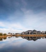
Hope you don't mind, but I downloaded your shot & processed the hell out of it. The bird has a few artefacts now that need to be tweaked, but maybe gives you an alternative idea. I processed it a little too much.

DSC_0964a.jpg

My tweaks were to increase overall exposure, then add a graduating filter down to the roof line of the houses. I then decreased the exposure in the filter. After that, I got trigger happy with clarity & vibrancy.
 
Last edited:

J-see

Senior Member
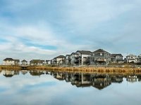
I also did one to see what is possible. Thirds would work but the other suggestion was also good. I'm still using thirds in this one.

DSC_0964.jpg

I processed it the way I do landscapes. You can do much better with the original file.
 

BackdoorArts

Senior Member
I don't mind the 50/50 crop. I think your problem is more in that you've got some cool details in there that need to be brought out, but without them you have a nice landscape captured in a portrait aspect ratio that further goes to confound the viewer as to what's interesting.

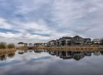
Use a gradient to lighten the dark water in the foreground so you can see some of what's reflecting in it. Then bring out some of those details in the clouds, both in the sky and the reflection (clarity, contrast and some detail extraction tools work here if you have them). Then it's just a matter of playing with saturation and light a bit (I needed to pull some reds out of the water).

15507875388_5f0677f2af_o.jpg


Or you can go to a 4:5 crop and put the horizon on the golden ratio line...

15507875388_5f0677f2af_o-2.jpg
 
Needs to follow the rule of thirds better. Also this is really a landscape oriented photo so shoot that way. Also in post processing you can boost the contrast and get a little more pop out of it. Like this

DSC_0964.jpg
 

Blacktop

Senior Member
I would change the orientation from portrait to landscape and ditch most of the water and some of the sky.


Yes, but then all he would have left is un- interesting houses. It's not a bad shot technically speaking (it can be fixed in post), but there is nothing really interesting for me when I look at it.
 
Top