Changing a shade of green

hark

Administrator
Staff member
Super Mod
I think Cindy doesn't use LR, but here is an old video I saved about using the targeted adjustment tool in LR. Nice tool for a quick fix like this.
https://www.youtube.com/watch?v=xTKBgJsnokE&feature=youtu.be

This looks very interesting and will take a longer look a little later (have an appointment soon). That isn't anything I've ever done yet.

I don't use LR, but Camera RAW offers the same features in a different layout which is what I use. So I did try something new to me. I used an adjustment brush over the green trees and painted on a light violet to tone down the greenish tint. Then I used a yellow brush over the green water to warm it up a little. Also lowered the saturation of the water in the foreground. After that I went back to PCC and did some dodging and burning to the trees.

It can definitely use more work, but take a look at the slight color changes as well as the dodging and burning. At least the greens aren't so darned ugly. ;) The first one had a vignette applied which I didn't add to the second edit.

Original Edit:

028 low res.jpg


Last Edit using the steps described above:

028 low res 2.jpg
 

BackdoorArts

Senior Member
FYI, 90% of the time when you want to mess with your unnatural looking greens it's not the greens that need adjusting, it's the yellows. Seriously.

Here's you raw file with adjustments only to the yellow channel in ACR (Hue: +43, Saturation: +30) -

Hark-ACR.jpg


The other option is not to mess with it in ACR but to just open it as is in Photoshop and use a Hue/Saturation adjustment layer. When you add the layer, use the pointer tool to click on the area you want to adjust and it will pick the proper channel (in the screen grab below I clicked on the bush on the bank - it chose yellow)...

Screen Shot 2016-08-22 at 1.31.41 PM.jpg


Once you've done that, make your hue and saturation adjustments to that channel (changing the master channel adjusts the hues on all colors, and this doesn't need that). The adjustment layer has a wider adjustment range than ACR, so you don't need to vary it as much. Here I've adjusted the Yellow channel so the Hue is +16, Saturation is +20, Lightness is -30, and for giggles, I actually completely desaturated the green channel. That's right, there are no greensin this photo...

Hark-Ps.jpg


There's still a lot you can do. I might tweak the color balance in the midtones, moving the Magenta-Green slider to the Magenta side a touch, and maybe the Yellow-Blue to the Blue side. But again, remember, in nature it's the yellow channel that messes with your greens.
 

hark

Administrator
Staff member
Super Mod
FYI, 90% of the time when you want to mess with your unnatural looking greens it's not the greens that need adjusting, it's the yellows. Seriously.

Here's you raw file with adjustments only to the yellow channel in ACR (Hue: +43, Saturation: +30) -

View attachment 224789

The other option is not to mess with it in ACR but to just open it as is in Photoshop and use a Hue/Saturation adjustment layer. When you add the layer, use the pointer tool to click on the area you want to adjust and it will pick the proper channel (in the screen grab below I clicked on the bush on the bank - it chose yellow)...

View attachment 224790


Once you've done that, make your hue and saturation adjustments to that channel (changing the master channel adjusts the hues on all colors, and this doesn't need that). The adjustment layer has a wider adjustment range than ACR, so you don't need to vary it as much. Here I've adjusted the Yellow channel so the Hue is +16, Saturation is +20, Lightness is -30, and for giggles, I actually completely desaturated the green channel. That's right, there are no greensin this photo...

View attachment 224791


There's still a lot you can do. I might tweak the color balance in the midtones, moving the Magenta-Green slider to the Magenta side a touch, and maybe the Yellow-Blue to the Blue side. But again, remember, in nature it's the yellow channel that messes with your greens.

Hmm...change the yellow channel when the greens are icky. New to me--I will surely remember this! ;)

As for the rest, I will try to wrap my head around everything you mentioned. I haven't done much with adjustment layers in PCC, but it's time to move out of my comfort zone. That's the only way I will grow in my knowledge.

I will play around with this and view the video Nick posted a little later. There is SO much more to learn, but I've used all the tricks I know and need/want to learn more. Thanks, Jake. I appreciate your detailed explanation. :encouragement:
 

BackdoorArts

Senior Member
Hmm...change the yellow channel when the greens are icky. New to me--I will surely remember this! ;)

As for the rest, I will try to wrap my head around everything you mentioned. I haven't done much with adjustment layers in PCC, but it's time to move out of my comfort zone. That's the only way I will grow in my knowledge.

I will play around with this and view the video Nick posted a little later. There is SO much more to learn, but I've used all the tricks I know and need/want to learn more. Thanks, Jake. I appreciate your detailed explanation. :encouragement:

Take a look at this, it's your original NEF file with the Green channel saturation boosted to +100 and the Yellow channel saturation cut to -100...

Screen Shot 2016-08-22 at 3.22.34 PM.jpg


Your greens definitely aren't where you thought they were.

If I'm stuck with some screwy colors that I can't figure out I just add a Hue/Saturation layer and just boost and cut each channel to see what plays where. Then I delete it and start fixing things knowing where each color actually lives. Fascinated me the first time I realized how much green isn't in my photograph.
 

hark

Administrator
Staff member
Super Mod
Take a look at this, it's your original NEF file with the Green channel saturation boosted to +100 and the Yellow channel saturation cut to -100...

View attachment 224794


Your greens definitely aren't where you thought they were.

If I'm stuck with some screwy colors that I can't figure out I just add a Hue/Saturation layer and just boost and cut each channel to see what plays where. Then I delete it and start fixing things knowing where each color actually lives. Fascinated me the first time I realized how much green isn't in my photograph.

Wow! I wouldn't have guessed that in a million years! Look at those trees!!! :eyetwitch: I imagine a lot of it has to do with the CP filter, but I'd rather learn how to deal with fixing the color instead of buying a new CP filter. The one I have cost $109 when I bought it new although the price has dropped considerably now. Thanks again for the info, Jake. Very enlightening. ;)
 

BackdoorArts

Senior Member
You may want to play with setting a custom white balance with the CP on as it may be what's messing with the colors. If nothing else shoot a gray card in similar light, find a proper WB reading on that and then use that on the other images.
 

hark

Administrator
Staff member
Super Mod
This evening I had a chance to play around with both types of edits that @nickt and @BackdoorHippie posted. Thank you to both of you--I can see benefits from both methods and appreciate learning new ways to edit.

Jake, I have a question...when I went into the yellows, I thought the lightness slider would affect the lights/darks of the yellows, but instead it turned them into black and white. Is that what the slider is supposed to do?

lightness slider.jpg
 

BackdoorArts

Senior Member
As I understand it, the Lightness slider determines the amount of black and white in the color. This is much like the luminance slider in the HSL section of Camera Raw, but as I said the ACR adjustments aren't as far sweeping. Digging deeper, in ACR the Hue slider sets the effective point for the color range and limits the adjustments to that area. In Photoshop, the Hue/Saturation adjustment (you can apply it both as an adjustment layer directly to the current layer using Image->Adjustments->Hue/Saturation, but you lose the advantage of tweaking it later) it impacts the bandwidth set in the color band.

Follow along, take your time, I need to lay this out step by step...

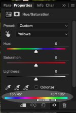
When you've selected Yellow in the HSL adjustment it defines the range of hues effected by the adjustment, in this case the from 15 to 105 degrees, with the concentration in the 45 to 75 degree band.
HSL-1.jpg

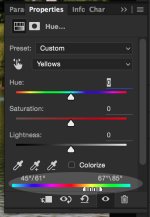
But those sliders are movable, so if you find your adjustment is impacting too wide or too narrow an area then you can move them...
HSL-2.jpg

Not sure what you want to impact? Use the eye dropper tool to select the precise area you want to affect. Grabbing the eyedropper and clicking on a bright spot in the bushes above the canoe the yellow range effectivity is change to this...
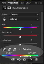
HSL-3.jpg

You can now use the +/- droppers to add and remove parts of the adjustment range, not that I've ever really had a reason to do it.

I've told you all this so that I can now tell you that when you move any of the sliders in the adjustment layer they will only impact the range defined in the color range selector. Move the Hue slider and it only changes the hues within that range, which means you can make your yellows any other color along the continuum (Red is 0/360, Cyan is 180, everything else is in between). Saturation will only impact the color range (in the last screen shot, hues between 7 and 97 degrees with a concentration on 37 to 67) and nothing else. Which brings us to Lightness.

Sliding Lightness left adds blacks to the color range - slide it all the way left and all colors are literally replaced with blacks...
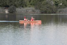
HSL-4.jpg


Sliding the Lightness right adds whites to the color range - slide it all the way right and all colors are literally replaced with whites...
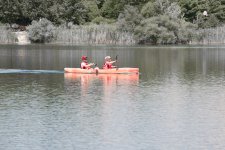
HSL-5.jpg


Don't believe me? Go to the Master channel which affects the entire spectrum of colors. Slide the Lightness slider all the way left and you've got an entirely black image. Slide it right it's entirely white.

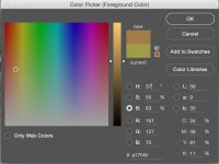
Wanna go deeper? OK, here's what the color picker gives me when I click on the same spot I used to choose the Yellow range with the eye dropper above...
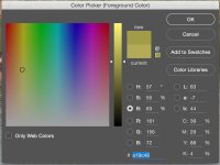
HSL-6.jpg

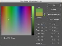
Notice the bar on the left with the two white arrows? It's position up/down corresponds to the B: 63 number you see in the numbers below. That's the current Lightness value. Grab an arrow and slide it up and you'll see the B value go up to 100 at the top (white) and 0 at the bottom (black), but notice that at the top it's not exactly "white". That's because you have a single Hue value (57). When you use the HSL slider you're affecting not just one hue but an entire range of hues, 7 to 97 in the range above, with a concentration from 37 to 67. For giggles, type those numbers in the H: value without changing anything else...

H:7
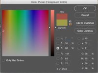
HSL-7.jpg

H:37
HSL-8.jpg

H67:
HSL-9.jpg

H:97
HSL-10.jpg

See how the hue changes? The little white dot slides left to right along the same horizontal line determined by the S: or Saturation number.

That range of colors is the range affected by the Hue, Saturation, and Lightness sliders in the adjustment tool. Changing Saturation will move the range of colors up and down along the vertical in the rainbow window. Changing Hue will move it left and right. Changing Lightness will move the range along the vertical bar to the right.

Blah, blah, blah. I may have dug too deep. But that's the math/science behind the tool. It's how I best understand this stuff.
 

hark

Administrator
Staff member
Super Mod
Follow along, take your time, I need to lay this out step by step...

Thank you for taking the time to give such a detailed explanation. I know I will come back to this to not only read and reread, but to also play around with the photo by applying what you are explaining. It kind of makes sense at this point, but I need to delve deeper to fully understand it--and that's something I really want to do. Thanks again, Jake. I appreciate your shared knowledge. :encouragement:
 
Top