Photoshop LAB Color Space

WayneF

Senior Member
Not to knock Lab color in any way, it is quite neat, but it's just another way to look at color... And as to dreams of wider gamut, it has be converted back to RGB (or CYMK) to view or print it or use it.

But it seems useful to point out that (if we only have Lightroom, but not Photoshop), we can also work with White Balance, which is in fact, just Lab color.

The White Balance Temperature slider (yellow to blue) is just the Lab b axis. And White Balance Tint slider (green to magenta) is just the Lab a axis.

LAB defines the a, b, L axes. And both a and b axes are color independent of the L intensity axis.

RGB color is device dependent on intensity... the device that creates it, and the device that views it, neither are perfect. LAB is device independent (but we still have to view it).

The LAB L axis is intensity, and a and b are color, independent of intensity. Color does not exist as Lab, but Lab is a way to separate color from intensity. Shifting RGB colors necessarily shift brightness level, but shifting LAB does not. But it will have to go back to RGB ultimately.

Anyway, my point, it seems simpler and more useful to just learn White Balance. It has already been handled for us.
 
Last edited:
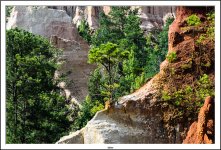
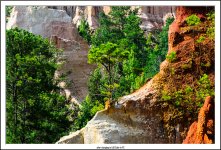
As with everything I read here thats looks interesting I try it out and see how I like it. So I did. here are a before and after. This was shot a long time ago with my D5100 and 18-105 lens. No corrections other than following the directions exactly in the article.
Here is before
DSC_6156-FrameShop.jpg

Here is after
DSC_6156-FrameShop_1.jpg

No tweaking at all. Just put the sliders exactly where the article stated. Was easy and fast even though I was having to read and was playing with some new things I had never done before so I had to find a few things. Easily repeatable.
 
Last edited:
I did notice that Nik will not work after doing this. After doing this what happens if you change it back? Does it maintain the expanded color pallet? To tired to get up and walk over to the computer to try.
 

WayneF

Senior Member
You have to convert LAB back to RGB to be compatible with other tools and drivers and devices. Your editor is just showing you a temp RGB copy on your monitor.
 
Still just another tool in the tool chest. The shot I used as an example was a good test. I was never satisfied with the shots I got compared to what I saw with my eyes when I was there.

I am going out west for a couple of weeks late summer and visiting Arches National Park, Dead Horse Point State Park, Canyonlands National Park, Arches National Park and the Grand Canyon and I can imagine the colors will be hard to reproduce. I am going to work on my post processing skills a lot between now and September when we go.
 

hark

Administrator
Staff member
Super Mod
As with everything I read here thats looks interesting I try it out and see how I like it. So I did. here are a before and after. This was shot a long time ago with my D5100 and 18-105 lens. No corrections other than following the directions exactly in the article.
Here is before
View attachment 160518

Here is after
View attachment 160519

No tweaking at all. Just put the sliders exactly where the article stated. Was easy and fast even though I was having to read and was playing with some new things I had never done before so I had to find a few things. Easily repeatable.

Not to knock it, but I prefer the before photo because the after photo has fake-looking greens. And the golden-brown on the close rocks looks a little overcooked, too.
 

WayneF

Senior Member
Those are actually closer to the colors in that area though. Red clays and sand.

It is pretty vivid? The picture looks like it might have already been in Picture Control Landscape or Vivid before?

Try from the original again, staying in RGB mode, but use the Photoshop Hue/Saturation tool (same Adjustments menu with Curve), and simply increase the Saturation to about 25 or 30... And compare. Just to make the point.

The procedure in the Lab article boosts saturation of the greens and magentas, and also saturation in the blues and yellows, which is all four axes, all points of the compass. :) I think the Saturation tool does it across the board too, probably in the same way inside. Hue/Saturation/Brightness is the HSB system, which is somewhat similar to Lab (at least the L channel is in common, independent of color).

The curve end points moved that way do the same thing as the Levels endpoints (levels is just marked 0..255). Lab a and b are just not affecting brightness like RGB Curve or Levels would. But in Lab, the a and b channels work the same.

And the White Balance Temperture/Tint sliders do exactly the same as this Lab tweak (they are the a and b channels), a Lab tool in RGB (because WB is Lab, it is the same thing). WB just does not mark equal increments from the ends like the Lab Curve tool does. Of course, Equal at both ends has no justification in reality, color being what it is, probably not oriented to our tool. It's just in Lab no color cast is added if equal in a and b. I'm thinking WB is a more useful thing to learn overall, but we can't set WB in equal amounts at both ends of the scale.

Moving the channel end points of channel a makes it more green or more magenta, but doing both the ends equally balances that color cast, and just leaves it more vivid. Any steeper curve is more contrast. The end points of b is the same with yellow and blue.

FWIW, if interested in Lab, Dan Margulis was an early guru (one of the first members to the Photoshop Hall of Fame), and a big proponent of using Lab to correct color in professional CMYK prepress work. CMYK is pretty hard on RGB monitors with RGB tools. One of his books is Professional Photoshop 5 (1998 - 5th Edition 2006), which may still be the best book on color correction. There are many used copies available on Amazon for about $13 total.
 
Last edited:
This was just a test using the exact settings that had in the example. I know there are many controls to fine tune. I have used it a couple times this evening carrying it back out of lab and then using NIK to finish it up. Again, just another tool in the tool box.

It is pretty vivid? The picture looks like it might have already been in Picture Control Landscape or Vivid before?

Try from the original again, staying in RGB mode, but use the Photoshop Hue/Saturation tool (same Adjustments menu with Curve), and simply increase the Saturation to about 25 or 30... And compare. Just to make the point.

The procedure in the Lab article boosts saturation of the greens and magentas, and also saturation in the blues and yellows, which is all four axes, all points of the compass. :) I think the Saturation tool does it across the board too, probably in the same way inside. Hue/Saturation/Brightness is the HSB system, which is somewhat similar to Lab (at least the L channel is in common, independent of color).

The curve end points moved that way do the same thing as the Levels endpoints (levels is just marked 0..255). Lab a and b are just not affecting brightness like RGB Curve or Levels would. But in Lab, the a and b channels work the same.

And the White Balance Temperture/Tint sliders do exactly the same as this Lab tweak (they are the a and b channels), a Lab tool in RGB (because WB is Lab, it is the same thing). WB just does not mark equal increments from the ends like the Lab Curve tool does. Of course, Equal at both ends has no justification in reality, color being what it is, probably not oriented to our tool. It's just in Lab no color cast is added if equal in a and b. I'm thinking WB is a more useful thing to learn overall, but we can't set WB in equal amounts at both ends of the scale.

Moving the channel end points of channel a makes it more green or more magenta, but doing both the ends equally balances that color cast, and just leaves it more vivid. Any steeper curve is more contrast. The end points of b is the same with yellow and blue.

FWIW, if interested in Lab, Dan Margulis was an early guru (one of the first members to the Photoshop Hall of Fame), and a big proponent of using Lab to correct color in professional CMYK prepress work. CMYK is pretty hard on RGB monitors with RGB tools. One of his books is Professional Photoshop 5 (1998 - 5th Edition 2006), which may still be the best book on color correction. There are many used copies available on Amazon for about $13 total.
 

J-see

Senior Member
LAB is more interesting for photography once you start to adjust the levels (curving). You only need to increase chromaticity vs saturation to directly see why. When I started using RT, it allowed me to process using RGB, LAB or CIECAM02 and after getting used to it, I close to always use either LAB or CIECAM.

You can adjust colors in LAB without affecting the lightness of your shot which is impossible in RGB since any change to the color also affects its lightness.

Here's a quick video about its use in PS:


The principle of editing LAB in RT is identical although not as handy as in PS. But I got used to it.
 
Last edited:

J-see

Senior Member
Here's a shot I processed normal in RGB and one on LAB. It's so easy to get whatever colors you like in LAB since it preserves the overall lightness of the shot. In the end you could do something similar in RGB color mode but it would cost a lot more time and effort since every change to a color channel has to be compensated in one or both others to fix the lightness it affects.

_DSC9907.jpg _DSC9907-1-1.jpg
 
Top